Storyboard Guide
1. Enable Storyboard
To launch the Storyboard Editor, please follow these steps:
-
Navigate to Configuration -> RDA Administration -> User Dashboards
-
To set up a new dashboard, click Add and start by filling in the key configuration details. This typically includes a unique name, a display label for the dashboard, and an optional description to outline its purpose and functionality.
{
  "name": "<dashboard-name>",
  "label": "<dashboard-label>",
  "description": "<description>",
  "enabled": true,
  "dashboard_type": "dashboard",
  "use_storyboard": true,
  "live_edit": true,
  "dashboard_filters": {
    "time_filter": false
  },
  "dashboard_sections": [
    {
      "title": "Tab Label",
      "show_filter": false,
      "widgets": [
        {
          "title": "sample label 1",
          "widget_type": "label",
          "advanced": true,
          "label": "Sample Label Widget",
          "min_width": 4,
          "min_height": 4,
          "widget_id": "label001"
        }
      ]
    }
  ]
}
-
Once user enters the required information, click Save to create the dashboard. After it’s added, user can personalize it by incorporating widgets, charts, graphs, and other data visualizations to bring user's storyboard to life.
-
Make sure to enable Storyboard by adding the enable flag in the dashboard definition (use_storyboard).
-
To activate the storyboard feature for an existing dashboard, navigate to the Edit JSON menu. From there, modify the dashboard definition by
adding use_storyboard: true, as illustrated in the example above.
2. Generate Storyboard
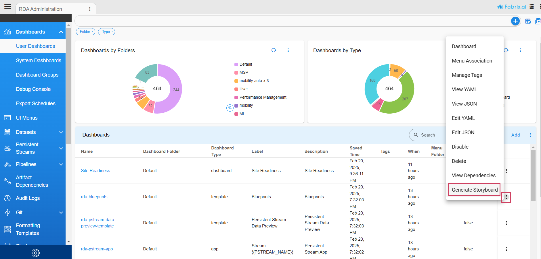
- An alternative way to transform an existing dashboard into a storyboard is to use the Generate Storyboard option from the menu.
3. Launching Storyboard Editor
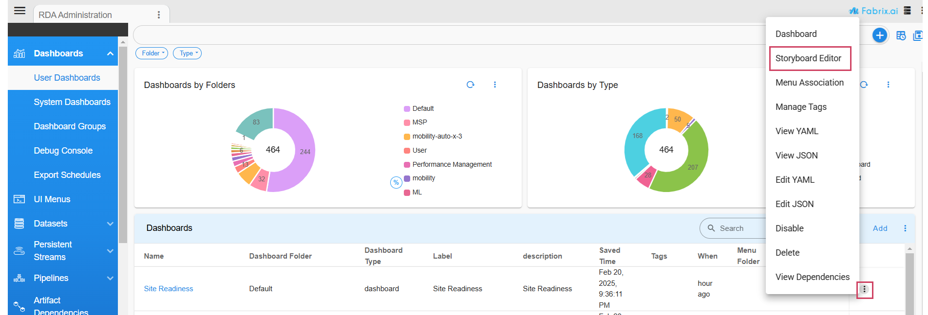
- After enabling the storyboard feature for a dashboard, the Storyboard Editor menu becomes available. To open it, just click the action menu.
4. Using Storyboard Editor
4.1 Adding Storyboard
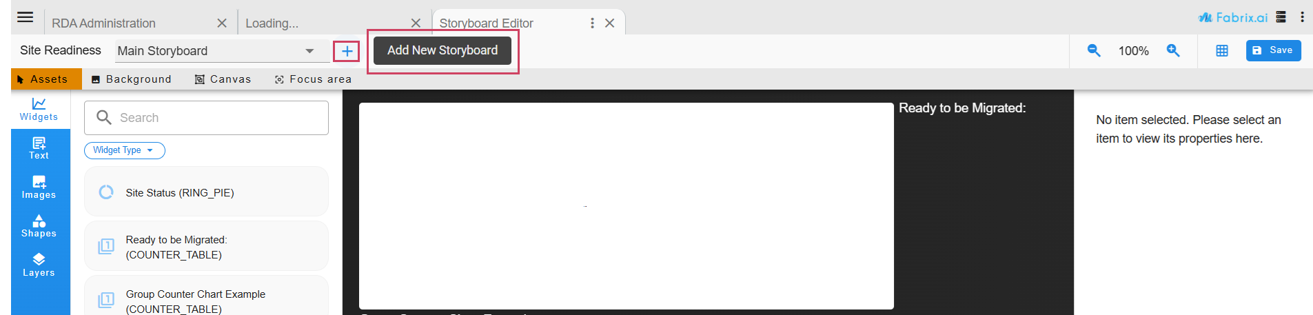
- Thereafter if user wants to add a new storyboard to it, click on “+” button next to the storyboard name.
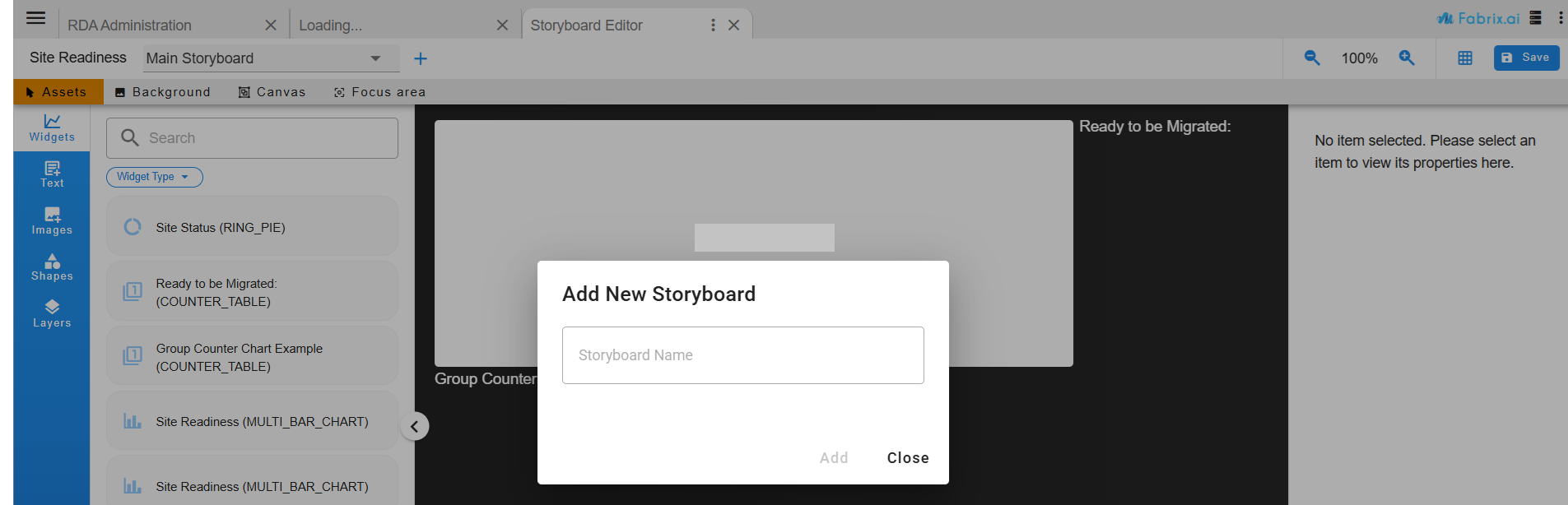
- Upon initial launch of the Storyboard Editor for the dashboard, the user will be prompted to enter a name for the storyboard.
4.2 Header Tools
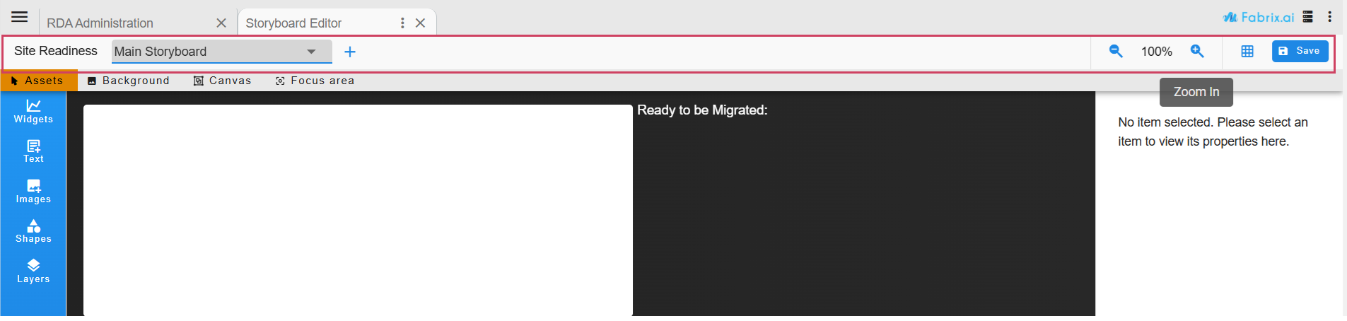
-
Dashboard Name
-
Storyboard Name (dropdown selection)
-
Add Storyboard
-
View controls - Zooming
-
Grid overlay
-
Save Action
4.3 Edit Modes
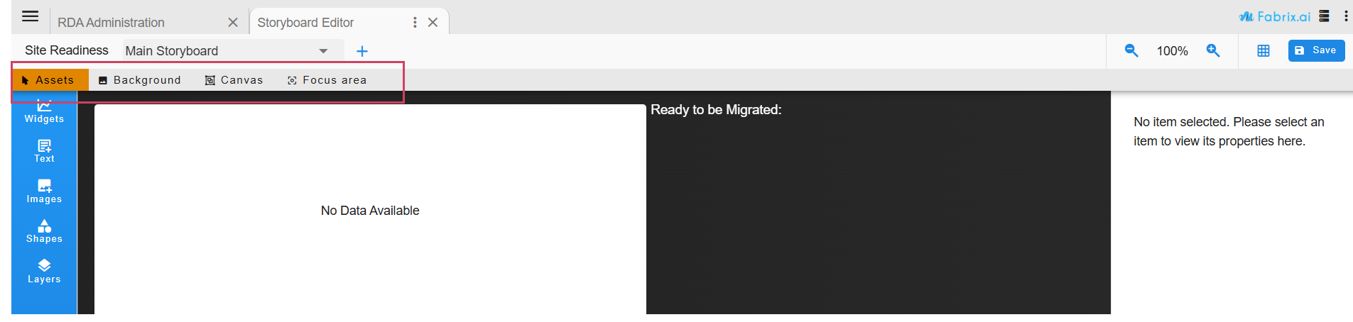
-
Assets
-
Background
-
Canvas
-
Focus area
4.3.1 Assets
- In Assets, user can place widgets, texts, images and visual objects (geometric shapes, lines) to the storyboard
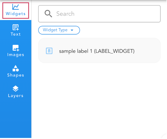
4.3.1.1 Widgets
- The storyboard can be customized by dragging and dropping dashboard widgets onto it.
widgets
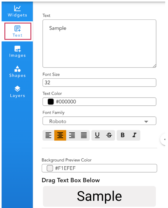
4.3.1.2 Texts
- Users can preview their text with the selected styles before effortlessly dragging and dropping it into the storyboard. The text input can be modified at any time, allowing them to seamlessly reapply the updated, styled text as needed.
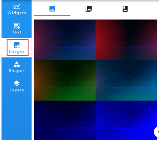
4.3.1.3 Images
- Images can be easily added to the storyboard by choosing from the built-in image and icon libraries, as well as the Icon Library.
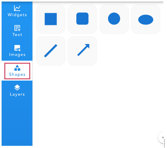
4.3.1.4 Shapes
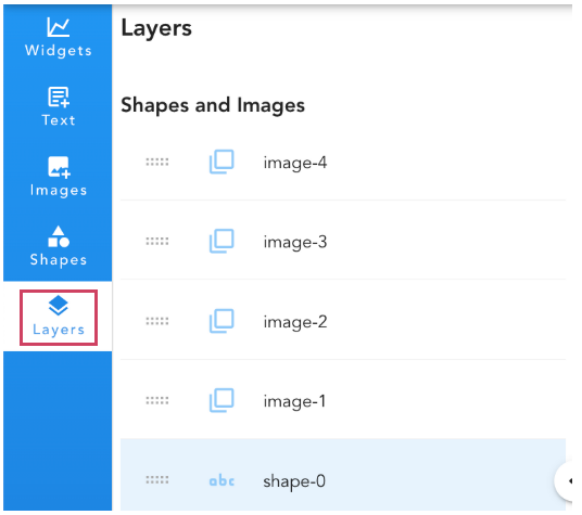
4.3.1.5 Layers
- Easily reorder the layers in the list to control their stacking order, arranging them seamlessly from front to back.
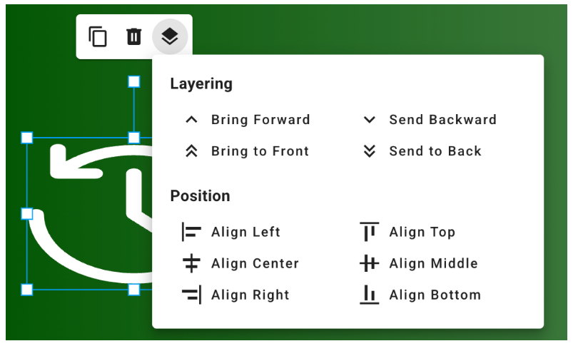
Object Context Menu
When widget or object is selected, a popup menu is available for:
-
Duplicate
-
Delete
-
Layering Tool / Position Alignment Tool
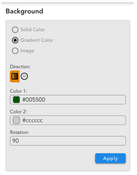
4.3.2 Background
- Users can personalize the storyboard background by applying solid colors or selecting an image to create a visually engaging backdrop.
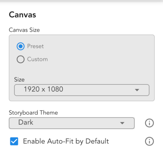
4.3.3 Canvas
Canvas Mode Settings:
In Canvas Mode, user can define the storyboard size and configure the default behavior of the Automatically Fit to Screen feature for the display. When Auto-scale is turned on, and if window size goes below this limit, the minimum scaling value will be set to this (minimum width / canvas width).
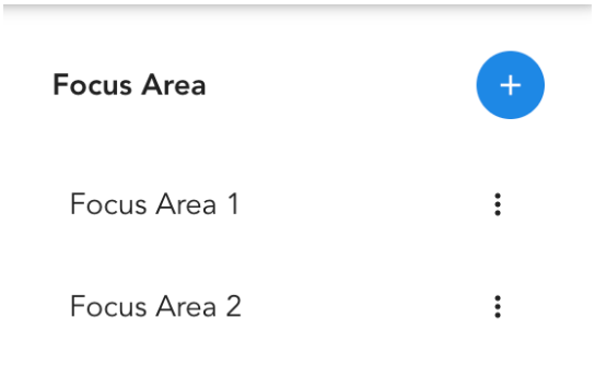
4.3.4 Focus Area
Users can set a Focus Area to showcase a specific portion of the storyboard, offering precise control over the viewing experience during presentations.
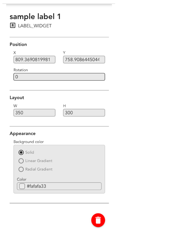
4.4 Properties Panel
The properties of selected objects, or the Storyboard settings (in Canvas Mode), are displayed in the right side of the Storyboard Editor.
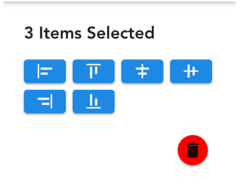
4.5 Multi-selection Alignments
When multiple objects are selected in Assets Mode, an alignment tool automatically appears in the right panel for easy positioning.
4.6 Save Action
Important
Always save your work before closing the editor. Any unsaved changes will be permanently lost.
4.7 Viewing Storyboard
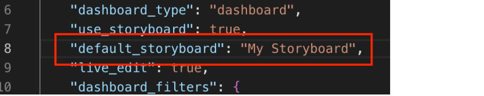
4.7.1 Adding Default Storyboard
default_storyboard must be added to the dashboard definition to display the storyboard upon dashboard launch.
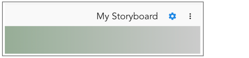
4.7.2 Storyboard Viewing Tools
When there’s a single storyboard in the dashboard, its label will appear on the right side.
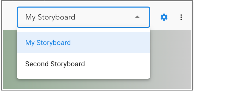
4.7.3 Storyboard Selection
When a dashboard contains multiple storyboards, a dropdown menu will appear, allowing users to easily switch between them.
4.7.4 Scale Tool
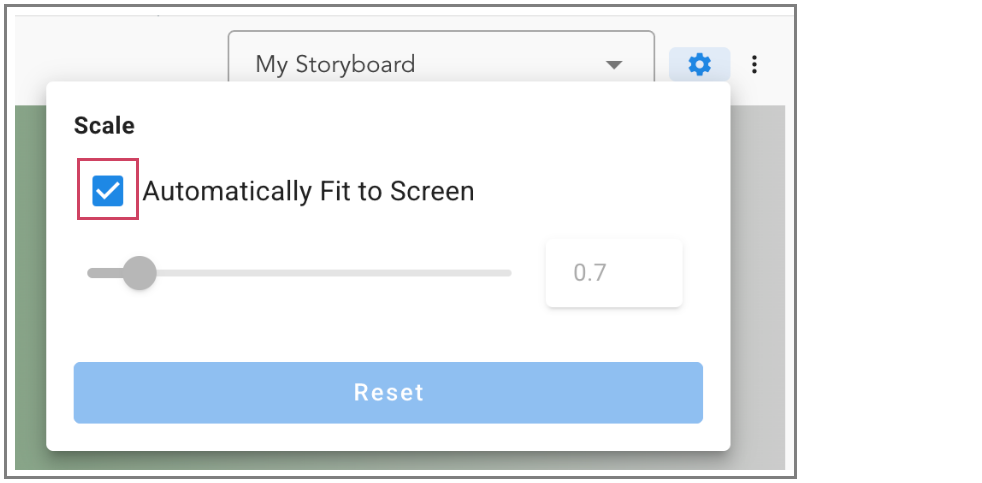
4.7.4.1 Automatically Fit to Screen
When the Automatically Fit to Screen option is selected, the storyboard automatically adjusts its width to match the browser window. The scale dynamically updates as the window is resized.
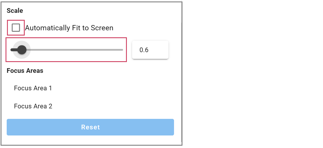
4.7.4.2 Focus Area Tool
The Focus Area control tool lets users highlight a specific section of the storyboard and adjust the scale to fit it perfectly within the window width. This tool becomes available once Focus Areas are added to the storyboard.
When the Automatically Fit to Screen option is disabled, users can adjust the storyboard display size manually using the scale slider.
4.7.4.3 Reset Button
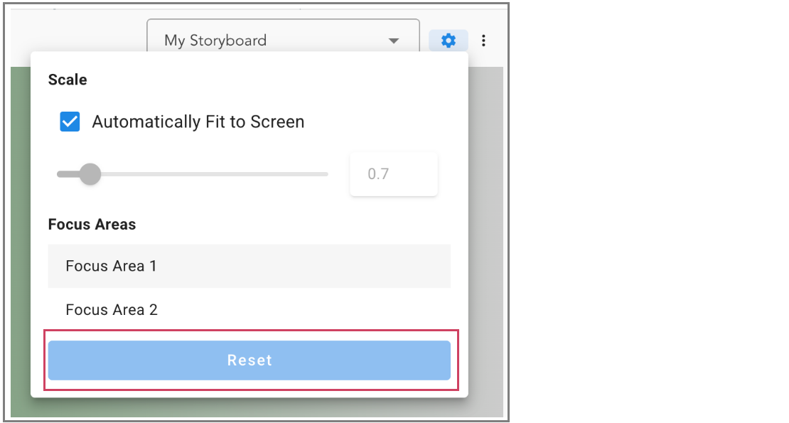
User can easily restore the storyboard to its original state before the focus area selection was applied.