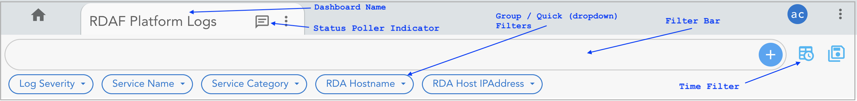
Dashboard
1. What is a Dashboard
Dashboards feature in RDA Fabric platform provides analytics and reporting using which different UI views can be created for different user personas such as executives, IT admins and operators etc. Dashboards are composable and customizable to fit specific user needs within the IT operations landscape.
Below are some of the available different data types in RDA Fabric platform using which Dashboards can be created, but not limited to.
- Metrics
- Alerts / Events
- Logs
- Traces
- Asset Inventory
- Tickets
- Other IT operations & service management data
2. Creating a Dashboard
Follow the below steps to access the Dashboard feature in RDA Fabric platform
2.1 Dashboard Configuration
Step-1: Login into RDA Fabric platform as a MSP Admin user.
Step-2: Go to Main Menu --> Configuration --> RDA Administration --> Dashboards
Step-3: Click on Add button to create a new Dashboard.
Dashboard configuration need to be provided in JSON / YAML format. Below is a sample configuration to create a new Dashboard.
{
    "name": "rdaf-platform-log-analytics-2",
    "label": "RDAF Platform Logs2",
    "description": "RDAF Platform service's log analysis dashboard",
    "version": "22.9.22.2",
    "enabled": true,
    "dashboard_style": "tabbed",
    "status_poller": {},
    "dashboard_filters": {
        "time_filter": true,
        "columns_filter": [],
        "group_filters": []
    },
    "dashboard_sections": [],
    "dashboard_type": "app",
    "dashboard_pages": []
}
Please refer the below table for details about Dashboard's configuration parameters.
Parameter Name |
Mandatory | Description |
|---|---|---|
name |
yes | Unique name or ID for the Dashboard. May contain letters, digits and hyphen only. |
label |
yes | Label for the dashboard. This is visible to users of the dashboard |
description |
yes | Description for the dashboard. This is also visible to the users |
version |
no | Dashboard version to track the changes for better management of it's configuration. Ex: YYYY.MM.DD.NUMBER 2022.12.01.01 or any alphanumerical value which uniquely distinguishes between each version. |
enabled |
yes | Specifies if the dashboard to be enabled / disabled. If not enabled, Dashboard would not be visible to users. Valid values are true or false. Default is false |
dashboard_style |
no | Dashboards can be tabbed or sectioned. If set to auto, tabs will be shown only if more than one section is specified under dashboard_sections. Default is auto |
dashboard_folder |
no | Specify the folder name under which the dashboard to be created. When it is not specified, it is placed under Default folder. |
status_poller |
no | It is a smart dashboard UI refresh feature. When used, it will refresh the Dashboard with new data within the user defined polling frequency automatically. It will refresh the Dashboard UI only if there is new data since last poll. |
dashboard_filters |
yes | This object defines if and how filtering should be enabled for dashboard. |
dashboard_sections |
yes | This is list of objects which specify list of sections, and widgets in each section. How to add the widgets to the Dashboard Section Refer Widgets Type |
dashboard_type |
no | Specify the Dashboard type. Supported values are app. |
dashboard_pages |
no | Specify the sub Dashboard configuration parameters. This parameter is needed when dashboard_type is set to app |
2.2 Status Poller
It is a smart dashboard UI refresh feature. When used, it will refresh the Dashboard with new data within the user defined polling frequency automatically. It will refresh the Dashboard UI only if there is new data since last poll.
Please refer the below sample configuration settings to enable Status Poller feature within the Dashboard configuration.
"status_poller": {
    "stream": "rdaf_pstream_name",
    "frequency": 30,
    "columns": [
        "timestamp"
    ],
    "sorting": [
        {
            "timestamp": "desc"
        }
    ],
    "query": "timestamp is after '${timestamp}'",
    "defaults": {
        "timestamp": "$UTCNOW"
    },
    "action": "refresh"
}
Please refer the below table for details about Status poller's configuration parameters.
Parameter Name |
Mandatory | Description |
|---|---|---|
stream |
yes | Persistent stream name from which the data to be polled to refresh the data within the Dashboard. |
frequency |
yes | Specify the polling frequency in Seconds. Ex: 15 or 30 or 60 etc. |
columns |
no | Specify the timestamp column within the persistent stream name. It is an array field and supports multiple values. Default value is timestamp |
sorting |
no | Specifies the sorting to be applied on the queried data. Default setting is desc. Supported values as desc and asc |
query |
yes | Specify the query in CFXQL format to query the data during the refresh poll. |
defaults |
yes | Specify the timestamp format of the RDA Fabric system, UTC vs Local time. Syntax is { "timestamp": "$UTCNOW" }. timestamp is timestamp column within the specified pstream name. Supported values are $NOW and $UTCNOW |
action |
yes | Supported value is refresh |
2.3 Dashboard Filters
Dashboard filters is a feature within each Dashboard which allows the user to expose selective columns from supported datasources such as persistent stream or a dataset as Filters.
- Time Filters
- Column Filters
- Group Filters
Time Filters: When the time filter is set to true, it allows for the adjustment or re-arrangement of intervals for a timestamp column. This feature enables users to manipulate and organize the time intervals displayed or analyzed within the dashboard. By setting the time filter to true, users gain the capability to modify how the timestamps are grouped, displayed, or analyzed based on their preferences or requirements.
Default Time Filter Labels: The default_time_filter_labels feature establishes a preset interval as the default selection for the dashboard when using time filters. This means that when a user accesses the dashboard or interface, it will automatically display or use the specified time interval as the default option for filtering or organizing the time-based data without requiring the user to manually select it each time.
Below is the sample configuration to specify Default Time Filter Labels
Note
Make sure the time_filter is enabled and set to true
Custom Time Filters: When custom time filters are enabled along with the time filter, users can define precise intervals for their timestamp data. This functionality permits users to customize intervals, like minutes (m), hours (h), days (d), weeks (w), months (M), and years (y). However, it's important to note that, users must input a number followed by the interval type letter. Just providing the 'm' designation won't display any results; users need to adhere to the format of providing a numerical value followed by the interval type letter to ensure accurate interval definitions.
Below is the sample configuration to specify Custom Time Filter
"dashboard_filters": {
"time_filter": true,
"custom_time_filters": [
"15m",
"32m",
"72m",
"1h",
"4h",
"36h",
"1d",
"3d",
"1w",
"2w",
"1M",
"3M",
"1y",
"10y"
]
}
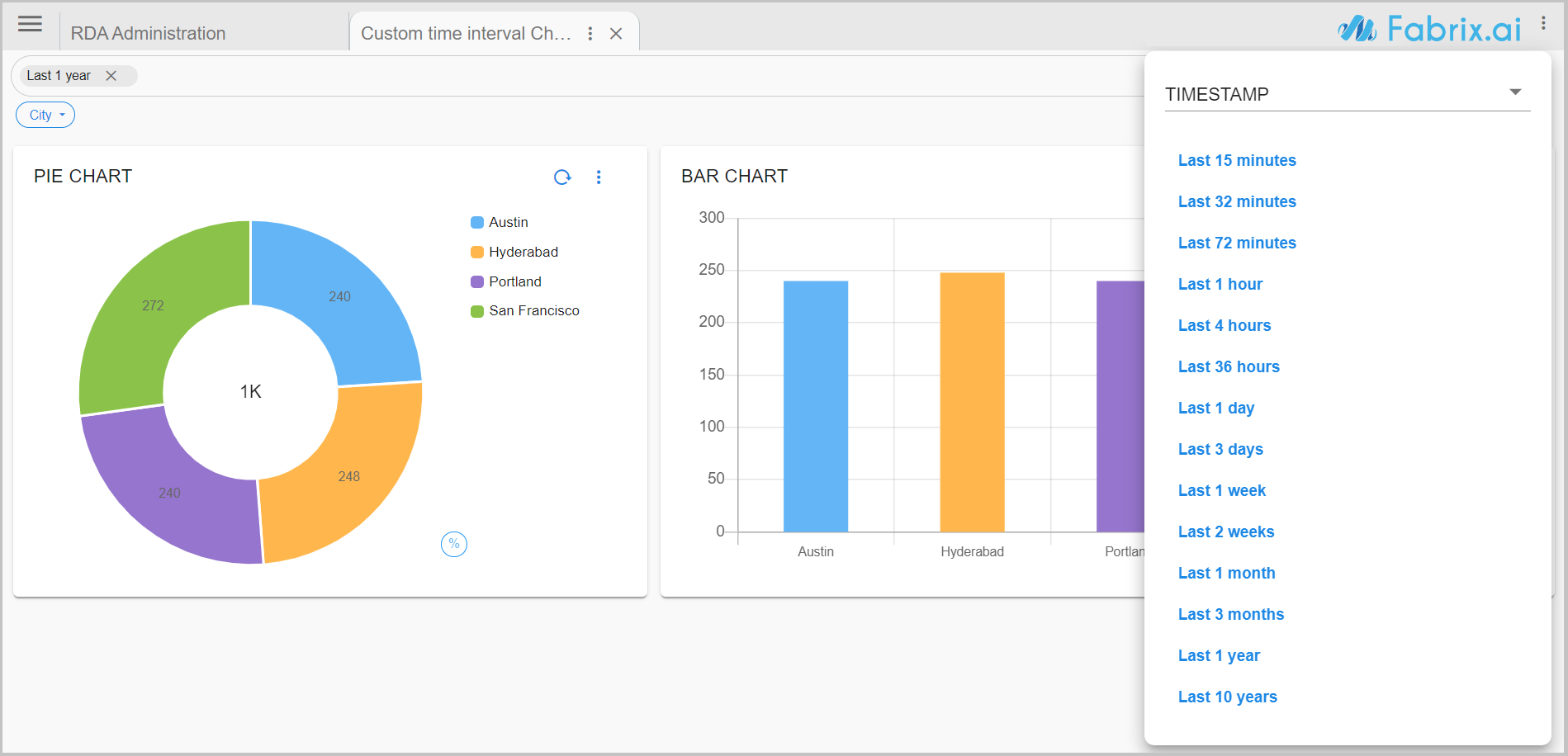
Note
Make sure the time_filter is enabled and set to true
Column Filters: option allows the user to query and filter the data on one or more selected column(s) using the dashboard's filter bar on demand.
"dashboard_filters": {
"time_filter": true,
"columns_filter": [
{
"id": "timestamp",
"label": "Timestamp",
"type": "DATETIME"
},
...
...
{
"id": "host",
"label": "IP Address",
"type": "TEXT"
}
]
}
Please refer the below table for details about Dashboard filter's configuration parameters.
Parameter Name |
Mandatory | Description |
|---|---|---|
time_filter |
no | This parameter is to enable time filter or not for the dashboard. Supported values are true or false. |
columns_filter |
no | Configure the parameters and specify the columns which need to be exposed as filterable columns. |
group_filters |
no | Configure the parameters and specify the columns which need to be exposed as group or quick (drop down) filters. |
Please refer the below table for details about Column filter's configuration parameters.
Parameter Name |
Mandatory | Description |
|---|---|---|
id |
yes | Column name from the persistent stream or dataset. |
label |
yes | Specify the label for the selected column under id parameter. |
type |
yes | Specify the selected column's data type. Supported values are TEXT, DATETIME |
For more information on various Text field related search options, Please Click Here
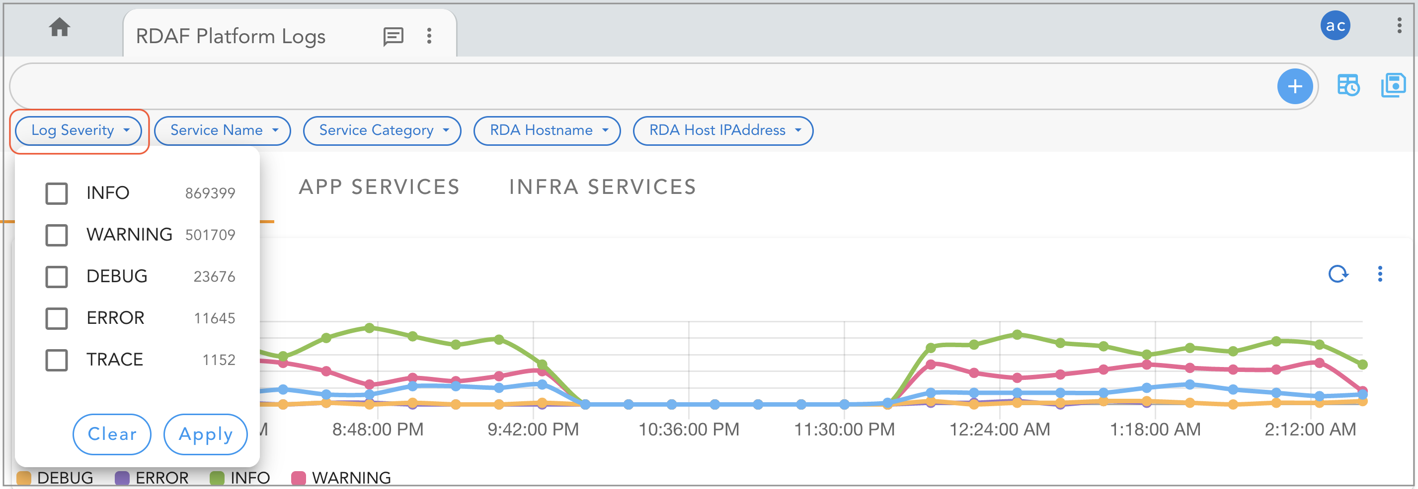
Group Filters: option acts as a quick filter, when defined, it provides a simple drop down with unique filtered values from the selected column and allows the user to select one or more values to filter the data quickly.
Tip
Both Column Filters and Group Filters are optional within the Dashboard configuration.
"group_filters": [
{
"stream": "rdaf_services_logs",
"title": "Log Severity",
"group_by": [
"log_severity"
],
"ts_column": "@timestamp",
"agg": "value_count",
"column": "_id",
"type": "int",
"show_counts": true
},
{
"stream": "rdaf_services_logs",
"title": "RDA Host IPAddress",
"group_by": [
"service_host"
],
"ts_column": "@timestamp",
"agg": "value_count",
"column": "_id",
"type": "int"
},
{
"stream": "main",
"title": "Name ( Sort Order Asc)",
"sort_order": "asc",
"group_by": [
"name"
],
"ts_column": "timestamp",
"agg": "value_count",
"column": "_id",
"type": "int"
},
{
"stream": "main",
"title": "Name (Top n)",
"top_n": 2,
"group_by": [
"name"
],
"ts_column": "timestamp",
"agg": "value_count",
"column": "_id",
"type": "int"
},
{
"stream": "main",
"title": "Name ( Bottom n )",
"bottom_n": 3,
"group_by": [
"name"
],
"ts_column": "timestamp",
"agg": "value_count",
"column": "_id",
"type": "int"
}
]
Please refer the below table for details about Group filter's configuration parameters.
Parameter Name |
Mandatory | Description |
|---|---|---|
stream |
yes | Specify the persistent stream. |
title |
yes | Specify the label for group filter |
group_by |
yes | Specify one or more columns to apply the group_by. This parameter supports multiple column values. Ex: "group_by": [ "column_01", "column_02", "column_n"] |
column |
yes | Specify the column name that is to uniquely identify the selected group_by column values within each record of persistent stream or dataset. |
ts_column |
yes | Specify the timestamp column name within the selected persistent stream. It is optional when dataset is used. |
agg |
yes | Specify the aggregation function. Supported values are value_count (shows total count), min, max, avg, sum, cardinality (shows unique count),first_record and last_record return the starting and final values of the column for the selected time range. |
type |
no | Specify the data type while performing aggregation function. Supported values are int and str. int option is valid only for min, max, sum, mean aggregation operations and these are not applicable for group filters. |
show_counts |
no | This Parameter is used to show or hide counts in group filters. supported values are true or false |
top_n |
No | Filters the top n values to display. For example, top_n:2 will show the top 2 values in the chart. |
bottom_n |
No | Filters the bottom n values to display. For example, bottom_n:2 will show the bottom 2 values in the chart. |
sort_order |
No | Sorts values in ascending or descending order. Expected values: [asc, desc]. |
2.4 Dashboard Pages
Dashboards can be grouped and used as sub dashboards within another main dashboard and they are configured as Dashboard Pages.
Below is the configuration format for Dashboard Pages.
"dashboard_pages": [
{
"name": "CFX Incidents - Dashboard",
"label": "Incidents",
"icon": "incident.svg",
"group": "group1"
},
...
...
{
"name": "Operational Metric - Dashboard",
"label": "Metric Analysis",
"icon": "metrics.svg",
"group":"group2"
}
]
Please refer the below table for details about Dashboard page(s) configuration parameters.
Parameter Name |
Mandatory | Description |
|---|---|---|
name |
yes | Specify name of the Dashboard which need to be added as a page. |
label |
yes | Specify the label for Dashboard page. |
icon |
no | Specify an icon image file name which can be used for the Dashboard page. The Page Menu Icons section below displays a few of the system's icons. |
group |
no | Specify multiple pages under single group |
Note
Please click on the Hamburger Menu to hide the page layout and increase the width
Below is the sample screenshot of Dashboard Pages
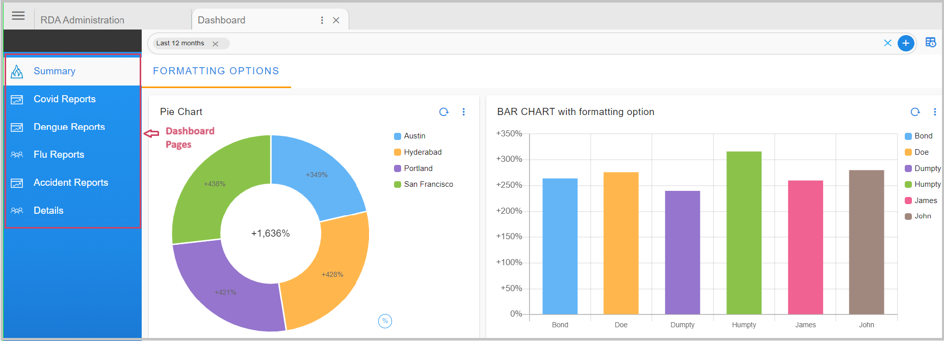
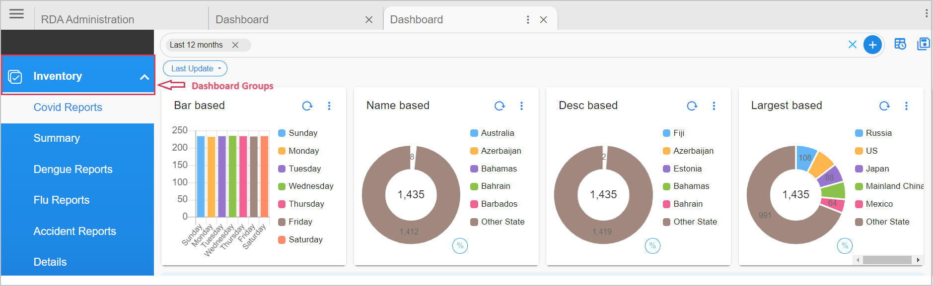
2.5 Grouping of Pages in an App
Dashboards can include multiple pages that work like sub-dashboards within a main dashboard(App). You can organize these pages and decide which ones can go together for easy navigation.
Below is the configuration format.
"dashboard_groups": {
"group1": {
"icon": "overall.svg",
"label": "Network"
},
"group2": {
"icon": "jobs.svg",
"label": "vCenter"
}
},
"dashboard_pages": [
{
"name": "aia-network-overall",
"label": "Network",
"icon": "hardware.svg",
"group": "group1"
}
]
Parameter Name |
Mandatory | Description |
|---|---|---|
icon |
no | Specify an icon image file name which can be used for the Dashboard group |
label |
yes | Specify the label for Dashboard group |
Below is the sample screenshot of Grouping of Pages in an App
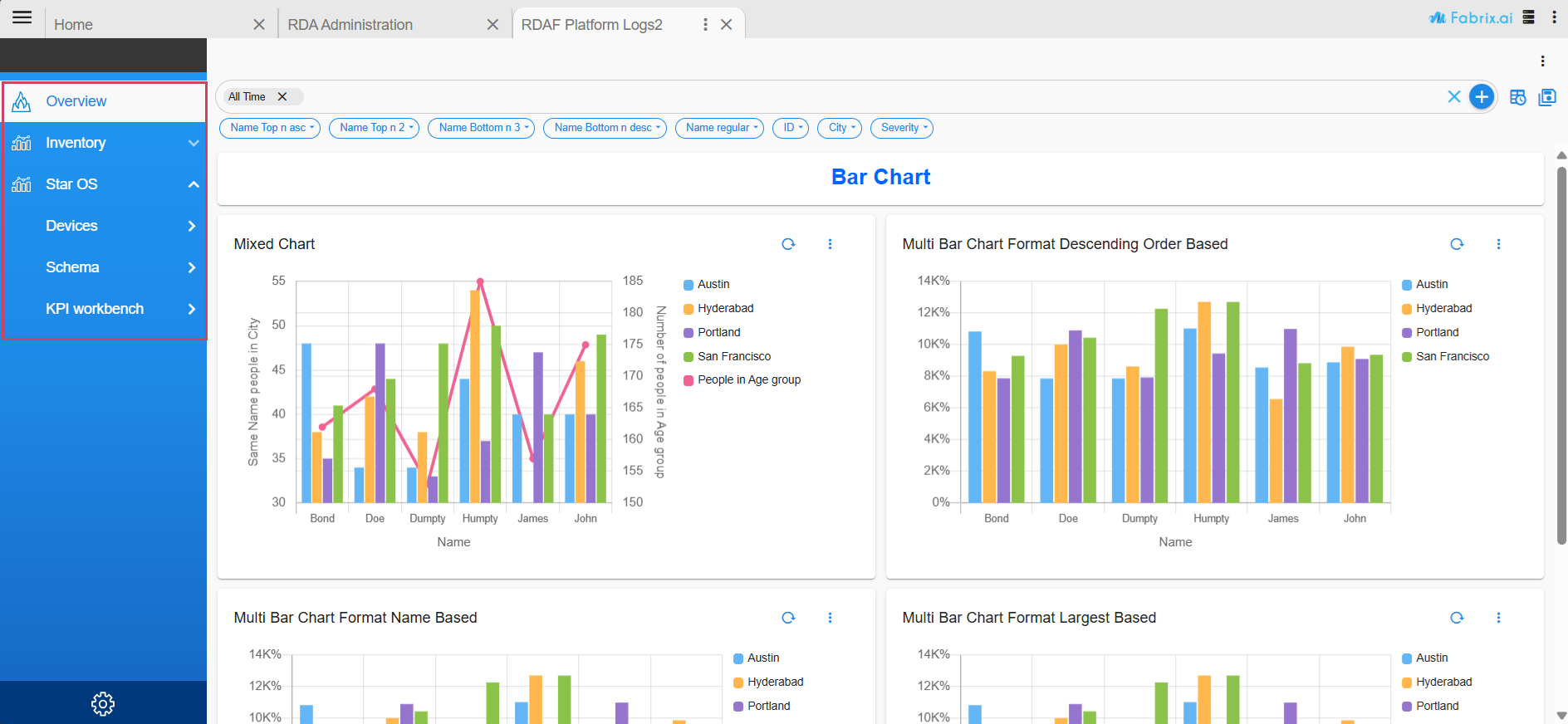
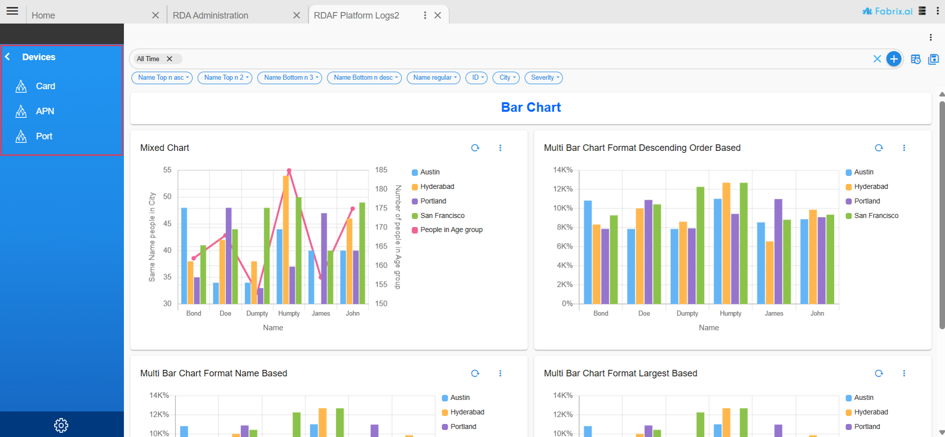
2.6 Hierarchical Pages Support
The dashboard configuration now supports a hierarchical structure for app-type dashboards, enabling the creation of multi-level subpages. This enhancement allows users to group pages and create subgroups, resulting in improved organization and more intuitive navigation within app dashboards.
2.6.1 Configuration Structure
Top-Level Keys
Key |
Type | Description |
|---|---|---|
dashboard_type |
string | Type of dashboard, should be “app” |
dashboard_hierarchical_pages |
boolean | Enables hierarchical page structure. Set to true to use nested groups and pages. |
dashboard_pages |
array | Defines the list of dashboard items, which can include pages and groups. |
2.6.1.1 Item Types
Each item in dashboard_pages can be of the following types
1. type: "page"
Represents a standalone dashboard page.
Property |
Mandatory | Description |
|---|---|---|
| type | Yes | Always "page" |
| name | Yes | Unique identifier for the page |
| label | Optional | Display name for the page |
| icon | Optional | Icon to show in the UI (e.g., "rda.svg") |
2. type: "group"
A folder-like group that can contain pages and/or more groups, enabling multi-level nesting.
{
"type": "group",
"label": "User Dashboards",
"icon": "Analytics.svg",
"items": [
{
"type": "page",
"name": "hello1",
"label": "Sub Page 1"
},
{
"type": "page",
"name": "hello2"
"label": "Sub Page 2",
"icon": "rda.svg"
}
]
}
Property |
Mandatory | Description |
|---|---|---|
| type | Yes | Always "group" |
| label | Yes | Display name for the group |
| icon | Optional | Icon for the group |
| items | Yes | Array of child items (page or group) |
2.6.2 Enabling Hierarchical Support
To activate the hierarchical dashboard mode, include this flag at the root:
Click to view the Full Configuration
{
"name": "rda_user_dashboard",
"label": "RDAF User Dashboard",
"description": "RDAF User Dashboard",
"dashboard_folder": "Default",
"version": "25.4.9.1",
"enabled": true,
"status_poller": {},
"dashboard_filters": {
"time_filter": true,
"columns_filter": [],
"group_filters": []
},
"dashboard_type": "app",
"dashboard_hierarchical_pages": true,
"dashboard_pages": [
{
"name": "bar_chart_examples",
"label": "Overview",
"group": "page",
"icon": "rda.svg"
},
{
"name": "timeseries_chart_example",
"label": "Inventory",
"icon": "Analytics.svg",
"type": "group",
"items": [
{
"type": "page",
"label": "Network Devices",
"name": "timeseries_chart_example",
"icon": "rda.svg"
},
{
"type": "page",
"label": "Command Builder",
"name": "timeseries_chart_example"
}
]
},
{
"type": "group",
"label": "Star OS",
"icon": "Analytics.svg",
"items": [
{
"type": "group",
"label": "Devices",
"icon": "Analytics.svg",
"items": [
{
"type": "page",
"label": "Card",
"name": "bar_chart_examples",
"icon": "rda.svg"
},
{
"type": "page",
"label": "APN",
"name": "bar_chart_examples"
},
{
"type": "page",
"label": "Port",
"name": "bar_chart_examples"
}
]
},
{
"type": "group",
"label": "Schema",
"icon": "Analytics.svg",
"items": [
{
"type": "page",
"label": "apn",
"name": "bar_chart_examples"
},
{
"type": "page",
"label": "card",
"name": "bar_chart_examples"
},
{
"type": "page",
"label": "system",
"name": "bar_chart_examples"
}
]
},
{
"type": "group",
"label": "KPI workbench",
"icon": "Analytics.svg",
"items": [
{
"type": "page",
"label": "card",
"name": "bar_chart_examples"
},
{
"type": "page",
"label": "apn",
"name": "bar_chart_examples"
},
{
"type": "page",
"label": "system",
"name": "bar_chart_examples"
}
]
}
]
}
]
}
Notes
- The
dashboard_pagesarray can include both page and group entries at any level. - If
dashboard_hierarchical_pagesis not set or false, all pages are treated as flat-level entries.
2.7 Dashboard Grid Layout
RDA Dashboards use a grid to display specified widgets. Grid width is always 12. column parameter of the layout can be between 0 (left most()) to 11 (right most). Grid Height is indefinite. row parameter of layout can start 0 for first row at these top.
RDA Dashboard uses an automated algorithm to layout the specified widgets in a dashboard.
Each widget's size and dimensions within a Dashboard is configured using the below parameters.
- min_width
- height
- max_width
Please refer the below configuration example and highlighted parameters
{
"name": "my-dashboard",
"label": "My Dashboard",
"description": "Example dashboard",
"enabled": true,
"dashboard_style": "tabbed",
"dashboard_filters": {
"time_filter": true,
"columns_filter": [
{
"id": "sys_created_on",
"label": "Created On",
"type": "DATETIME"
},
{
"id": "assigned_to",
"label": "Assigned To",
"type": "TEXT"
}
]
},
"dashboard_sections": [
{
"title": "Service Now",
"show_filter": true,
"widgets": [
{
"title": "Sample Data",
"widget_type": "tabular",
"min_width": 8,
"height": 8,
"max_width": 12,
"timestamp": "sys_created_on",
"columns": {
"assigned_to": "Assigned To",
"sys_created_on": "Created On",
"severity": "Severity"
},
"dataset": "servicenow_data"
}
]
}
]
}
3. Dashboard Charts / Widgets
Dashboards support many different types of charts / widgets using which data can be presented and visualized as per the targeted user persona requirements.
Below are the supported widget types & features.
- Pie Chart
- Tabular Report
- Counter Chart
- Bar Chart
- Multi Bar Chart
- Line Graph/Timeseries Chart
- Data Flow Chart
- Image Chart
- 3-Column Navigator
- Shaded Chart
- Label Chart
- Features
- Gauge Widget
- Card Report
Please refer the below widget parameter table which has the associated type value for each of the above widgets / charts.
Widget / Chart Parameter Name |
Description |
|---|---|
pie_chart |
A pie chart is a circle / a donut that is divided into areas, or slices. Each area / slice represents the count or percentage of the observations of a level for the variable. |
tabular |
Tabular report is used to visualize the data in tabular format using one or more selected fields. |
custom_counter |
Custom counter chart is used to show the total count of the selected field's value. |
expressions_counter |
Expression counter chart can be used to show the derived computed values using one more fields value. |
bar_chart |
Bar chart can be used to display the selected fields values as individual bars (horizontal / vertical) whose height is determined by the value. |
topology |
Topology chart is used to visualize the relationship between different nodes or components which exchanges the data between them. |
timeseries |
Timeseries is a line graph chart to visualize any timeseries metric data |
timeseries_multisource |
Timeseries multisource is another type of line graph chart to visualize any timeseries metric data from more than one datasource |
dataflow |
Dataflow chart is used to visualize the dataflow between different end points within the RDA Fabric platform. |
image |
Image chart is used to add and visualize any URL based image within a Dashboard. |
shaded |
Shaded chart is used to display the Train and Predict Data |
label |
Label Chart is used as a Label inside the Dashboard Section |
3-column navigator |
A 3-column navigator is a type of website or application layout where the screen is divided into three vertical sections or columns |
gauge widget |
A gauge widget is typically used to display a single numerical value within a defined range. |
3.1 Pie Chart
Please refer the below configuration parameter table which are used to configure a pie chart within the dashboard.
Parameter Name |
Mandatory | Description |
|---|---|---|
title |
yes | Specify the label for the pie chart. |
widget_type |
yes | Specify the chart / widget type. i.e. pie_chart |
stream |
no | Specify the persistent stream. Note: Either of persistent stream or dataset parameter is needed. |
dataset |
no | Specify the dataset name. Note: Either of persistent stream or dataset parameter is needed |
ts_column |
yes | Specify the timestamp column name within the selected persistent stream. It is optional when dataset is used. |
extra_filter |
no | Use this parameter to filter the data from from one or more selected field(s). It supports CFXQL query format. |
column |
yes | Specify the column name that is to uniquely identify the selected group_by column values within each record of persistent stream or dataset. |
agg |
yes | Specify the aggregation function. Supported values are value_count (shows total count), min, max, avg, sum, cardinality (shows unique count)first_record and last_record return the starting and final values of the column for the selected time range. |
group_by |
yes | Specify one or more columns to apply the group_by. This parameter supports multiple column values. Ex: "group_by": [ "column_01", "column_02", "column_n"] |
type |
no | Specify the data type while performing aggregation function. Supported values are int and str. int option is valid only for min, max, sum, mean aggregation functions. |
style |
no | Using this parameter, each grouped value can be visualized using a specific color using color-map parameter as shown in the one of the below examples. |
min_width |
no | Specify the chart / widget's minimum width size, range is 0 to 12. |
height |
no | Specify the chart / widget's height, range is 0 to n. |
max_width |
no | Specify the chart / widget's maximum width size, range is 0 to 12. |
formatting |
no | To format number with localized units, Use the style & unit option |
notation |
no | We can specify as standard, compact, scientific and engineering Standard Notation: is the implied default, Compact Notation: uses locale-specific symbols to represent large numbers. It is a more human-friendly alternative to scientific notation, Scientific Notation: will only have one significant digit, Engineering Notation: will have three significant digits Note: By default, Compact Notation rounds to the nearest integer, but always keeps 2 significant digits. You can set any of minimum, maximumFractionDigits or minimum, maximum SignificantDigits to override that behavior |
style |
no | The possible values for style are currency & unit |
unit |
no | The unit can have following values angle: degree, area: acre , hectare concentration: percent digital: bit, byte, kilobit, kilobyte, megabit, megabyte, gigabit, gigabyte, terabit, terabyte, petabyte duration: millisecond, second, minute, hour, day, week, month, year length: millimeter, centimeter, meter, kilometer, inch, foot, yard, mile, mile-scandinavian mass: gram, kilogram, ounce, pound, stone temperature: celsius, fahrenheit volume: liter, milliliter, gallon, fluid-ounce speed: meter-per-second |
currency |
no | The Possible value for currency is USD |
SignDisplay |
no | It helps to explicitly display the sign, even when the number is positive. The possible values are always To prevent showing the sign when the value is 0, use signDisplay: exceptZero |
currencySign |
no | when the currencySign is set to accounting it enables a locale-specific format for negative currency amounts. example, wrapping the amount in parentheses |
top_n |
no | Filters top x values to show ex. When top_n:2 then the top 2 values are shown in the chart |
bottom_n |
no | Filters bottom x values to show ex. When bottom_n:2 then the bottom 2 values are shown in the chart |
others_spec |
no | This Parameter will help in sorting, limiting & labeling the others column |
name_based_limit |
no | This Parameter is used to sort the report by name in ascending order |
limit |
no | This Parameter is used to limit the visible reports |
label |
no | This Parameter is used to rename the others column. By default we have others |
segment_filter |
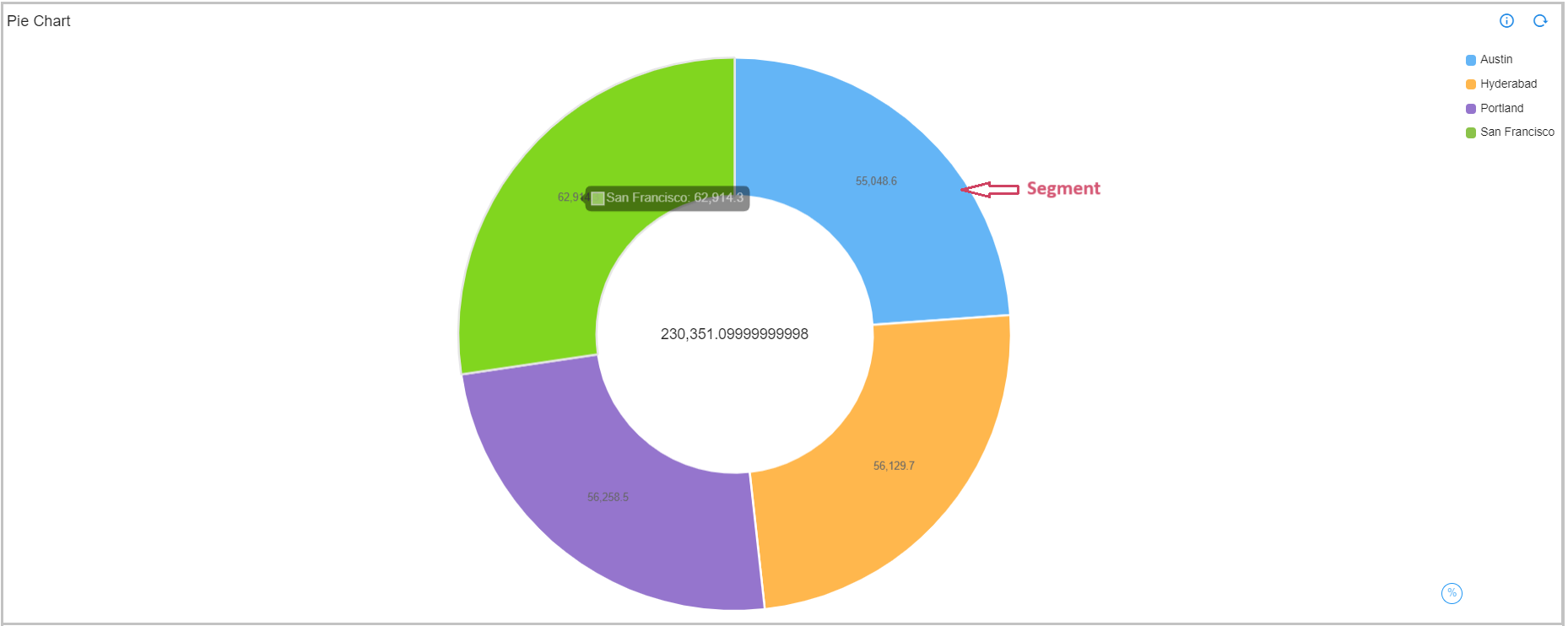
no | When we set this filter as false we don't have the ability to filter when we click on the segment Note: By default its TRUE |
Below is the sample configuration of Pie Chart / Widget.
{
"widget_type": "pie_chart",
"title": "Logs by RDA Host",
"stream": "rdaf_services_logs",
"ts_column": "timestamp",
"extra_filter": "log_severity in ['ERROR', 'DEBUG', 'INFO']",
"column": "_id",
"agg": "value_count",
"group_by": [
"service_host"
],
"type": "str",
"min_width": 4,
"height": 2,
"max_width": 4
}
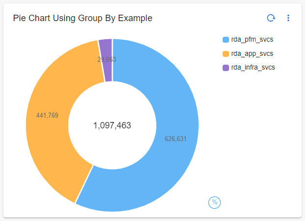
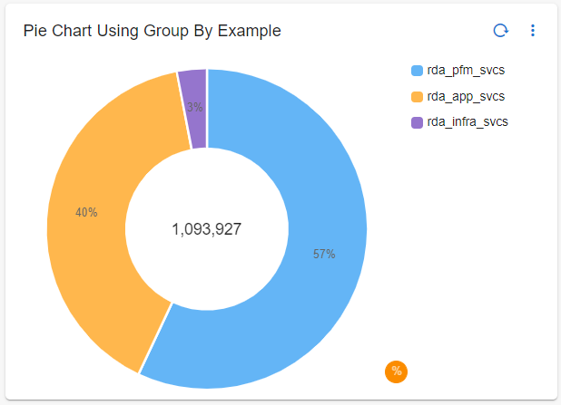
3.1.1 Sample Pie Chart
| Pie Chart Using Group By Example: | Pie Chart Using Group By Example Percentage: |
|---|---|
 |
 |
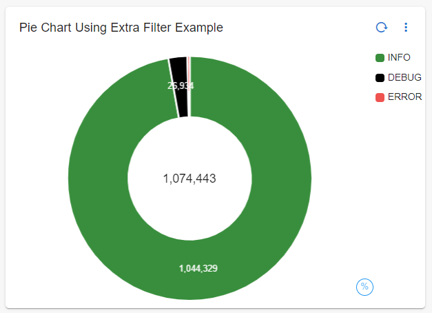
3.1.2 Pie Chart using extra_filter
{
"widget_type": "pie_chart",
"title": "Pie Chart Using Extra Filter Example",
"stream": "rdaf_services_logs",
"extra_filter": "log_severity in ['ERROR', 'DEBUG', 'INFO']",
"ts_column": "timestamp",
"column": "_id",
"agg": "value_count",
"group_by": [
"log_severity"
],
"type": "str"
}
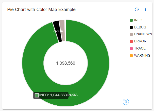
3.1.3 Pie Chart with color-mapping
{
"widget_type": "pie_chart",
"title": "Pie Chart with Color Map Example",
"stream": "rdaf_services_logs",
"ts_column": "timestamp",
"column": "_id",
"agg": "value_count",
"group_by": [
"log_severity"
],
"type": "str",
"style": {
"color-map": {
"ERROR": [
"#ef5350",
"#ffffff"
],
"WARNING": [
"#FFA726",
"#ffffff"
],
"INFO": [
"#388e3c",
"#ffffff"
],
"DEBUG": [
"#000000",
"#ffffff"
],
"UNKNOWN": [
"#bcaaa4",
"#ffffff"
]
}
}
}
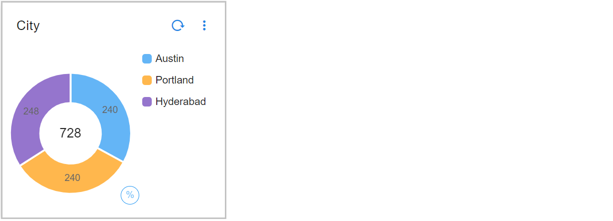
3.1.4 Pie Chart Showing Bottom N Values
Below is the sample configuration of Pie Chart Showing Bottom N Values
{
"widget_type": "pie_chart",
"title": "City",
"duration_hours": 1080,
"stream": "people_custom_timestamp",
"ts_column": "timestamp",
"extra_filter": null,
"column": "count_",
"agg": "sum",
"group_by": [
"city"
],
"bottom_n": 3,
"type": "int",
"min_width": 3,
"height": 3,
"max_width": 6
}
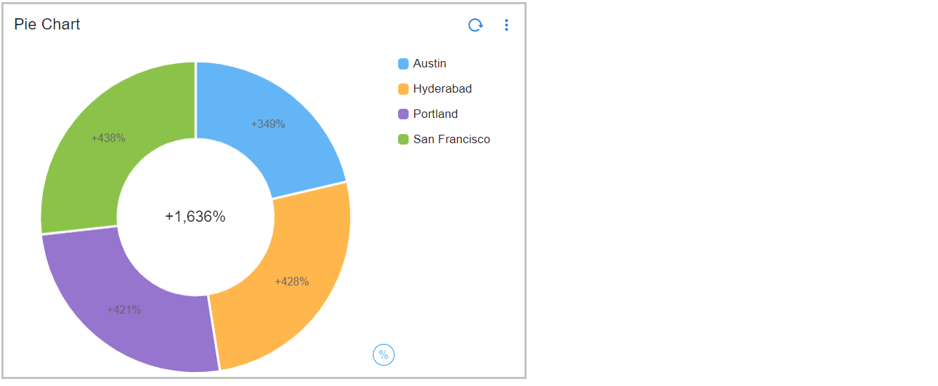
3.1.5 Pie Chart Using Formatting Options
Below is the sample configuration of Pie Chart Using Formatting Options
{
"widget_type": "pie_chart",
"title": "Pie Chart",
"duration_hours": 1080,
"stream": "main",
"ts_column": "timestamp",
"extra_filter": null,
"column": "count_",
"agg": "sum",
"group_by": [
"city"
],
"formatting": {
"style": "unit",
"unit": "percent",
"signDisplay": "always"
},
"type": "int",
"min_width": 3,
"height": 3,
"max_width": 6
}
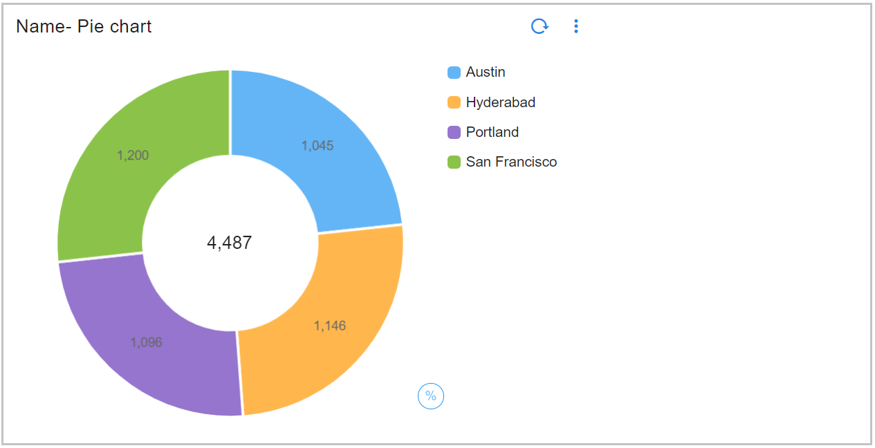
3.1.6 Pie Chart Using Others Spec
Below is the sample configuration of Pie Chart Using Others Spec
{
"widget_type": "pie_chart",
"title": "Name- Pie chart",
"duration_hours": 10800,
"stream": "main",
"ts_column": "timestamp",
"extra_filter": null,
"column": "count_",
"agg": "sum",
"group_by": [
"city"
],
"others_spec": {
"city": {
"name_based_limit": true
}
},
"type": "int",
"min_width": 6,
"height": 6,
"max_width": 6
}
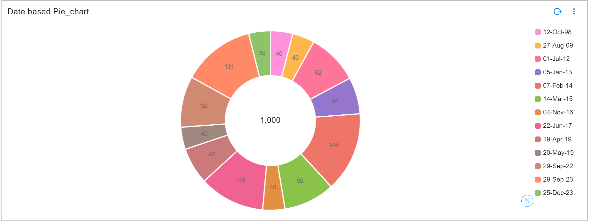
3.1.7 Pie Chart Using Sorting Type
Please refer the below configuration parameter table which are additionally used to configure a Pie Chart Using Sorting Type within the dashboard.
Note
semantic sort: is used to sort data by numeric, month, weekday, date, severity, priority
ordinal sort: is used for custom ordering that is specified by an ordered set in widget definition
lexical sort: is used to have control over case sensitivity in standard sort
Parameter Name |
Mandatory | Description |
|---|---|---|
groups_meta |
yes | This Parameter is used for sorting groups in reports. Possible values are type,ignore_case,order,format |
type |
yes | This Parameter is used to specify the sorting type, Expected Parameters are numeric, month, weekday , date , severity , priority, custom |
order |
no | is to specify a custom ordered set when the type is custom, Expected Order to Pass <str1>, <str2>, <str3>….<strn> |
format |
no | This Parameter is to specify the date format using the python date format rules, Expected format %d %b %Y,%d-%b-%Y |
ignore_case |
no | This Parameter specifies if the data values must be a case sensitive match to the Ordinal values, Expected Parameters are true or false |
Below is the sample configuration of Pie Chart Using Sorting Type / Widget.
{
"widget_type": "pie_chart",
"title": "Date based Pie_chart",
"duration_hours": 10800,
"stream": "trail",
"ts_column": "timestamp",
"extra_filter": null,
"column": "count_",
"agg": "value_count",
"group_by": [
"date"
],
"groups_meta": {
"type": "date",
"format": "%d-%b-%y"
},
"type": "int",
"limit": 15,
"min_width": 6,
"height": 5,
"max_width": 6
}
3.1.8 Pie Chart with No Filter Option
Below is the sample configuration of Pie Chart Using Sorting Type / Widget.
{
"widget_type": "pie_chart",
"title": "Pie Chart ",
"stream": "main",
"ts_column": "timestamp",
"description": "Pie Charts",
"segment_filter": false,
"column": "donation",
"agg": "sum",
"group_by": [
"city"
],
"min_width": 3,
"max_width": 4,
"type": "str"
}
Note
When user clicks on the segment and when the segment_filter is set to false user would not have the ability to filter
3.2 Tabular Report
Please refer the below configuration parameter table which are used to configure a Tabular report within the dashboard.
Parameter Name |
Mandatory | Description |
|---|---|---|
title |
yes | Specify the label for the Tabular report. |
widget_type |
yes | Specify the chart / widget type. i.e. tabular |
stream |
no | Specify the persistent stream. Note: Either of persistent stream or dataset parameter is needed. |
dataset |
no | Specify the dataset name. Note: Either of persistent stream or dataset parameter is needed. |
extra_filter |
no | Specify CFXQL based query to filter the data. * gets all of the data from the selected persistent stream or dataset. |
formatter |
no | Supported values are truncate & currency. |
resizableColumns |
no | Specify true or false to enable or disable to enable the flexibility of adjusting each column's width |
paginated |
no | Specify true or false to enable or disable paginated data for tabular report. |
virtual_scrolling |
no | Specify true or false to enable or disable this parameter. It allows to scroll through the paginated data instead of manually going through one page at a time. |
showRowSummary |
no | Specify true or false to enable or disable this parameter. It provides a clickable UI option for each row to view it's summary that includes all of the columns and their values in a vertical form. |
max_rows |
no | Specify the maximum number of rows to be shown within a page. |
sorting |
no | Specify the column / field names on which the sorting to enabled. Supported values for sorting is desc or asc. The default value is desc |
columns |
yes | Specify one or more columns / fields to be shown in the tabular report. Syntax is as shown above. columns: { "column_a_name": "column a label", "column_b_name": "column b label", ...} |
min_width |
no | Specify the chart / widget's minimum width size, range is 0 to 12. |
height |
no | Specify the chart / widget's height, range is 0 to n. |
max_width |
no | Specify the chart / widget's maximum width size, range is 0 to 12. |
ts_column |
yes | Specify the timestamp column name within the selected persistent stream. It is optional when dataset is used. |
widget_id |
no | Every widget will be represented with Unique id at the end, Its Autogenerated if not provided |
remote_searchable |
no | is set to true by default. If users want local search, they can set it to false. |
remote_searchable_cols |
no | is set, we will honor the fields in here for remote search. If it is not set, we will use up-to 10 TEXT visible columns defined in the table. |
remote_search_columns_count |
no | is set, to specify how many columns to pick for remote search. |
custom_columns |
no | Allows user to add the expression to the columns. |
columnGroupLabel |
no | Allows user to add Header to multiple columns. |
Pivot |
no | Pivot table is used to arrange, group and summarize for an easy analysis of large sets of data in a tabular form.Supported values are pivot_type, agg,group_by, columns, series. |
pivot_type |
no | Supported pivot types are standard, extended and advanced. By default its standard |
group_by |
yes | Specify column to apply |
agg |
yes | Specify the aggregation function. Supported values are value_count (shows total count), min, max, avg, sum, cardinality (shows unique count)first_record and last_record return the starting and final values of the column for the selected time range. |
column |
yes | Name of the column in the data to perform aggregations |
series |
no | if pivot_type is extended or advanced, this is mandatory |
label |
yes | if new column is created, then this will let user to add the label to that column |
agg_size |
No | Number of aggregated records to fetch ( default 1000 records) |
agg_sort_order |
No | Determines whether to display the top or bottom N aggregates. Use asc to show the bottom N values and desc to show the top N values. |
totals |
No | Displays total row and column counts in the table |
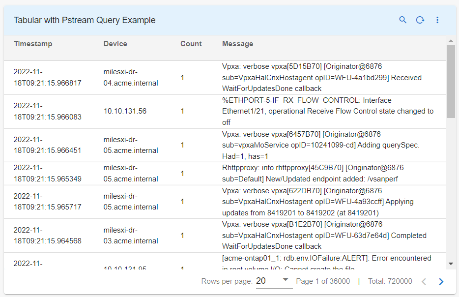
3.2.1 Sample Tabular Report
Below is the sample configuration of Tabular Report / Widget.
{
"title": "Tabular Report Example",
"widget_type": "tabular",
"stream": "dli-synthetic-logs-raw",
"extra_filter": "timestamp is after -720d",
"min_width": 6,
"height": 8,
"max_width": 6,
"paginated": true,
"remote_searchable": true,
"remote_searchable_cols": [
"device",
"message"
],
"max_rows": 50,
"sorting": [
{
"timestamp": "desc"
}
],
"columns": {
"timestamp": "Timestamp",
"device": "Device",
"count_": "Count",
"message": "Message"
},
"widget_id": "94a3fc11"
}
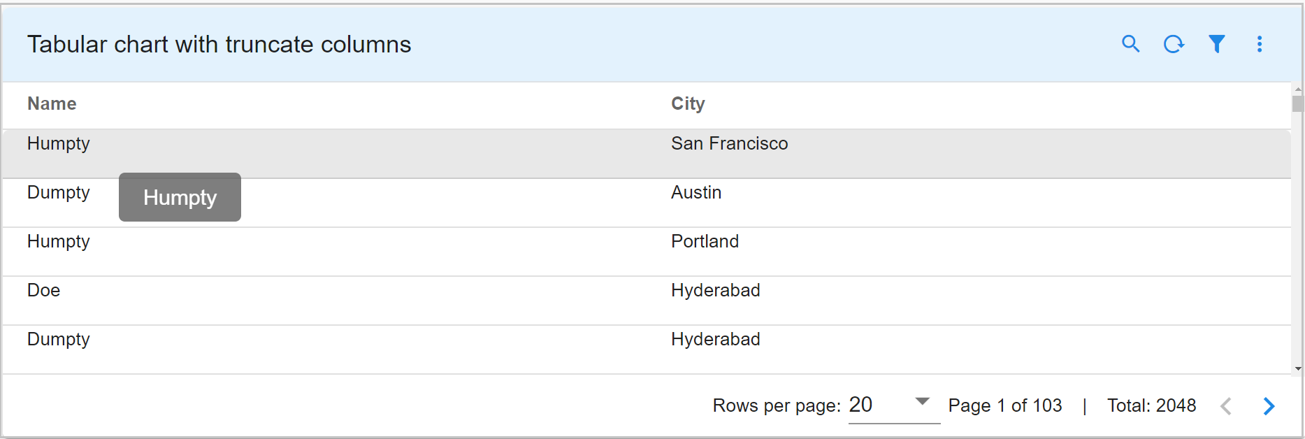
3.2.2 Tabular Report with truncate columns
Below is the sample configuration of Tabular Report / Widget with truncate columns parameter.
{
"title": "Tabular chart with truncate columns",
"widget_type": "tabular",
"stream": "main",
"columns": {
"name": {
"title": "Name",
"formatter": "truncate"
},
"city": {
"title": "City"
}
}
}
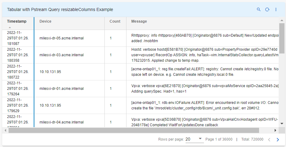
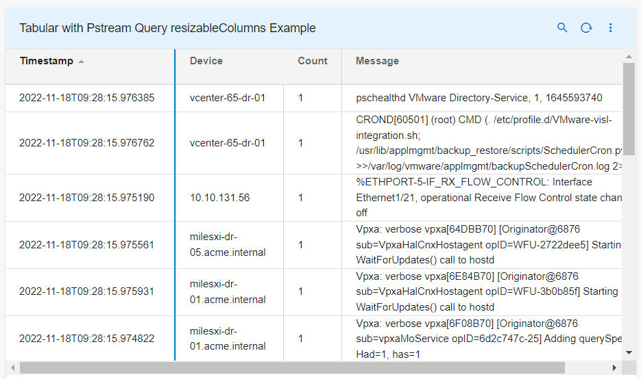
3.2.3 Tabular Report with resizableColumns
Below is the sample configuration of Tabular Report / Widget with resizableColumns parameter.
{
"title": "Tabular with resizableColumns Example",
"widget_type": "tabular",
"stream": "dli-synthetic-logs-raw",
"extra_filter": "timestamp is after -720d",
"min_width": 6,
"height": 8,
"max_width": 6,
"resizableColumns": true,
"paginated": true,
"max_rows": 50,
"sorting": [
{
"timestamp": "desc"
}
],
"columns": {
"timestamp": "Timestamp",
"device": "Device",
"count_": "Count",
"message": "Message"
},
"widget_id": "94a3fc11"
}
3.2.4 Tabular Report with virtual_scrolling & showRowSummary
Below is the sample configuration of Tabular Report / Widget with Virtual_scrolling & showRowSummary parameter.
{
"title": "virtual_scrolling and showRowSummary",
"widget_type": "tabular",
"stream": "rda_synthetic_metrics",
"ts_column": "timestamp",
"extra_filter": "timestamp is after -720d",
"min_width": 6,
"height": 8,
"max_width": 6,
"paginated": true,
"virtual_scrolling": true,
"showRowSummary": true,
"max_rows": 50,
"sorting": [
{
"timestamp": "desc"
}
],
"columns": {
"timestamp": "Timestamp",
"metric_name": "metric_name",
"count_": "Count",
"source_tool": "source_tool",
"stack_name": "stack_name"
},
"widget_id": "94a3fc11"
}
3.2.5 Tabular Report with Column Specific Hyperlink
Please refer the below configuration parameter table which are used to configure a Tabular Report with Column Specific Hyperlink within the dashboard.
Parameter Name |
Mandatory | Description |
|---|---|---|
appName |
yes | Specify the appName. Supported values are user-dashboard |
permission |
yes | Specify the permission in order to enable Hyperlink. Supported values are aia:page:view, oia:page:view |
drillDownContext |
yes | Context column-id that needs to be passed to the landing dashboard |
drillDownLinkField |
yes | Column-id that needs to be enabled with hyperlink |
identifier |
yes | Column-id that needs to be enabled with hyperlink |
selectionType |
yes | Specify the selectionType. Supported values are SINGLE |
stateName |
yes | Specify the stateName. Supported values are app.featureapp |
title |
yes | Specify the label for the action |
actionCondition |
no | Specifies the condition to be met for the action (hyperlink) to be either shown or hidden |
actionControl |
no | Specify the actionControl. Supported values are SHOW_IF HIDE_IF |
conditionValue |
no | Matches according to the value present in stream data |
fieldId |
no | Id of the column that specifies the condition value |
type |
yes | Specifies the action type. The supported types are GO_TO_APP_STATE. |
conditionType |
no | 1) EQUAL: Checks if fieldValue equals conditionValue 2) EQUAL_IGNORE_CASE: Checks if fieldValue equals conditionValue (ignoring case) 3) NOT_EQUAL: Checks if fieldValue does not equal conditionValue 4) GREATER_OR_EQUAL: Checks if fieldValue is greater than or equal to conditionValue.5) GREATER_THAN: Checks if fieldValue is greater than conditionValue. 6) LESS_OR_EQUAL: Checks if fieldValue is less than or equal to conditionValue.7) LESS_THAN: Checks if fieldValue is less than conditionValue. 8) IN: Checks if fieldValue is within the conditionValue array. 9) IS_NOT_NULL: Checks if fieldValue is not null 10) IS_NULL: Checks if fieldValue is null or undefined |
Below is the sample configuration of Tabular Report / Widget with Column specific Hyperlink.
"actions": [
{
"appName": "user-dashboard",
"permission": "aia:page:view",
"drillDownContext": "id",
"drillDownLinkField": "dns_name",
"identifier": "dns_name",
"selectionType": "SINGLE",
"stateName": "app.featureapp",
"title": "View Details",
"actionCondition": {
"actionControl": "SHOW_IF",
"conditionalField": [
{
"fieldId": "equipment_type",
"conditionType": "EQUAL",
"conditionValue": "CHASSIS"
}
]
},
"type": "GO_TO_APP_STATE"
}
]
{
"actionControl": "HIDE_IF",
"conditionalField": [
{
"conditionType": "EQUAL",
"conditionValue": "Completed",
"fieldId": "task_status"
},
{
"fieldId": "completion_date",
"conditionType": "IS_NOT_NULL"
}
]
}
{
"actionControl": "SHOW_IF",
"conditionalField": [
{
"conditionType": "IS_NOT_NULL",
"fieldId": "a_incident_id"
},
{
"fieldId": "a_cluster_score",
"conditionType": "GREATER_THAN",
"conditionValue": "4"
}
]
}
{
"actionControl": "SHOW_IF",
"conditionalField": [
{
"fieldId": "a_alert_category",
"conditionType": "NOT_EQUAL_IGNORE_CASE",
"conditionValue": "Device Performance"
}
]
}
{
"actionControl": "HIDE_IF",
"conditionalField": [
{
"conditionType": "IS_NULL",
"fieldId": "a_asset_name"
},
{
"fieldId": "a_alert_type",
"conditionType": "NOT_EQUAL",
"conditionValue": "Virtualization/Hypervisor"
}
]
}
{
"actionControl": "SHOW_IF",
"conditionalField": [
{
"fieldId": "a_severity",
"conditionType": "IN",
"conditionValue": [
"WARNING",
"CRITICAL",
"MAJOR"
]
}
]
}
Note
Mentioned below needs to be part of the columns list and the value needs to be replaced with the template/dashboard/app name
Ex: user-dashboard-<template/dashboard/app name>
"id": {
"title": "ID",
"value": "user-dashboard-aia-network-drilldown-app",
"key": true,
"type": "FIXED_VALUE",
"hidden": true,
"visible": false
}
Note
All the report definitions that are part of the above template/dashboard/app needs to be added with mentioned below parameters
Note
In order to pass column(s) as a context to template/dashboard/app, make sure the list of include_context_keys mentioned above are the key column(s)
3.2.6 Tabular Report with External URL Hyperlink
Below is the sample configuration of Tabular Report / Widget with External URL Hyperlink.
Note
Make sure the URL values are present as one of the column value in Pstream/Dataset as shown in Below Example
Below is how the column needs to be added in order to enable External URL on Specific column
"<column-id>": {
"title": "<label>",
"htmlTemplateForRow": "<a href=\"{{row.<column-id>}}\" target='_blank'>{{row.<column-id>}}</a>"
}
"drilldown_url": {
"title": "Drilldown_URL",
"htmlTemplateForRow": "<a href=\"{{row.drilldown_url}}\" target='_blank'>{{row.controller_name}}</a>"
}
Note
Same URL link can be launched by enabling hyperlink on different column, Below is the syntax for column Definition
"drilldown_url": {
"title": "Controller",
"htmlTemplateForRow": "<a href=\"{{row.drilldown_url}}\" target='_blank'>{{row.controller_name}}</a>"
}
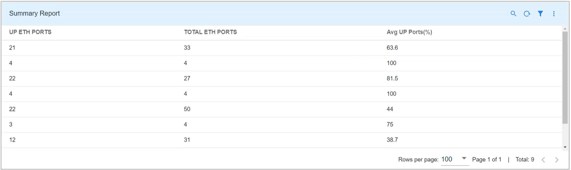
3.2.7 Tabular Report with Custom Columns
Please refer the below configuration parameter table which are additionally used to configure a Tabular Report Using Custom Columns within the dashboard.
Parameter Name |
Mandatory | Description |
|---|---|---|
id |
yes | It will be the column_id for the custom column, If you want to use that column any where else you can refer with that column id |
expr |
yes | The expression on any arithmetic operations on given columns will support the following syntax for example: expr: "((input-output)/input) * 100" |
label |
yes | This will specify the label for obtained column |
Below is the sample configuration of Tabular Report / Widget with custom_columns.
{
"widget_type": "tabular",
"title": "Summary Report",
"stream": "network-devices-inventory",
"ts_column": "collection_timestamp",
"sorting": [],
"extra_filter": "up_eth_ports is not None",
"columns": {
"up_eth_ports": "UP ETH PORTS",
"total_eth_ports": "TOTAL ETH PORTS"
},
"custom_columns": [
{
"id": "avg_up_ports",
"label": "Avg UP Ports(%)",
"expr": "((up_eth_ports / total_eth_ports) * 100) "
}
]
}
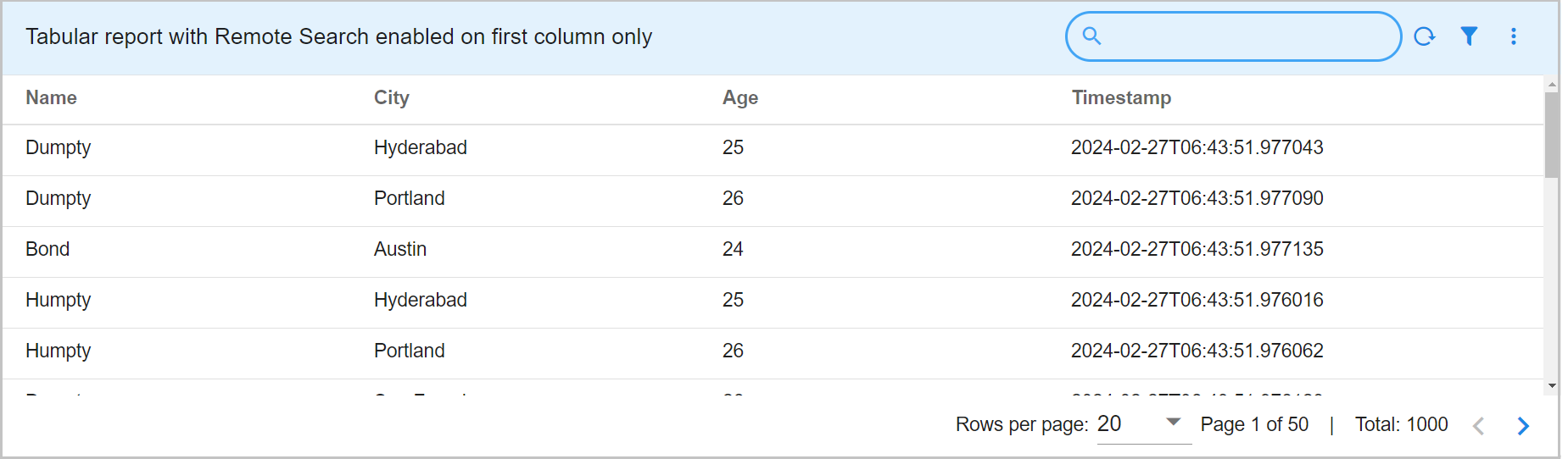
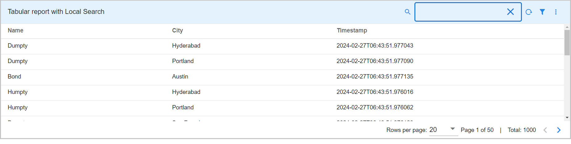
3.2.8 Tabular Report with Remote Search & Local Search
Below is the sample configuration of Tabular Report / Widget with remote search & local search.
{
"title": "Tabular report with Remote Search enabled on first column only",
"widget_type": "tabular",
"duration_hours": 10000,
"stream": "people_1k",
"min_width": 8,
"height": 5,
"paginated": true,
"max_rows": 50,
"defaultColumnWidth": 100,
"remote_search_columns_count": 1,
"remote_searchable_cols": [
"city"
],
"columns": {
"name": "Name",
"city": "City",
"age": "Age",
"timestamp": "Timestamp"
}
}
{
"title": "Tabular report with Local Search",
"widget_type": "tabular",
"stream": "main",
"min_width": 8,
"height": 5,
"paginated": true,
"max_rows": 50,
"defaultColumnWidth": 100,
"remote_searchable": false,
"columns": {
"name": "Name",
"city": {
"title": "City"
},
"timestamp": {
"title": "Timestamp"
}
}
}
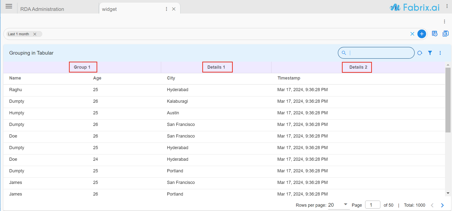
3.2.9 Tabular Report with Grouped Columns
Below is the sample configuration of Tabular Report / Widget with Grouped Columns.
{
"title": "Grouping in Tabular",
"widget_type": "tabular",
"stream": "main",
"columns": {
"name": {
"title": "Name",
"columnGroupLabel": "Group 1",
"defaultColumnWidth": 60,
"visible": true
},
"city": {
"title": "City",
"columnGroupLabel": "Details 1",
"defaultColumnWidth": 60,
"visible": true
},
"age": {
"title": "Age",
"columnGroupLabel": "Group 1",
"defaultColumnWidth": 20,
"visible": true
},
"timestamp": {
"title": "Timestamp",
"type": "DATETIME",
"columnGroupLabel": "Details 2",
"defaultColumnWidth": 300
}
}
}
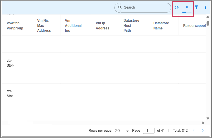
3.2.10 Tabular Report with Auto Refresh
Parameter Name |
Mandatory | Description |
|---|---|---|
refreshType |
yes | Enables automatic refresh at regular intervals Supported value - Periodic |
refreshInterval |
yes | (integer): The refresh interval in milliseconds. 60000 means the component refreshes every 60 seconds (1 minute). |
Below is a sample configuration for Tabular report with Auto Refresh Option.
{
"title": "Data",
"widget_type": "tabular",
"duration_hours": 1080,
"max_width": 12,
"height": 8,
"min_width": 12,
"stream": "topology_nodes",
"ts_column": "timestamp",
"extra_filter": null,
"refreshOptions": {
"refreshType": "Periodic",
"refreshInterval": 60000
},
"widget_id": "ce14998d"
}
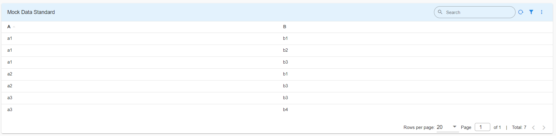
3.2.11 Pivot Tabular Report
Below is the sample configuration of Pivot Tabular Report.
{
"title": "Mock Data Standard",
"widget_type": "tabular",
"stream": "mock_data",
"min_width": 12,
"height": 6,
"max_width": 12,
"columns": {
"A": "A",
"B": "B"
},
"pivot": {
"pivot_type": "standard",
"group_by": [
"A",
"B"
],
"column": "count_",
"agg": "value_count"
}
}
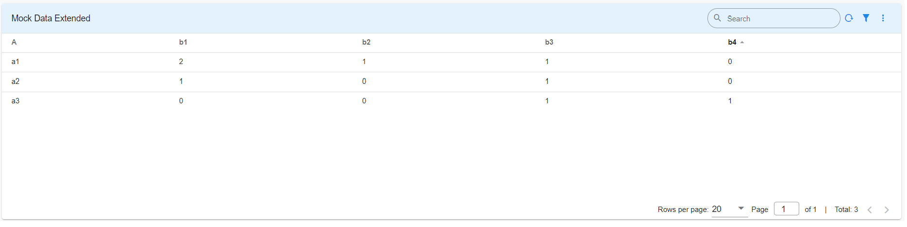
3.2.12 Extended Pivot Tabular Report
Below is the sample configuration of Extended Pivot Tabular Report.
{
"title": "Mock Data Extended",
"widget_type": "tabular",
"stream": "mock_data",
"min_width": 12,
"height": 6,
"max_width": 12,
"columns": {
"A": "A",
"B": "B"
},
"pivot": {
"pivot_type": "extended",
"group_by": [
"A",
"B"
],
"series": [
{
"column": "count_",
"agg": "value_count",
"type": "int",
"label": "Count"
}
]
}
}
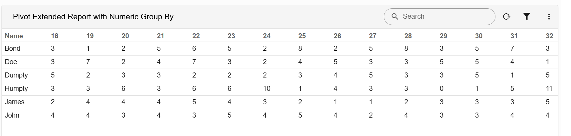
3.2.13 Pivot Extended Report with Numeric Group By Columns
Below is a sample configuration of an Extended Pivot Tabular Report using a numeric column in the group_by definition.
{
"name":"pivot_extended_numeric_groupby",
"label":"Pivot Extended Report with Numeric Group By",
"description":"Demonstrates an Extended Pivot Tabular Report using a numeric column in the group_by definition.",
"enabled":true,
"live_edit":true,
"stream":"main",
"dashboard_type":"dashboard",
"dashboard_sections":[
{
"title":"Employee Details",
"show_filter":true,
"widgets":[
{
"widget_type":"tabular",
"title":"Pivot Extended Report with Numeric Group By",
"stream":"main",
"duration_hours":24000,
"max_width":6,
"min_width":6,
"ts_column":"timestamp",
"extra_filter":"name is not empty",
"columns":{
"name":"Name"
},
"pivot":{
"pivot_type":"extended",
"pivot_col":{
"age":"Age",
"type":"numeric"
},
"group_by":[
"name",
"age"
],
"series":[
{
"column":"age",
"agg":"value_count",
"type":"int",
"label":"Age"
}
]
},
"widget_id":"30d901a1"
}
]
}
]
}
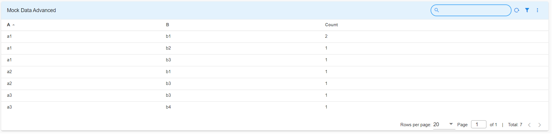
3.2.14 Advanced Pivot Tabular Report
Below is the sample configuration of Advanced Pivot Tabular Report.
{
"title": "Mock Data Advanced",
"widget_type": "tabular",
"stream": "mock_data",
"min_width": 12,
"height": 6,
"max_width": 12,
"columns": {
"A": "A",
"B": "B"
},
"pivot": {
"pivot_type": "advanced",
"group_by": [
"A",
"B"
],
"series": [
{
"column": "count_",
"agg": "value_count",
"type": "int",
"label": "Count"
}
]
}
}
3.2.15 Advanced Pivot Tabular Report with Sum of Rows and Sum of Columns
Below is a sample configuration of Advanced Pivot Tabular Report with Sum of Rows and Sum of Columns / Widget.
{
"title": "Network Equipment Sales",
"widget_type": "tabular",
"max_width": 12,
"height": 6,
"min_width": 12,
"stream": "pivot_test_sales",
"columns": {
"state": "State",
"city": "City"
},
"totals": {
"column_total": {
"label": "City Total Sales ($M)"
},
"row_total": {
"label": "Country Total Sales ($M)"
}
},
"pivot": {
"pivot_type": "advanced",
"group_by": [
"state",
"city"
],
"series": [
{
"column": "router_sales",
"label": "Router Sales ($M)",
"type": "int",
"agg": "sum"
},
{
"column": "switch_sales",
"label": "Switch Sales ($M)",
"type": "int",
"agg": "sum"
}
]
}
}
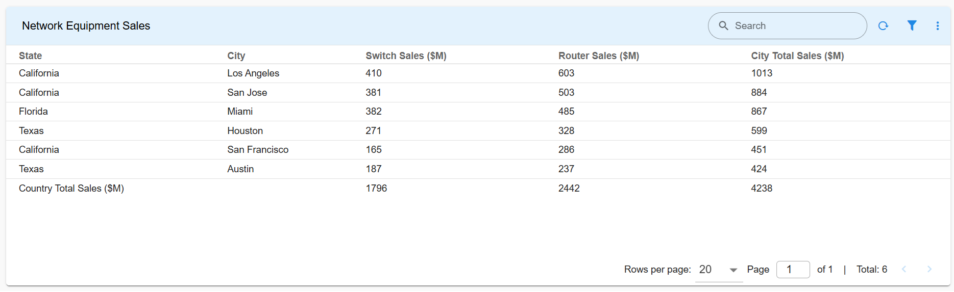
Note
Please click on the Hamburger Menu to hide the page layout and increase the width
3.2.16 Advanced Pivot Tabular Report with Top n and Bottom n Group Aggregates
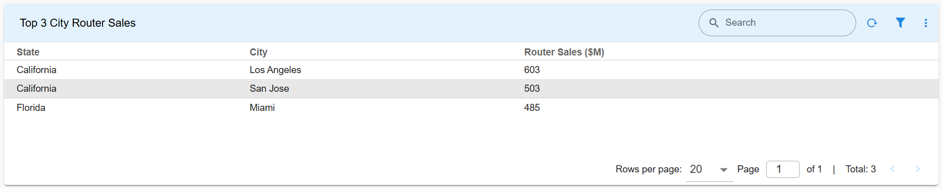
3.2.16.1 Advanced Pivot Tabular Report with Top 3 Aggregates and UI View
Below is a sample configuration of Advanced Pivot Tabular Report with Top 3 group aggregates, and the corresponding UI report.
{
"title": "Top 3 City Router Sales",
"widget_type": "tabular",
"max_width": 12,
"height": 4,
"min_width": 12,
"stream": "pivot_test_sales",
"columns": {
"state": {
"title": "State"
},
"city": {
"title": "City"
}
},
"agg_size": 3,
"pivot": {
"agg_sort_order": "desc",
"pivot_type": "advanced",
"group_by": [
"state",
"city"
],
"series": [
{
"column": "router_sales",
"label": "Router Sales ($M)",
"type": "int",
"agg": "sum"
}
]
}
}
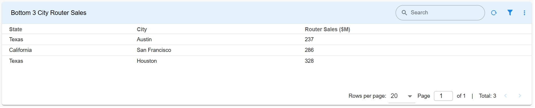
3.2.16.2 Advanced Pivot Tabular Report with Bottom 3 Aggregates and UI View
Below is a sample configuration of Advanced Pivot Tabular Report with Bottom 3 group aggregates, and the corresponding UI report.
{
"title": "Bottom 3 City Router Sales",
"widget_type": "tabular",
"max_width": 12,
"height": 4,
"min_width": 12,
"stream": "pivot_test_sales",
"columns": {
"state": {
"title": "State"
},
"city": {
"title": "City"
}
},
"agg_size": 3,
"pivot": {
"agg_sort_order": "asc",
"pivot_type": "advanced",
"group_by": [
"state",
"city"
],
"series": [
{
"column": "router_sales",
"label": "Router Sales ($M)",
"type": "int",
"agg": "sum"
}
]
}
}
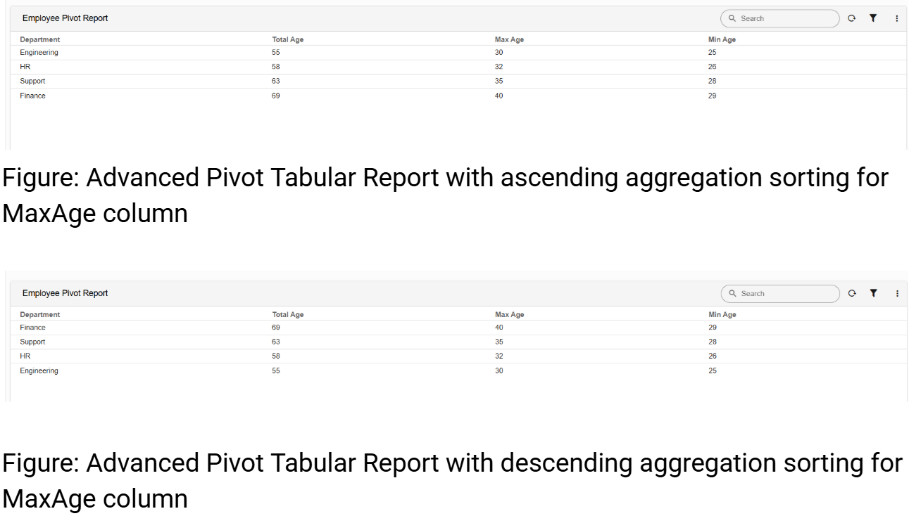
3.2.17 Tabular Report to Control Sorting
Advanced Pivot Tabular Reports support controlling the sorting order of aggregated values.
Supported values:
| Value | Description |
|---|---|
asc |
Ascending order |
desc |
Descending order |
Parameters:
| Parameter Name | Mandatory | Description |
|---|---|---|
agg_sort_order |
Yes | Controls the sorting order of pivot aggregation results. Supported values are asc and desc. |
sort_by |
Yes | Used inside a pivot series definition to specify which aggregation column should be used for sorting. Only one aggregation series should have sort_by: true. |
Below is a sample configuration of an Advanced Pivot Tabular Report using agg_sort_order to sort aggregated values in descending order based on the Max Age aggregation, and the corresponding UI report.
{
"name": "pivot_agg_sort_order_demo",
"label": "Pivot agg_sort_order Demo",
"description": "Sample dashboard demonstrating agg_sort_order usage",
"enabled": true,
"live_edit": true,
"stream": "employee_pivot_data",
"dashboard_type": "dashboard",
"dashboard_sections": [
{
"title": "Employee Age Aggregation",
"show_filter": true,
"widgets": [
{
"title": "Employee Pivot Report",
"widget_type": "tabular",
"max_width": 12,
"height": 10,
"min_width": 12,
"stream": "employee_pivot_data",
"ts_column": "timestamp",
"paginated": true,
"columns": {
"department": {
"title": "Department",
"type": "TEXT"
}
},
"pivot": {
"pivot_type": "advanced",
"agg_sort_order": "desc",
"group_by": [
"department"
],
"series": [
{
"column": "age",
"agg": "sum",
"type": "int",
"label": "Total Age"
},
{
"column": "age",
"agg": "max",
"type": "int",
"label": "Max Age",
"sort_by": true
},
{
"column": "age",
"agg": "min",
"type": "int",
"label": "Min Age"
}
]
},
"widget_id": "b039e934"
}
]
}
],
"saved_time": "2026-05-22T08:30:06.013133"
}
3.3 Counter Chart
Please refer the below configuration parameter table which are used to configure a simple Counter chart within the dashboard.
Parameter Name |
Mandatory | Description |
|---|---|---|
title |
yes | Specify the label for the Group Chart. |
widget_type |
yes | Specify the chart / widget type. i.e. counter,custom_counter,expression_counter |
formatter |
no | To format integer values as K (thousands) or M (millions), use the DescriptiveCountFormatter or the CountFormatter. Alternatively, you can use options like "notation": "compact" by specifying the style and unit for localized formatting—especially when the values are already in thousands, a multiplier can also be applied. |
stream |
no | Specify the persistent stream. Note: Either of persistent stream or dataset parameter is needed. |
ts_column |
yes | Specify the timestamp column name within the selected persistent stream. It is optional when dataset is used. |
duration_hours |
no | this parameter specifies how many hours in the past should the data be fetched. If time_filter is set to true, time filter will override this value. |
column |
yes | Name of the column in the data that contains numerical data to perform aggregations |
agg |
yes | Specify the aggregation function. Supported values are value_count (shows total count), min, max, avg, sum, cardinality (shows unique count)first_record and last_record return the starting and final values of the column for the selected time range. |
type |
yes | Specify the data type while performing aggregation function. Supported values are int or float option is valid only for min, max, sum, mean aggregation functions. |
expression |
yes | the expression on any arithmetic operations on given columns will support Example syntax: "expression": "((input-output)/input) * 100" needed only for expression_counter not needed for other counter types |
unit |
yes | Units to be displayed next to the value(Specific to Expression Counter) |
segments |
yes | Segments is a list of objects. Each segment defines a variable to be computed. needed only for expression_counter |
extra_filter |
no | Use this parameter to filter the data from from one or more selected field(s). It supports CFXQL query format. |
min_Width |
no | Specify the timestamp column name within the selected persistent stream or dataset. |
max_width |
no | Specify the chart / widget's maximum width size, range is 0 to 12. |
type |
yes | Specify the data type while performing aggregation function. Supported values are int or float option is valid only for min, max, sum, mean |
variable |
no | Name of the variable to be computed. Note This variable name may be used in expression. |
duration_hours |
no | This parameter specifies how many hours in the past should the data be fetched. If time_filter is set to true, time filter will override this value. |
group_by |
yes | Specify one or more columns to apply the group_by. This parameter supports multiple column values. Ex: "group_by": [ "column_01", "column_02", "column_n"] |
style |
no | Using this parameter, each grouped value can be visualized using a specific color using color-map parameter as shown in the above example. Note not needed in custom_counter and expression_counter |
limit |
no | Limiting of groups/segments |
sparkline |
no | Optional visualization configuration for the grouped counts with default interval as 1D, fill as True and smooth also as True |
widget_id |
no | Every widget will be represented with Unique id at the end, it is autogenerated if not provided |
total_counter |
no | When widget_type is set to counter this parameter enables showing an additional counter chart that sums up the values of counter charts and shows the total. |
notation |
No | Specifies the type of number notation: - standard: Default implied format - compact: Human-friendly using locale-specific symbols (e.g., 1K, 1M) - scientific: One significant digit (e.g., 1E6) - engineering: Three significant digits (e.g., 1.00E6) Note: By default, compact notation rounds to the nearest integer while maintaining 2 significant digits. You can override using minimum/maximumFractionDigits or minimum/maximumSignificantDigits. |
style |
No | Possible values: currency, unit |
unit |
No | Unit categories and values: - angle: degree - area: acre, hectare - concentration: percent - digital: bit, byte, kilobit, kilobyte, megabit, megabyte, gigabit, gigabyte, terabit, terabyte, petabyte - duration: millisecond, second, minute, hour, day, week, month, year - length: millimeter, centimeter, meter, kilometer, inch, foot, yard, mile, mile-scandinavian - mass: gram, kilogram, ounce, pound, stone - temperature: celsius, fahrenheit - volume: liter, milliliter, gallon, fluid-ounce - speed: meter-per-second (Specific for Formatter) |
currency |
No | Possible value: USD , INR , GBP |
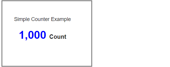
3.3.1 Simple Counter Chart Example
Below is a sample configuration of Counter Chart / Widget.
{
"title": "Simple Counter Example",
"widget_type": "custom_counter",
"formatter": "DescriptiveCountFormatter",
"stream": "main",
"ts_column": "timestamp",
"column": "city",
"style": {
"color-list": [
"#0000FF"
]
},
"agg": "value_count",
"type": "int"
}
3.3.2 Expression Counter Example
Below is a sample configuration of Counter Chart / Widget with expression_counter and expression.
{
"title": "Expression Counter Example",
"widget_type": "expression_counter",
"color": "#8e24aa",
"expression": "((input+output)) * 100",
"unit": "%",
"segments": [
{
"variable": "output",
"stream": "main",
"ts_column": "timestamp",
"group_by": [
"city"
],
"column": "count_",
"agg": "cardinality",
"type": "int"
},
{
"variable": "input",
"stream": "main",
"ts_column": "timestamp",
"group_by": [
"name"
],
"column": "count",
"agg": "value_count",
"type": "int"
}
]
}

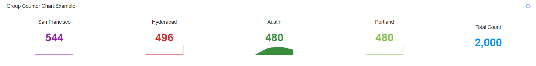
3.3.3 Group Counter Chart Example
Note
To show up the Total Counter, Use the following parameters:
show - Set it to true for total counter chart to show up.
label - Optional. Default: “Total”.
location - Where to show the total counter. Optional. Default: “left”.
color - Hex Color Code
Below is a sample configuration of Counter Chart / Widget grouping multiples of them.
{
"title": "Group Counter Chart Example",
"widget_type": "counter",
"min_width": 12,
"max_width": 12,
"stream": "main",
"ts_column": "timestamp",
"style": {
"color-map": {
"Austin": "#388e3c",
"San Francisco": "#8e24aa",
"Hyderabad": "#d32f2f",
"Portland": "#8BC34A"
}
},
"sparkline": {
"interval": "1d"
},
"group_by": [
"city"
],
"total_counter": {
"show": true,
"label": "Total Count",
"location": "right",
"color": "#0096FF"
},
"column": "count_",
"agg": "sum",
"type": "int"
}
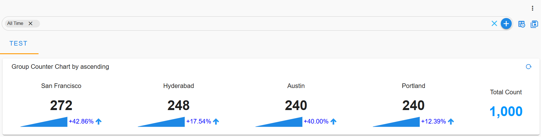
3.3.4 Counter Chart with Trend Feature
The Counter Chart now supports a Trend feature, allowing users to visualize trends in the displayed data. This feature provides insights by comparing selected data points and displaying the difference either as a percentage or a value.
Parameter Name |
Mandatory | Description |
|---|---|---|
data_points |
yes | Determines which data points to compare: first_last (compares the first and last points in the dataset) or last_two (compares the last two points). |
show_difference |
yes | Specifies how the difference is displayed: percentage (percentage change) or value (absolute difference).The difference is calculated based on show_difference. If set to value, the absolute difference is displayed. If set to percentage, the percentage change is computed. |
styles |
(optional) | Custom styles for trend visualization, including arrow visibility and color customization. |
showArrow |
(optional) | Determines whether an arrow indicating trend direction is shown. |
color |
(optional) | Defines colors for trend direction. Supports up (positive trend) and down (negative trend). |
Below is a sample configuration of Counter Chart / Widget with Trend feature.
{
"title": "Counter Chart enhancement",
"widget_type": "counter",
"min_width": 12,
"max_width": 12,
"max_height": 4,
"stream": "main",
"ts_column": "timestamp",
"limit": 8,
"sparkline": {
"interval": "1s",
"trend": {
"data_points": "first_last",
"show_difference": "value",
"styles": {
"showArrow": false,
"color": {
"up": "blue",
"down": "green"
}
}
}
},
"sorting": {
"ascending": true
},
"group_by": [
"city"
],
"column": "count_",
"agg": "sum",
"type": "int"
}
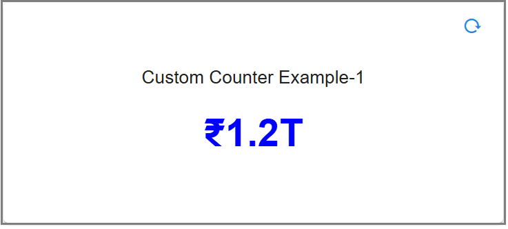
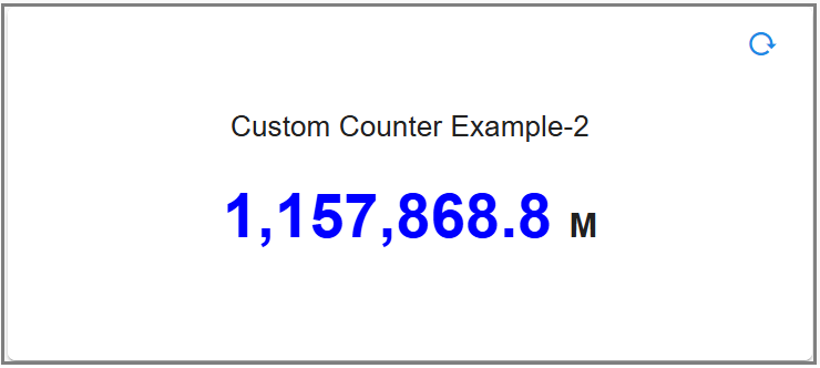
3.3.5 Counter Chart with Formatter Option
Below is a sample configuration of Counter Chart / Widget with Formatter Option.
{
"title": "Custom Counter Example-1",
"widget_type": "custom_counter",
"max_width": 12,
"min_width": 6,
"formatter": {
"notation": "compact",
"style": "currency",
"currency": "INR"
},
"stream": "main_new",
"ts_column": "timestamp",
"column": "donation",
"style": {
"color-list": [
"#0000FF"
]
},
"agg": "sum",
"type": "int"
}
{
"title": "Custom Counter Example-2",
"widget_type": "custom_counter",
"formatter": "CountFormatter",
"stream": "main_new",
"max_width": 12,
"min_width": 6,
"ts_column": "timestamp",
"column": "donation",
"style": {
"color-list": [
"#0000FF"
]
},
"agg": "sum",
"type": "int"
}
{
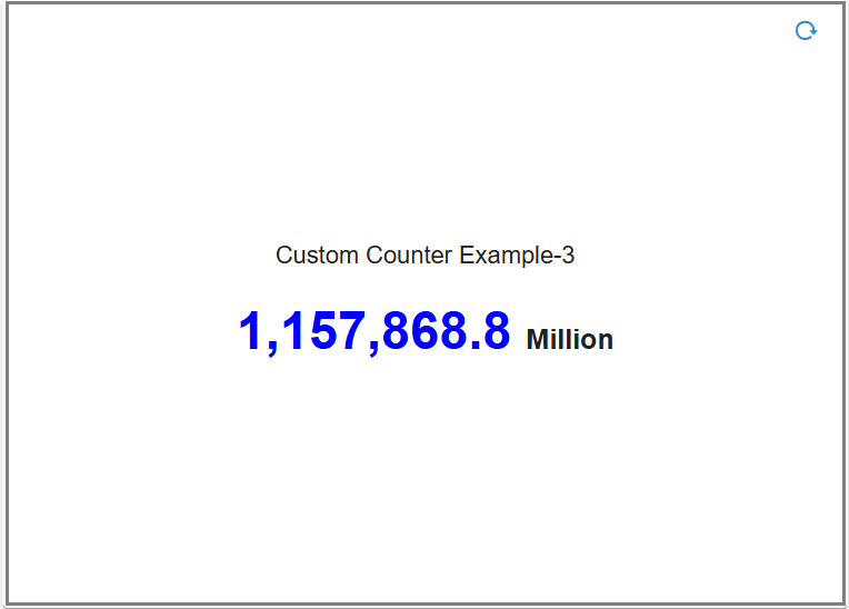
"title": "Custom Counter Example-3",
"widget_type": "custom_counter",
"formatter": "DescriptiveCountFormatter",
"stream": "main_new",
"max_width": 12,
"min_width": 6,
"ts_column": "timestamp",
"column": "donation",
"style": {
"color-list": [
"#0000FF"
]
},
"agg": "sum",
"type": "int"
}
3.4 Bar Chart
Please refer the below configuration parameter table which are used to configure a Bar chart within the dashboard.
Parameter Name |
Mandatory | Description |
|---|---|---|
title |
yes | Specify the label for the Bar Chart. |
widget_type |
yes | Specify the chart / widget type. i.e. bar_chart |
stream |
no | Specify the persistent stream. Note: Either of persistent stream or dataset parameter is needed. |
chartProperties |
chartProperties defines the representation of data using Yaxis, Xaxis & Various other Combinations like zooming,color etc... | |
dataset |
no | Specify the dataset name. Note: Either of persistent stream or dataset parameter is needed |
ts_column |
yes | Specify the timestamp column name within the selected persistent stream. It is optional when dataset is used. |
duration hours |
no | This parameter specifies how many hours in the past should the data be fetched. If time_filter is set to true, time filter will override this value. |
group by |
yes | Specify one or more columns to apply group_by. This parameter supports multiple column values. Ex: "group_by": [ "column_01", "column_02", "column_n"] |
extra_filter |
no | use this parameter to filter the data from from one or more selected field(s). It supports CFXQL query format. |
column |
yes | Name of the column in the data that contains numerical data to perform aggregations |
agg |
yes | Specify the aggregation function. Supported values are value_count (shows total count), min, max, avg, sum, cardinality (shows unique count)first_record and last_record return the starting and final values of the column for the selected time range. |
type |
no | Specify the data type while performing aggregation function. Supported values are int and str. int option is valid only for min, max, sum, mean aggregation functions. |
widget_id |
no | Every widget will be represented with Unique id at the end, Its Autogenerated if not provided |
formatting |
no | To format number with localized units, Use the style & unit option |
notation |
no | We can specify as standard, compact, scientific and engineering Standard Notation: is the implied default, Compact Notation: uses locale-specific symbols to represent large numbers. It is a more human-friendly alternative to scientific notation, Scientific Notation: will only have one significant digit, Engineering Notation: will have three significant digits Note: By default, Compact Notation rounds to the nearest integer, but always keeps 2 significant digits. You can set any of minimum, maximumFractionDigits or minimum, maximum SignificantDigits to override that behavior |
style |
no | The possible values for style are currency & unit |
unit |
no | The unit can have following values angle: degree, area: acre , hectare concentration: percent digital: bit, byte, kilobit, kilobyte, megabit, megabyte, gigabit, gigabyte, terabit, terabyte, petabyte duration: millisecond, second, minute, hour, day, week, month, year length: millimeter, centimeter, meter, kilometer, inch, foot, yard, mile, mile-scandinavian mass: gram, kilogram, ounce, pound, stone temperature: celsius, fahrenheit volume: liter, milliliter, gallon, fluid-ounce speed: meter-per-second |
currency |
no | The Possible value for currency is USD |
SignDisplay |
no | It helps to explicitly display the sign, even when the number is positive. The possible values are always To prevent showing the sign when the value is 0, use signDisplay: exceptZero |
currencySign |
no | when the currencySign is set to accounting it enables a locale-specific format for negative currency amounts. example, wrapping the amount in parentheses |
top_n |
no | Filters top x values to show ex. When top_n:2 then the top 2 values are shown in the chart |
bottom_n |
no | Filters bottom x values to show ex. When bottom_n:2 then the bottom 2 values are shown in the chart |
others_spec |
no | This Parameter will help in sorting, limiting & labeling the others column |
name_based_limit |
no | This Parameter is used to sort the report by name in ascending order |
limit |
no | This Parameter is used to limit the visible reports |
label |
no | This Parameter is used to rename the others column. By default we have others |
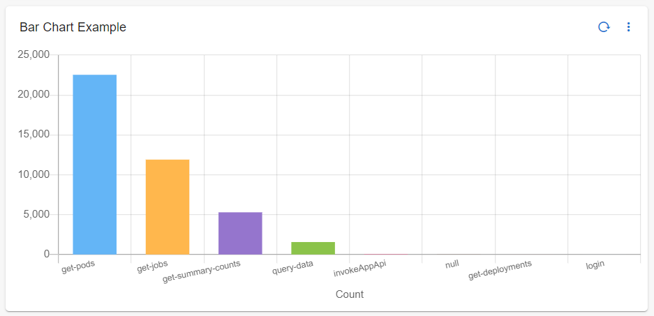
3.4.1 Bar Chart Example
Below is a sample of Bar Chart / Widget configuration.
{
"title": "Bar Chart Example",
"widget_type": "bar_chart",
"stream": "rda_microservice_traces",
"ts_column": "timestamp",
"chartProperties": {
"yAxisLabel": null,
"xAxisLabel": "Count",
"stacked": true,
"legendLocation": "none",
"orientation": "vertical"
},
"duration_hours": 24,
"group_by": [
"request_type"
],
"column": "duration",
"agg": "value_count",
"type": "int",
"widget_id": "f4786acb"
}
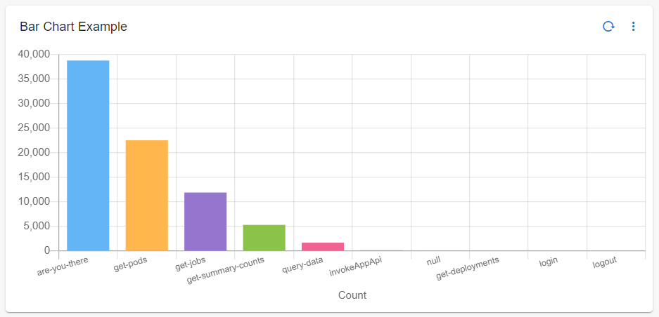
3.4.2 Bar Chart with extra filter
Below is a sample of Bar Chart / Widget configuration with extra_filter
{
"title": "Bar Chart Example",
"widget_type": "bar_chart",
"stream": "rda_microservice_traces",
"extra_filter": "request_type != 'are-you-there'",
"ts_column": "timestamp",
"chartProperties": {
"yAxisLabel": null,
"xAxisLabel": "Count",
"stacked": true,
"legendLocation": "none",
"orientation": "vertical"
},
"duration_hours": 24,
"group_by": [
"request_type"
],
"column": "duration",
"agg": "value_count",
"type": "int",
"widget_id": "f4786acb"
}
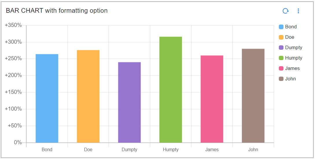
3.4.3 Bar Chart with Formatting Option
Below is a sample configurations of Bar Chart with Formatting Options / Widget.
{
"widget_type": "bar_chart",
"title": "BAR CHART with formatting option",
"stream": "main",
"chartProperties": {
"orientation": "vertical"
},
"formatting": {
"style": "unit",
"unit": "percent",
"signDisplay": "exceptZero"
},
"ts_column": "timestamp",
"column": "count_",
"agg": "value_count",
"group_by": [
"name"
],
"type": "str"
}
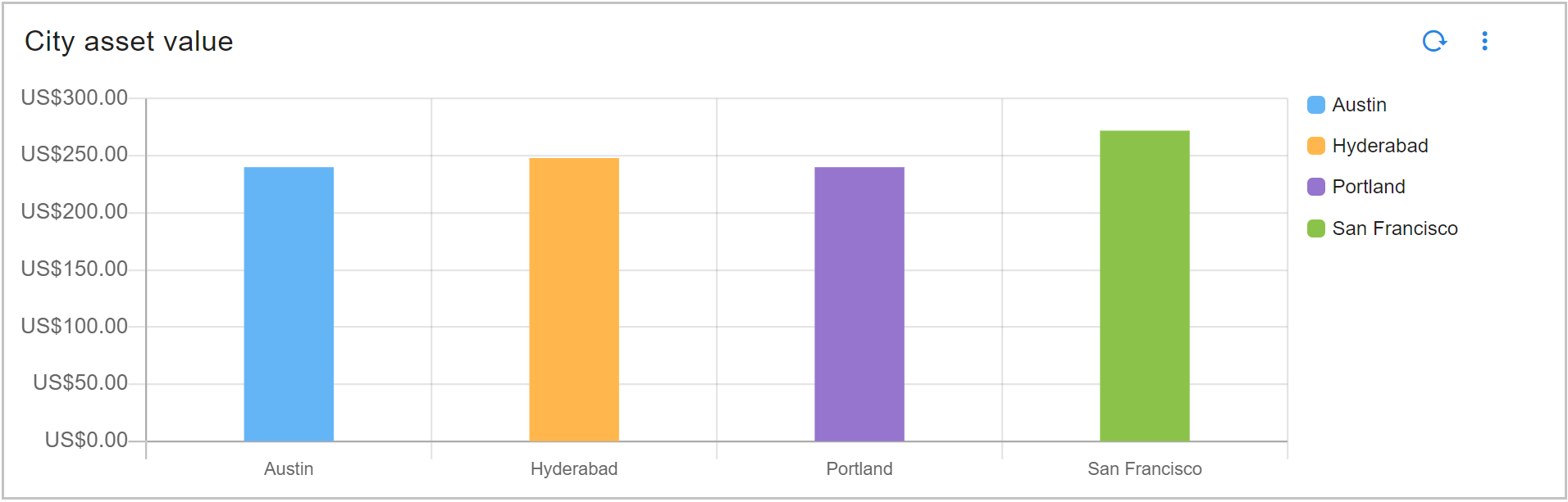
{
"widget_type": "bar_chart",
"title": "City asset value",
"stream": "people_custom_timestamp",
"chartProperties": {
"barThickness": 10,
"orientation": "vertical"
},
"formatting": {
"style": "currency",
"currency": "USD"
},
"ts_column": "timestamp",
"column": "count_",
"agg": "value_count",
"group_by": [
"city"
],
"type": "str"
}
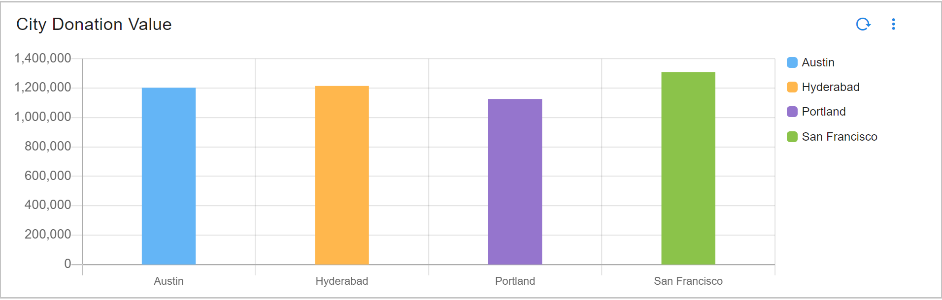
{
"widget_type": "bar_chart",
"title": "City Donation Value",
"stream": "donationn",
"chartProperties": {
"orientation": "vertical"
},
"formatting": {
"notation": "standard"
},
"ts_column": "timestamp",
"column": "donation",
"agg": "sum",
"group_by": [
"city"
],
"type": "int"
}
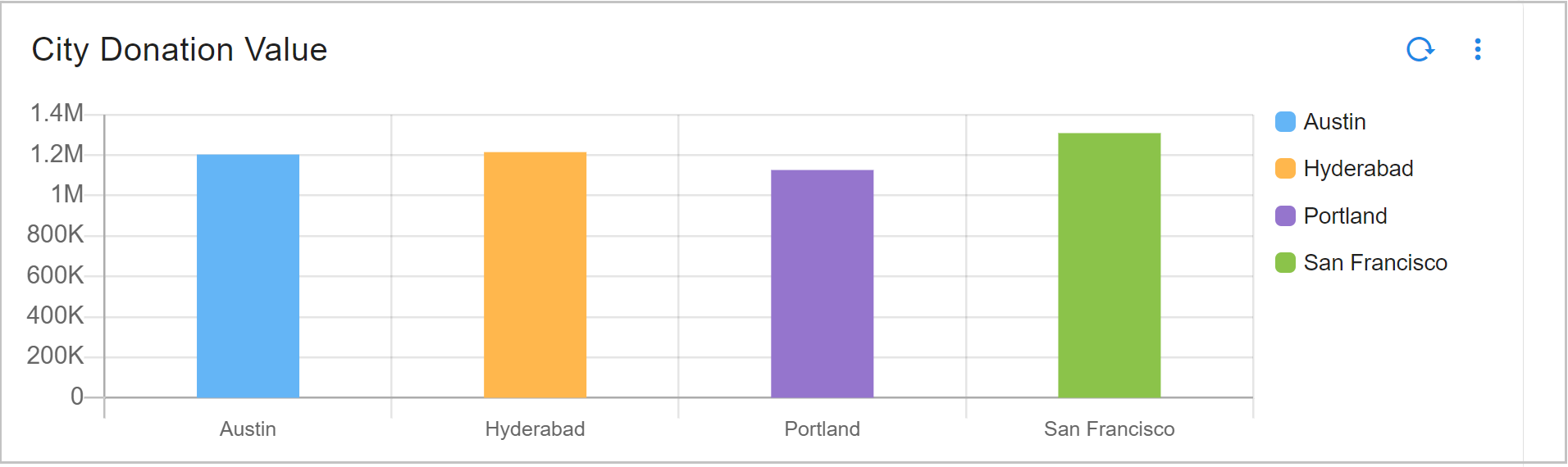
{
"widget_type": "bar_chart",
"title": "City Donation Value",
"stream": "donationn",
"chartProperties": {
"orientation": "vertical"
},
"formatting": {
"notation": "compact"
},
"ts_column": "timestamp",
"column": "donation",
"agg": "sum",
"group_by": [
"city"
],
"type": "int"
}
3.4.4 Bar Chart Showing Top N Values
Below is a sample configuration of Bar Chart Showing Top N Values / Widget.
{
"widget_type": "bar_chart",
"title": "City Donation Value",
"stream": "donationn",
"chartProperties": {
"orientation": "vertical"
},
"formatting": {
"notation": "compact"
},
"ts_column": "timestamp",
"top_n": 3,
"column": "donation",
"agg": "sum",
"group_by": [
"city"
],
"type": "str"
}
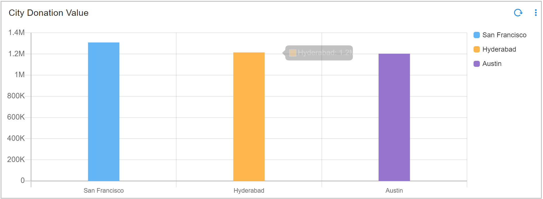
3.4.5 Bar Chart With Others Spec
Below is a sample configuration of Bar Chart With Others Spec / Widget.
{
"widget_type": "bar_chart",
"title": "Name based sort in Bar",
"duration_hours": 1080,
"stream": "main",
"ts_column": "timestamp",
"extra_filter": null,
"column": "count_",
"agg": "sum",
"group_by": [
"city"
],
"others_spec": {
"label": "other state",
"Country": {
"name_based_limit": true
}
},
"type": "int",
"min_width": 6,
"height": 6,
"max_width": 6
}
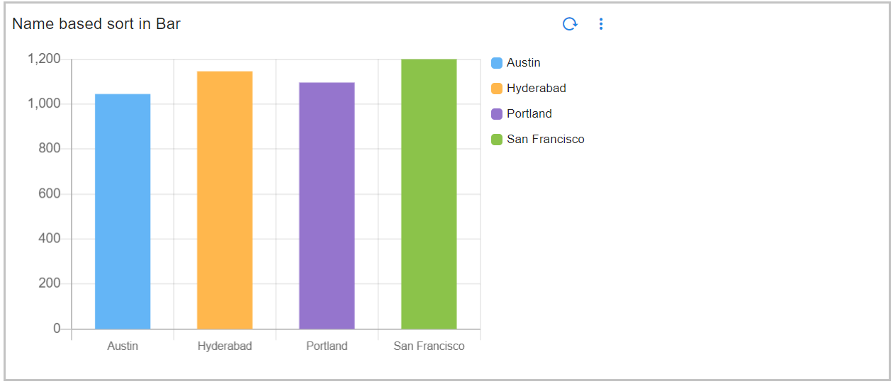
3.4.6 Bar Chart Using Sorting Type
Please refer the below configuration parameter table which are additionally used to configure a Bar Chart Using Sorting Type within the dashboard.
Note
semantic sort: is used to sort data by are numeric, month, weekday, date, severity, priority
ordinal sort: is used for custom ordering that is specified by an ordered set in widget definition
lexical sort: is used to have control over case sensitivity in standard sort
Parameter Name |
Mandatory | Description |
|---|---|---|
groups_meta |
yes | This Parameter is used for sorting groups in reports. Possible values are type,ignore_case,order,format |
type |
yes | This Parameter is used to specify the sorting type, Expected Parameters are numeric, month, weekday , date , severity , priority, custom |
order |
no | This Parameter is to specify a custom ordered set when the type is custom, Expected Order to Pass <str1>, <str2>, <str3>….<strn> |
format |
no | This Parameter is to specify the date format using the python date format rules, Expected format %d %b %Y,%d-%b-%Y |
ignore_case |
no | This Parameter specifies if the data values must be a case sensitive match to the Ordinal values, Expected Parameters are trueor false |
Below is the sample configuration of Bar Chart Using Sorting Type / Widget.
{
"widget_type": "bar_chart",
"title": "Month based Bar",
"duration_hours": 10800,
"stream": "trail",
"ts_column": "timestamp",
"extra_filter": null,
"column": "count_",
"agg": "value_count",
"group_by": [
"Months"
],
"groups_meta": {
"type": "month"
},
"type": "int",
"limit": 15,
"min_width": 6,
"height": 5,
"max_width": 6
}
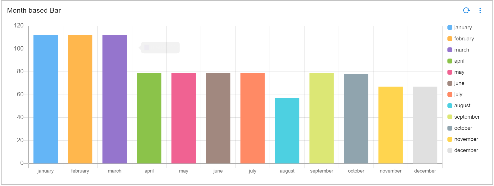
3.4.7 Fixed Bar Width Chart
Please refer the below configuration parameter table which are used to configure a Fixed Bar Width Chart within the dashboard.
Parameter Name |
Mandatory | Description |
|---|---|---|
title |
yes | Specify the label for the FIXED_BAR_WIDTH_CHART. |
widget_type |
yes | Specify the chart / widget type. i.e. fixed_bar_width_chart |
stream |
no | Specify the persistent stream. Note: Either of persistent stream or dataset parameter is needed. |
chartProperties |
yes | chartProperties defines the representation of data using Yaxis, Xaxis & Various other Combinations like barThickness, zooming, color etc... |
dataset |
no | Specify the dataset name. Note: Either of persistent stream or dataset parameter is needed |
ts_column |
yes | Specify the timestamp column name within the selected persistent stream. It is optional when dataset is used. |
duration hours |
no | This parameter specifies how many hours in the past should the data be fetched. If time_filter is set to true, time filter will override this value. |
group by |
yes | Specify one or more columns to apply group_by. This parameter supports multiple column values. Ex: "group_by": [ "column_01", "column_02", "column_n"] |
extra_filter |
no | use this parameter to filter the data from from one or more selected field(s). It supports CFXQL query format. |
column |
yes | Name of the column in the data that contains numerical data to perform aggregations |
agg |
yes | Specify the aggregation function. Supported values are value_count (shows total count), min, max, avg, sum, cardinality (shows unique count)first_record and last_record return the starting and final values of the column for the selected time range. |
type |
no | Specify the data type while performing aggregation function. Supported values are int and str. int option is valid only for min, max, sum, mean aggregation functions. |
widget_id |
no | Every widget will be represented with Unique id at the end, Its Autogenerated if not provided |
Below is a sample configuration of Fixed Bar Width Chart / Widget.
{
"title": "FIXED_BAR_WIDTH_CHART",
"widget_type": "fixed_bar_width_chart",
"stream": "people_custom_timestamp",
"chartProperties": {
"barThickness": 100
},
"ts_column": "timestamp",
"column": "age",
"agg": "value_count",
"group_by": [
"city"
]
}
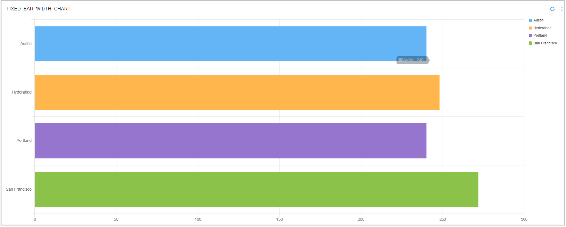
3.4.8 Bar Chart with Hidden Data Labels on the X/Y Axis
Added a separate control that enables users to hide or display data labels on the X-axis and/or Y-axis without affecting the unit conversion functionality.
Below is a sample configuration to hide widget data labels on X/Y Axis.
{
"title": "Hide label without impacting unit conversion",
"widget_type": "bar_chart",
"stream": "main",
"ts_column": "timestamp",
"duration_hours": 1080,
"chartProperties": {
"yAxisLabel": "Donation",
"xAxisLabel": "Name",
"stacked": true,
"legendLocation": "bottom",
"orientation": "vertical",
"options": {
"scales": {
"yAxes": [
{
"ticks": {
"display": false
}
}
]
}
}
},
"converting": {
"unit": "pound",
"addn": "/s",
"axis": "y"
},
"group_by": [
"name"
],
"column": "count_",
"agg": "value_count",
"widget_id": "xiivtzof"
}
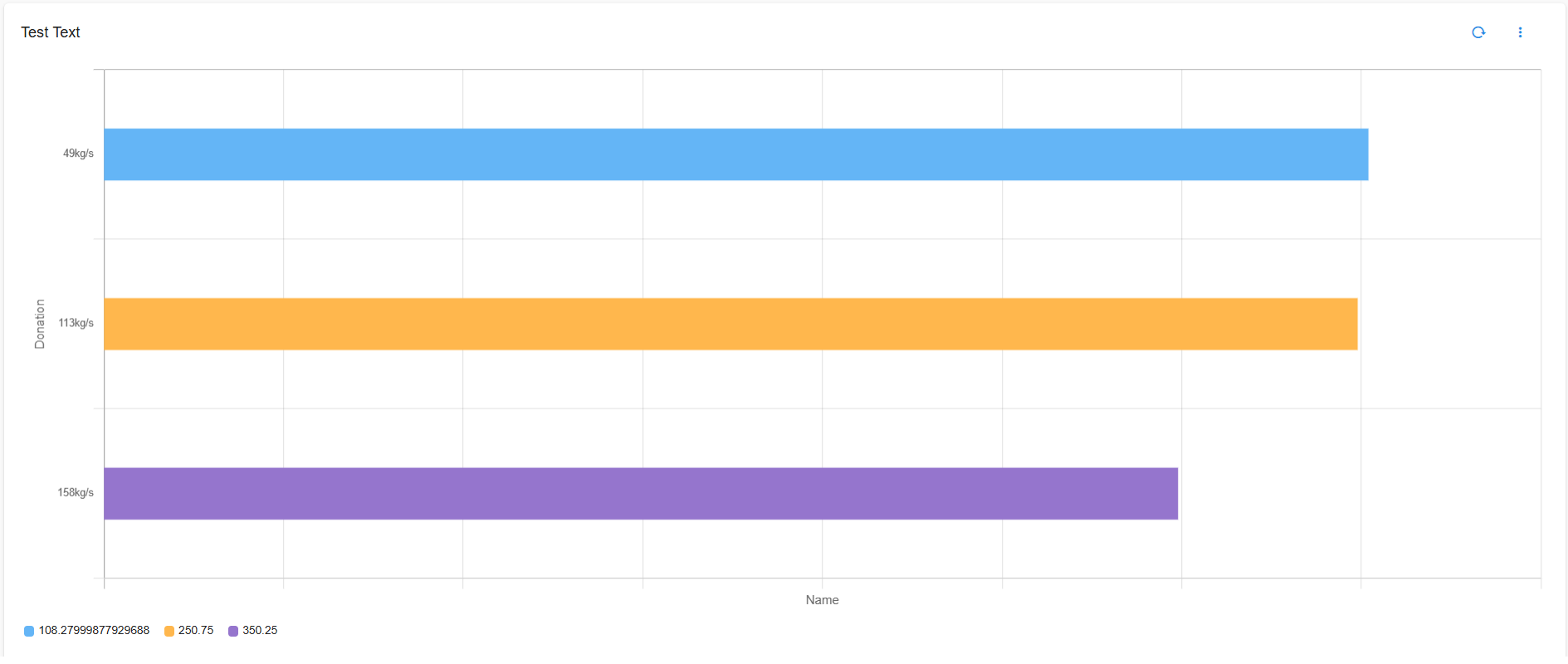
3.4.9 Bar Chart with Custom Colors for Data Labels
Added a configuration option that lets users manually specify custom text colors (e.g., black, white, grey, or any HEX/RGB value) for data labels.
Below is a sample configuration of custom text color for Data Labels.
{
"title": "Add text color for data labels",
"widget_type": "bar_chart",
"stream": "main",
"ts_column": "timestamp",
"duration_hours": 1080,
"chartProperties": {
"xAxisLabel": "Name",
"yAxisLabel": "Donation",
"stacked": true,
"orientation": "vertical",
"enablePercentage": true,
"options": {
"scales": {
"yAxes": [
{
"ticks": {
"display": true,
"fontColor": "#ff0000"
}
}
]
}
}
},
"group_by": [
"name"
],
"column": "count_",
"agg": "value_count",
"widget_id": "xiivtzof"
}
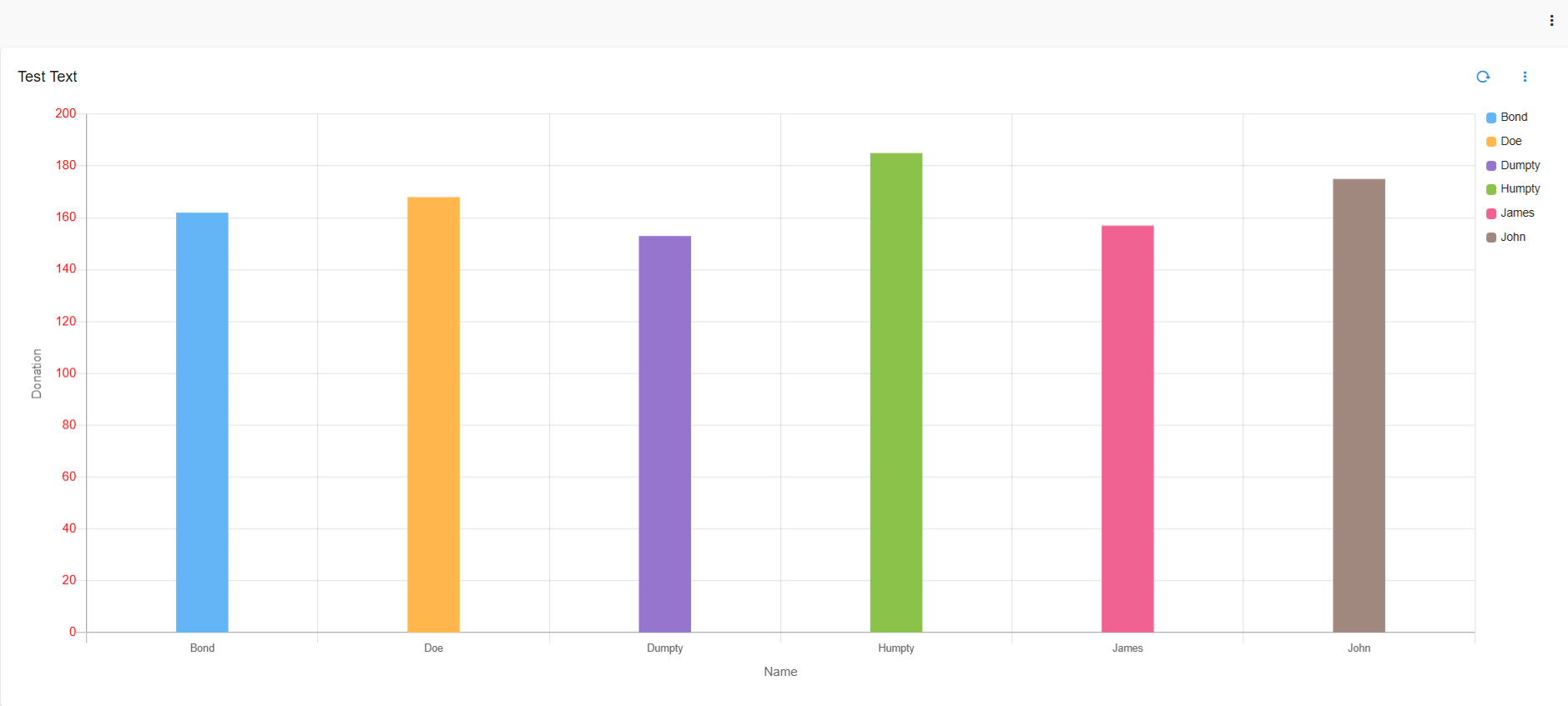
3.5 Multi Bar Chart
Please refer the below configuration parameter table which are used to configure a Multi Bar chart within the dashboard.
Parameter Name |
Mandatory | Description |
|---|---|---|
title |
yes | Specify the label for the Multi Bar Chart. |
widget_type |
yes | Specify the chart / widget type. i.e. multi_bar_chart |
stream |
no | Specify the persistent stream. Note: Either of persistent stream or dataset parameter is needed. |
extra_filter |
no | use this parameter to filter the data from from one or more selected field(s). It supports CFXQL query format. |
ts_column |
yes | Specify the timestamp column name within the selected persistent stream. It is optional when dataset is used. |
chartProperties |
chartProperties defines the representation of data using Yaxis, Xaxis & Various other Combinations like zooming,color etc... | |
duration hours |
no | This parameter specifies how many hours in the past should the data be fetched. If time_filter is set to true, time filter will override this value. |
group_by |
yes | Specify one or more columns to apply the group_by. This parameter supports multiple column values. Ex: "group_by": [ "column_01", "column_02", "column_n"] |
Column |
yes | Name of the column in the data that contains numerical data to perform aggregations |
agg |
yes | Specify the aggregation function. Supported values are value_count (shows total count), min, max, avg, sum, cardinality (shows unique count)first_record and last_record return the starting and final values of the column for the selected time range. |
type |
yes | Specify the data type while performing aggregation function. Supported values are int and str. int option is valid only for min, max, sum, mean aggregation functions. |
widget_id |
no | Every widget will be represented with Unique id at the end, Its Autogenerated if not provided |
limit |
no | Limiting of groups/segments |
formatting |
no | To format number with localized units, Use the style & unit option |
notation |
no | We can specify as standard, compact, scientific and engineering Standard Notation: is the implied default, Compact Notation: uses locale-specific symbols to represent large numbers. It is a more human-friendly alternative to scientific notation, Scientific Notation: will only have one significant digit, Engineering Notation: will have three significant digits Note: By default, Compact Notation rounds to the nearest integer, but always keeps 2 significant digits. You can set any of minimum, maximumFractionDigits or minimum, maximum SignificantDigits to override that behavior |
style |
no | The possible values for style are currency & unit |
unit |
no | The unit can have following values angle: degree, area: acre , hectare concentration: percent digital: bit, byte, kilobit, kilobyte, megabit, megabyte, gigabit, gigabyte, terabit, terabyte, petabyte duration: millisecond, second, minute, hour, day, week, month, year length: millimeter, centimeter, meter, kilometer, inch, foot, yard, mile, mile-scandinavian mass: gram, kilogram, ounce, pound, stone temperature: celsius, fahrenheit volume: liter, milliliter, gallon, fluid-ounce speed: meter-per-second |
currency |
no | The Possible value for currency is USD |
SignDisplay |
no | It helps to explicitly display the sign, even when the number is positive. The possible values are always To prevent showing the sign when the value is 0, use signDisplay: exceptZero |
currencySign |
no | when the currencySign is set to accounting it enables a locale-specific format for negative currency amounts. example, wrapping the amount in parentheses |
others_spec |
no | This Parameter will help in sorting, limiting & labeling the others column |
largest |
no | This Parameter is used to sort the report by largest value in asc order |
descending_order |
no | This Parameter is used to sort the report by largest value in descending order |
name_based_limit |
no | This Parameter is used to sort the report by name in ascending order |
limit |
no | This Parameter is used to limit the visible reports |
label |
no | This Parameter is used to rename the others column. By default we have others |
3.5.1 Multi Bar Chart Example
Below is a sample configuration of Multi Bar Chart / Widget .
{
"title": "Multi Bar Chart Example",
"widget_type": "multi_bar_chart",
"stream": "rda_microservice_traces",
"extra_filter": "request_type != 'are-you-there'",
"ts_column": "timestamp",
"chartProperties": {
"yAxisLabel": "Duration",
"xAxisLabel": "Services",
"stacked": true,
"legendLocation": "right",
"orientation": "vertical"
},
"duration_hours": 24,
"group_by": [
"request_type",
"destination"
],
"column": "duration",
"agg": "value_count",
"type": "int",
"widget_id": "172919af"
}
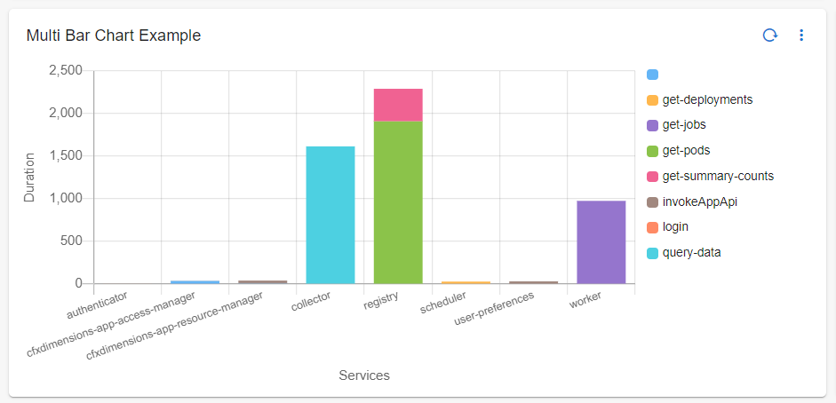
3.5.2 Multi Bar Chart with extra filter
Below is a sample configuration of Multi Bar Chart / Widget with extra_filter
{
"title": "Multi Bar Chart Example",
"widget_type": "multi_bar_chart",
"stream": "rda_microservice_traces",
"extra_filter": "source in ['scheduler', 'alert-ingester']",
"ts_column": "timestamp",
"chartProperties": {
"yAxisLabel": "Duration",
"xAxisLabel": "Services",
"stacked": true,
"legendLocation": "right",
"orientation": "vertical"
},
"duration_hours": 24,
"group_by": [
"request_type",
"destination"
],
"column": "duration",
"agg": "value_count",
"type": "int",
"widget_id": "172919af"
}
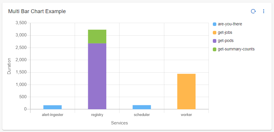
3.5.3 Multi Bar Chart Without Filters
{
"title": "Multi Bar Chart Example",
"widget_type": "multi_bar_chart",
"stream": "rda_microservice_traces",
"ts_column": "timestamp",
"chartProperties": {
"yAxisLabel": "Duration",
"xAxisLabel": "Services",
"stacked": true,
"legendLocation": "right",
"orientation": "vertical"
},
"duration_hours": 24,
"group_by": [
"request_type",
"destination"
],
"column": "duration",
"agg": "value_count",
"type": "int",
"widget_id": "172919af"
}
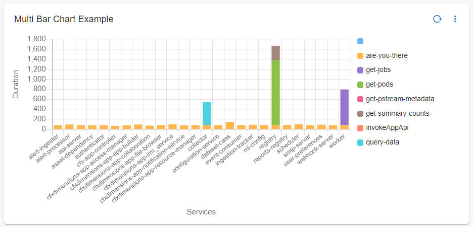
3.5.4 Multi Bar Chart With Formatting Options
Below is a sample configuration of Multi Bar Chart With Formatting Options.
{
"title": "Multi Bar Chart Format",
"widget_type": "multi_bar_chart",
"stream": "main",
"ts_column": "timestamp",
"group_by": [
"city",
"name"
],
"formatting": {
"notation": "compact",
"style": "unit",
"unit": "percent",
"signDisplay": "always"
},
"chartProperties": {
"yAxisLabel": null,
"xAxisLabel": "name",
"stacked": false,
"legendLocation": "right",
"orientation": "vertical",
"barThickness": 100
},
"column": "donation",
"agg": "sum",
"type": "str"
}
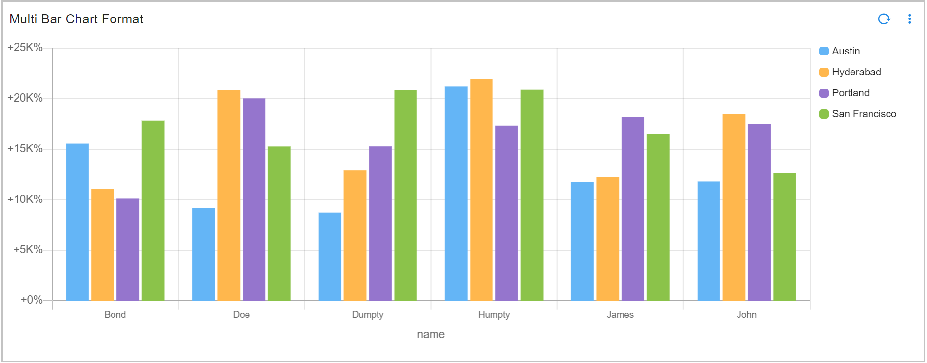
3.5.5 Multi Bar Chart Showing Top N Values
Below is a sample configuration of Bar Chart Showing Top N Values.
{
"title": "Multi Bar Chart",
"widget_type": "multi_bar_chart",
"stream": "donationn",
"ts_column": "timestamp",
"group_by": [
"city",
"name"
],
"chartProperties": {
"yAxisLabel": null,
"xAxisLabel": "name",
"stacked": false,
"legendLocation": "right",
"orientation": "vertical"
},
"others_spec": {
"limit": 2,
"show_others": false
},
"column": "donation",
"agg": "sum",
"type": "str"
}
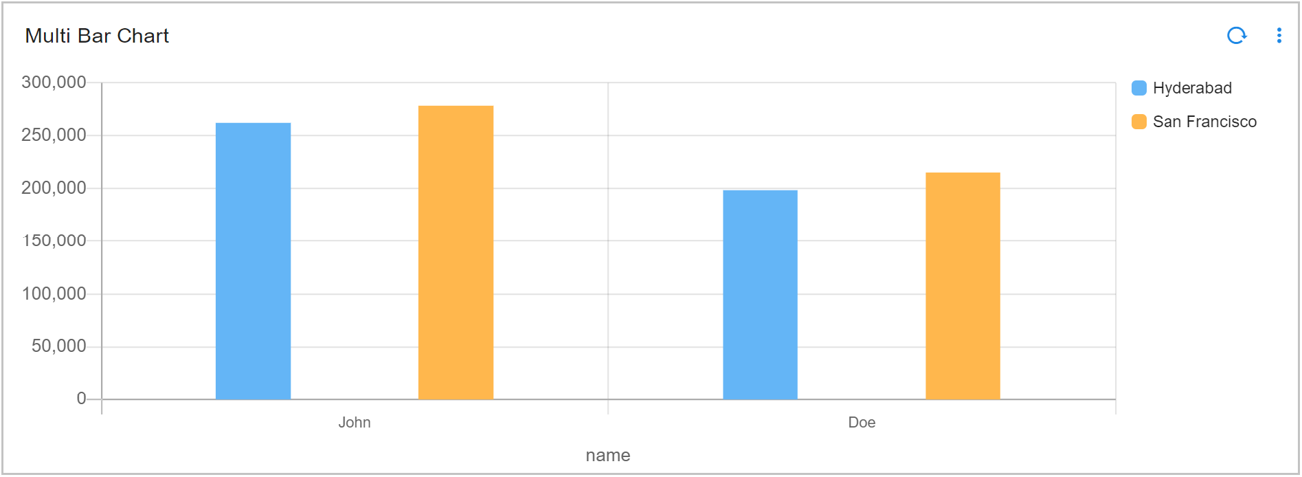
3.5.6 Multi Bar Chart Using Others Spec
Below is a sample configuration of Multi Bar Chart Using Others Spec
{
"title": "Multi Bar Chart Format desc Based",
"widget_type": "multi_bar_chart",
"stream": "main",
"ts_column": "timestamp",
"group_by": [
"city",
"name"
],
"formatting": {
"notation": "compact",
"style": "unit",
"unit": "percent"
},
"chartProperties": {
"yAxisLabel": null,
"xAxisLabel": "name",
"stacked": false,
"legendLocation": "right",
"orientation": "vertical"
},
"descending_order": true,
"others_spec": {
"limit": 3,
"label": "Other Names",
"show_others": true,
"city": {
"largest": false,
"name_based_limit": false
},
"name": {
"largest": false,
"name_based_limit": false
}
},
"column": "donation",
"agg": "sum",
"type": "str"
}
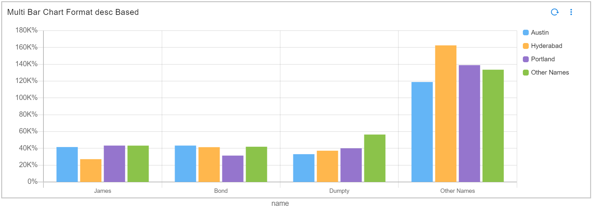
3.5.7 Multi Bar Chart Using Sorting Type
Please refer the below configuration parameter table which are additionally used to configure a Multi Bar Chart Using Sorting Type within the dashboard.
Note
semantic sort: is used to sort data by numeric, month, weekday, date, severity, priority
ordinal sort: is used for custom ordering that is specified by an ordered set in widget definition
lexical sort: is used to have control over case sensitivity in standard sort
Parameter Name |
Mandatory | Description |
|---|---|---|
groups_meta |
yes | This parameter is used for sorting groups in reports. Possible values are type,ignore_case,order,format |
series_meta |
yes | This parameter is used for For sorting the series (segments of each bar) in Multi Bar chart, Possible values are type, ignore_case,order,format |
type |
yes | This parameter is used to specify the sorting type, Expected Parameters are numeric, month, weekday , date , severity , priority, custom |
order |
no | is to specify a custom ordered set when the type is custom, Expected Order to Pass <str1>, <str2>, <str3>….<strn> |
format |
no | This parameter is to specify the date format using the python date format rules, Expected format %d %b %Y,%d-%b-%Y |
ignore_case |
no | This Parameter specifies if the data values must be a case sensitive match to the Ordinal values, Expected Parameters are true or false |
Below is the sample configuration of Multi Bar Chart Using Sorting Type / Widget.
{
"widget_type": "multi_bar_chart",
"title": "Week based Multibar",
"duration_hours": 10800,
"stream": "mw1",
"ts_column": "timestamp",
"extra_filter": null,
"column": "count_",
"agg": "value_count",
"group_by": [
"Week",
"date"
],
"groups_meta": {
"type": "date"
},
"series_meta": {
"type": "weekday"
},
"type": "int",
"min_width": 6,
"height": 5,
"max_width": 6
}
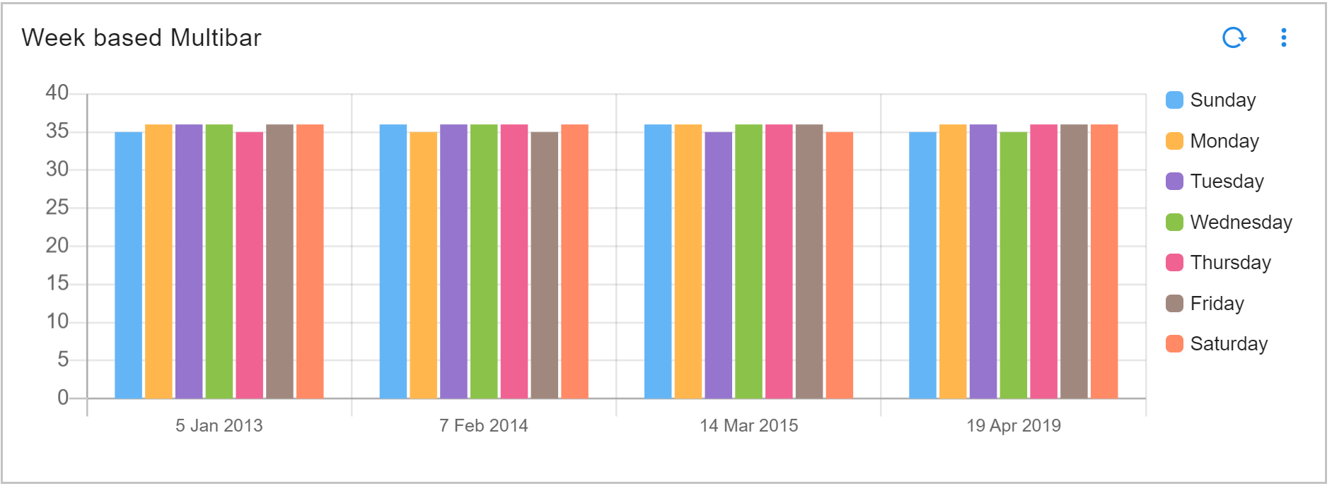
3.6 Mixed Chart Bucket
Please refer the below configuration parameter table which are used to configure a Mixed Chart Bucket within the dashboard.
Parameter Name |
Mandatory | Description |
|---|---|---|
title |
yes | Specify the label for the Mixed Chart. |
widget_type |
yes | Specify the chart / widget type. i.e. mixed_chart_buckets |
stream |
no | Specify the persistent stream. Note: Either of persistent stream or dataset parameter is needed. |
extra_filter |
no | use this parameter to filter the data from from one or more selected field(s). It supports CFXQL query format. |
ts_column |
yes | Specify the timestamp column name within the selected persistent stream. It is optional when dataset is used. |
chartProperties |
no | chartProperties defines the representation of data using Yaxis, Xaxis & Various other Combinations like zooming,color etc... |
duration hours |
no | This parameter specifies how many hours in the past should the data be fetched. If time_filter is set to true, time filter will override this value. |
group_by |
yes | Specify one or more columns to apply the group_by. This parameter supports multiple column values. Ex: "group_by": [ "column_01", "column_02", "column_n"] |
Column |
yes | Name of the column in the data that contains numerical data to perform aggregations |
agg |
yes | Specify the aggregation function. Supported values are value_count (shows total count), min, max, avg, sum, cardinality (shows unique count)first_record and last_record return the starting and final values of the column for the selected time range. |
type |
yes | Specify the data type while performing aggregation function. Supported values are int and str. int option is valid only for min, max, sum, mean aggregation functions. |
widget_id |
no | Every widget will be represented with Unique id at the end, Its Autogenerated if not provided |
axis |
no | To provide another y-axis support we will add the new definition here Note: Cannot have more than 2 axis entries in the array. |
graph_type |
no | It expects two parameters bar & line, Note: Default is bar |
group_label |
no | This Parameter if specified avoids multiple names, when same group_by is passed in different axis we can assign a name for group_label |
formatting |
no | To format number with localized units, Use the style & unit option |
notation |
no | We can specify as standard, compact, scientific and engineering Standard Notation: is the implied default, Compact Notation: uses locale-specific symbols to represent large numbers. It is a more human-friendly alternative to scientific notation, Scientific Notation: will only have one significant digit, Engineering Notation: will have three significant digits Note: By default, Compact Notation rounds to the nearest integer, but always keeps 2 significant digits. You can set any of minimum, maximumFractionDigits or minimum, maximum SignificantDigits to override that behavior |
style |
no | The possible values for style are currency & unit |
unit |
no | The unit can have following values angle: degree, area: acre , hectare concentration: percent digital: bit, byte, kilobit, kilobyte, megabit, megabyte, gigabit, gigabyte, terabit, terabyte, petabyte duration: millisecond, second, minute, hour, day, week, month, year length: millimeter, centimeter, meter, kilometer, inch, foot, yard, mile, mile-scandinavian mass: gram, kilogram, ounce, pound, stone temperature: celsius, fahrenheit volume: liter, milliliter, gallon, fluid-ounce speed: meter-per-second |
currency |
no | The Possible value for currency is USD |
SignDisplay |
no | It helps to explicitly display the sign, even when the number is positive. The possible values are always To prevent showing the sign when the value is 0, use signDisplay: exceptZero |
currencySign |
no | when the currencySign is set to accounting it enables a locale-specific format for negative currency amounts. example, wrapping the amount in parentheses |
Note
The formatting provided in one axis will be used for both.
Below is a sample configuration of Mixed Chart Bucket / Widget.
{
"title": "Mixed Chart",
"widget_type": "mixed_chart_buckets",
"axis": [
{
"stream": "people_custom_timestamp",
"ts_column": "timestamp",
"chartProperties": {
"yAxisLabel": "Same name people in City",
"xAxisLabel": "Name",
"stacked": false,
"legendLocation": "right",
"orientation": "vertical"
},
"group_by": [
"city",
"name"
],
"column": "_RDA_Id",
"agg": "value_count",
"type": "int"
},
{
"stream": "people_custom_timestamp",
"ts_column": "timestamp",
"chartProperties": {
"yAxisLabel": "Number of people in Age group",
"xAxisLabel": "Name"
},
"group_by": [
"count_",
"name"
],
"group_label": "People in Age group",
"column": "_RDA_Id",
"agg": "value_count",
"type": "int",
"graph_type": "line"
}
]
}
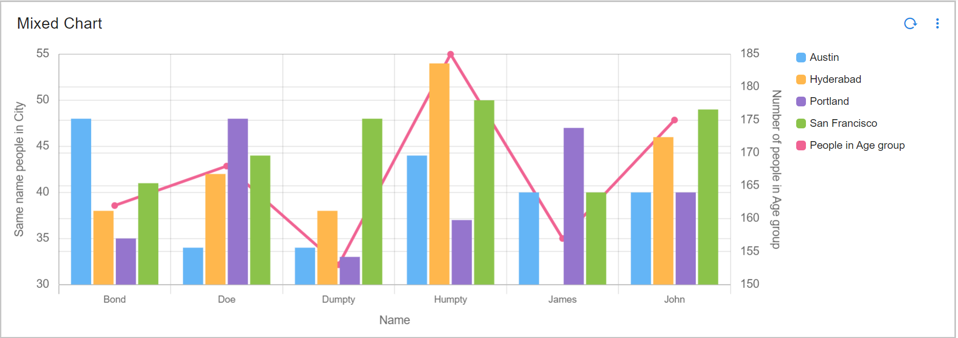
3.7 Line Graph / Timeseries Chart
Please refer the below configuration parameter table which are used to configure a Line Graph/Timeseries Chart within the dashboard.
Parameter Name |
Mandatory | Description |
|---|---|---|
title |
yes | Specify the label for the Line Graph chart. |
widget_type |
yes | Specify the chart / widget type. i.e. timeseries |
stream |
no | Specify the persistent stream. Note: Either of persistent stream or dataset parameter is needed. |
dataset |
no | Specify the dataset name. Note: Either of persistent stream or dataset parameter is needed |
max_width |
no | Specify the chart / widget's maximum width size, range is 0 to 12. |
min_Width |
no | Specify the timestamp column name within the selected persistent stream or dataset. |
height |
no | Specify the chart / widget's height, range is 0 to n. |
chartProperties |
no | chartProperties defines the representation of data using Yaxis, Xaxis & Various other Combinations like zooming,color etc... |
interval |
yes | Displays the report according to the prescribed time frame, Supported units are auto, milliseconds (ms), seconds (s), minutes (m), hours (h), days (d). example: '5m' means 5 minutes |
interval_type |
no | When the interval_type is set to calendar. Note: the possible values for interval are minute,hour,day,week,month,quarter,year |
gap_interval |
no | This expects join, keep, skip ex. keep - Drops the value to 0 for missing intervals, join - Draws the lines for missing intervals, skip - Shows gaps. Note: Default is keep |
group_by |
yes | Splitting and defining reports which are identical and showing them categorically |
series_spec |
yes | Its more about how many series to show and which data points to show |
column |
yes | Name of the column in the data that contains numerical data to perform aggregations |
agg |
yes | Specify the aggregation function. Supported values are value_count (shows total count), cardinality (shows unique count), min, max and avg |
type |
yes | Specify the data type while performing aggregation function. Supported values are int and str. int option is valid only for min, max, sum, mean aggregation functions. |
widget_id |
no | Every widget will be represented with Unique id at the end, Its Autogenerated if not provided |
fixTimeWindow |
no | By specifying fixTimeWindow as true X-axis time window will show user selected duration even if the data is only for subset of the time |
customIntervalMap |
no | which can contain from and to range expressed in hours, and interval for that time range. If this map is not specified, backend defaults to a built in range. |
style |
no | Using this parameter, each grouped value can be visualized using a specific color using color-map parameter as shown in the one of the below examples. |
alert_markers |
no | This parameter helps us to add markers in Time Series Graph. |
group_selection |
no | This parameter allows sorting the output in either ascending or descending order using the column, agg, limit, and orderby parameters. The column parameter specifies the column to group the selection and display the values. The agg parameter determines the type of aggregation to perform. The limit parameter restricts the visible output, with a default value of 20. The orderby parameter sorts the results in either ascending or descending order, with descending as the default. |
unit |
yes | Converts values to the specified unit (e.g., bytes, bits, kilobytes). |
addn |
no | Adds suffixes like "ps" (per second) or "PH" (per hour). |
Below is a sample configuration of Line Graph/Timeseries Chart / Widget.
{
"title": "Time Series using Stream Example",
"widget_type": "timeseries",
"stream": "rdaf_services_logs",
"ts_column": "timestamp",
"max_width": 12,
"height": 3,
"min_width": 12,
"chartProperties": {
"yAxisLabel": "Count",
"xAxisLabel": null,
"legendLocation": "bottom"
},
"interval": "15Min",
"group_by": [
"log_severity"
],
"series_spec": [
{
"column": "log_severity",
"agg": "value_count",
"type": "int"
}
]
}
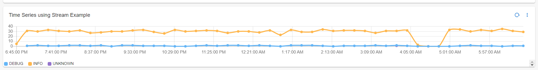
3.7.1 Line Graph / Timeseries Chart With Fix Time Window
Below is a sample configuration of Line Graph/Timeseries Chart With Fix Time Window / Widget.
{
"title": "Time Series using Stream Example",
"widget_type": "timeseries",
"stream": "rda_microservice_traces",
"ts_column": "timestamp",
"max_width": 12,
"height": 3,
"min_width": 12,
"fixTimeWindow": true,
"chartProperties": {
"yAxisLabel": "Count",
"xAxisLabel": null,
"legendLocation": "bottom"
},
"interval": "auto",
"group_by": [
"request_type"
],
"series_spec": [
{
"column": "request_type",
"agg": "value_count",
"type": "int"
}
],
"widget_id": "121762cf"
}
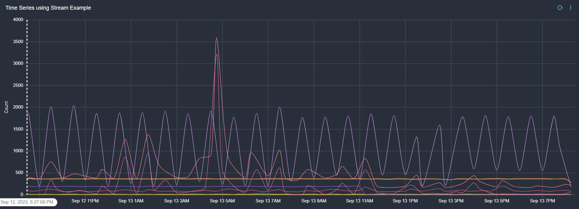
User Selected Duration
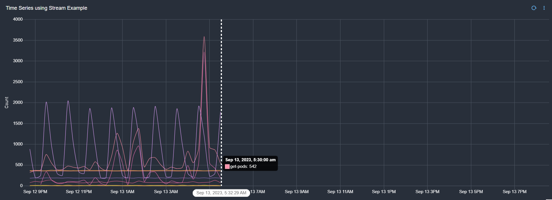
3.7.2 Line Graph / Timeseries Chart with Interval and Interval Type
Below is a sample configuration of Line Graph/Timeseries Chart with Interval and Interval Type
{
"title": "Time Series (Calendar Interval month)",
"widget_type": "timeseries",
"stream": "covid19",
"ts_column": "timestamp",
"width": 12,
"height": 6,
"chartProperties": {
"yAxisLabel": "Confirmed Count",
"xAxisLabel": "months",
"legendLocation": "bottom"
},
"interval": "month",
"interval_type": "calendar",
"series_spec": [
{
"column": "Confirmed",
"agg": "value_count",
"type": "int"
}
]
}
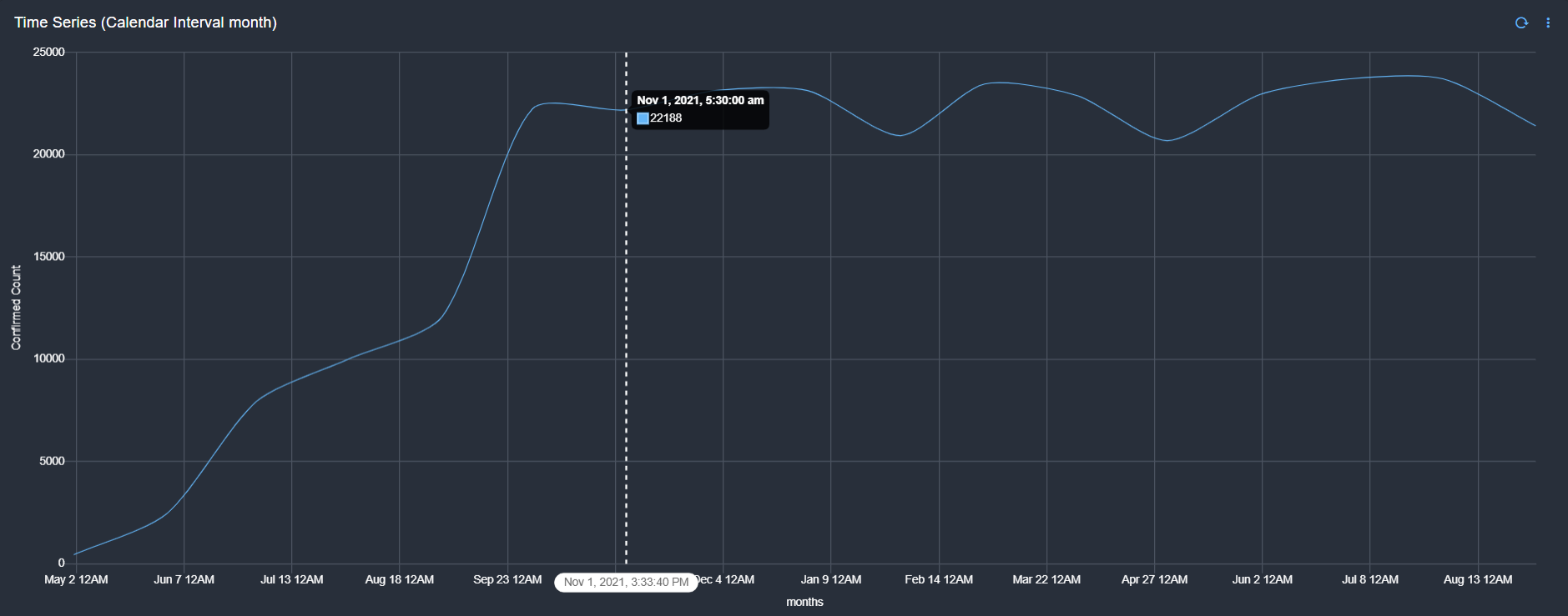
3.7.3 Line Graph / Timeseries Chart with Gap Interval
Below is a sample configuration of Line Graph/Timeseries Chart with Gap Interval - Keep / Widget configuration
{
"title": "Time Series (Gap Interval Keep)",
"widget_type": "timeseries",
"gap_interval": "keep",
"stream": "covi19",
"ts_column": "timestamp",
"max_width": 12,
"height": 3,
"min_width": 12,
"chartProperties": {
"yAxisLabel": "Count",
"xAxisLabel": "Timestamp",
"legendLocation": "bottom"
},
"interval": "5m",
"series_spec": [
{
"column": "Confirmed",
"agg": "sum",
"type": "int"
}
]
}
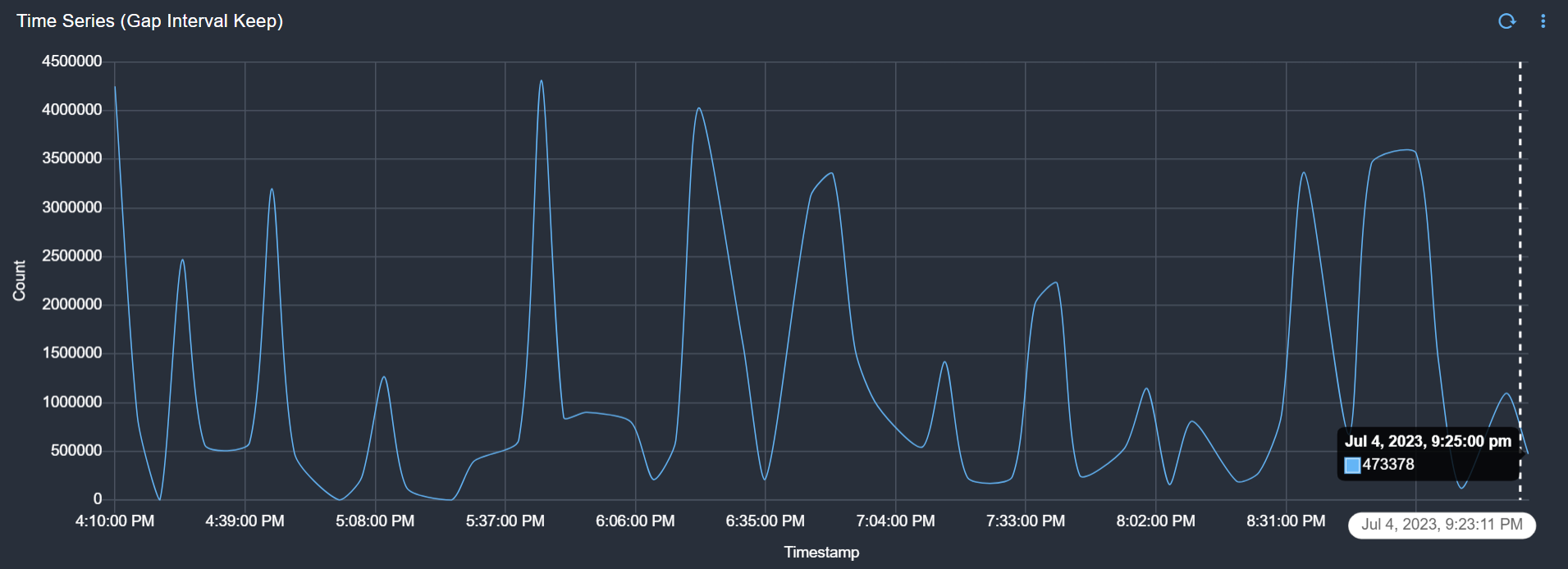
Below is a sample configuration of Line Graph/Timeseries Chart with Gap Interval - Join / Widget configuration
{
"title": "Time Series (Gap Interval Join)",
"widget_type": "timeseries",
"gap_interval": "join",
"stream": "covi19",
"ts_column": "timestamp",
"max_width": 12,
"height": 3,
"min_width": 12,
"chartProperties": {
"yAxisLabel": "Count",
"xAxisLabel": "Timestamp",
"legendLocation": "bottom"
},
"interval": "5m",
"series_spec": [
{
"column": "Confirmed",
"agg": "sum",
"type": "int"
}
]
}
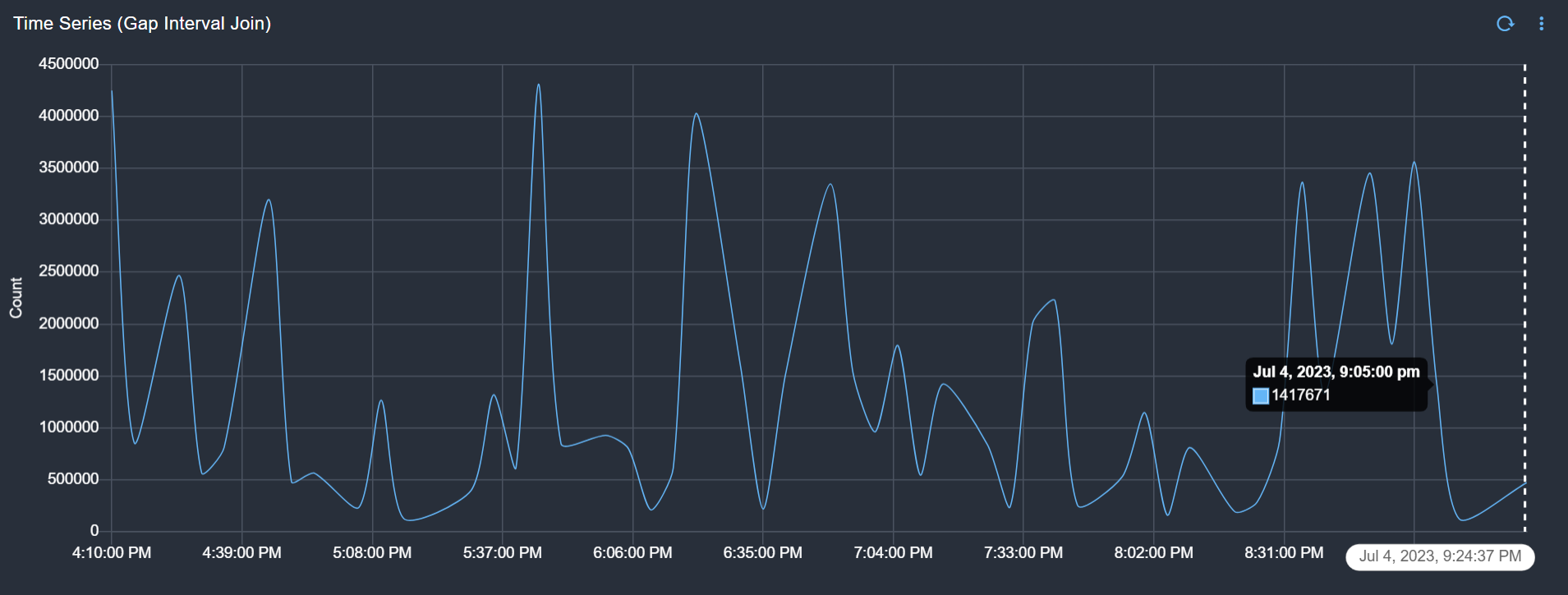
Below is a sample configuration of Line Graph/Timeseries Chart with Gap Interval - Skip / Widget configuration
{
"title": "Time Series (Gap Interval Skip)",
"widget_type": "timeseries",
"gap_interval": "skip",
"stream": "covi19",
"ts_column": "timestamp",
"max_width": 12,
"height": 3,
"min_width": 12,
"chartProperties": {
"yAxisLabel": "Count",
"xAxisLabel": "Timestamp",
"legendLocation": "bottom"
},
"interval": "5m",
"series_spec": [
{
"column": "Confirmed",
"agg": "sum",
"type": "int"
}
]
}
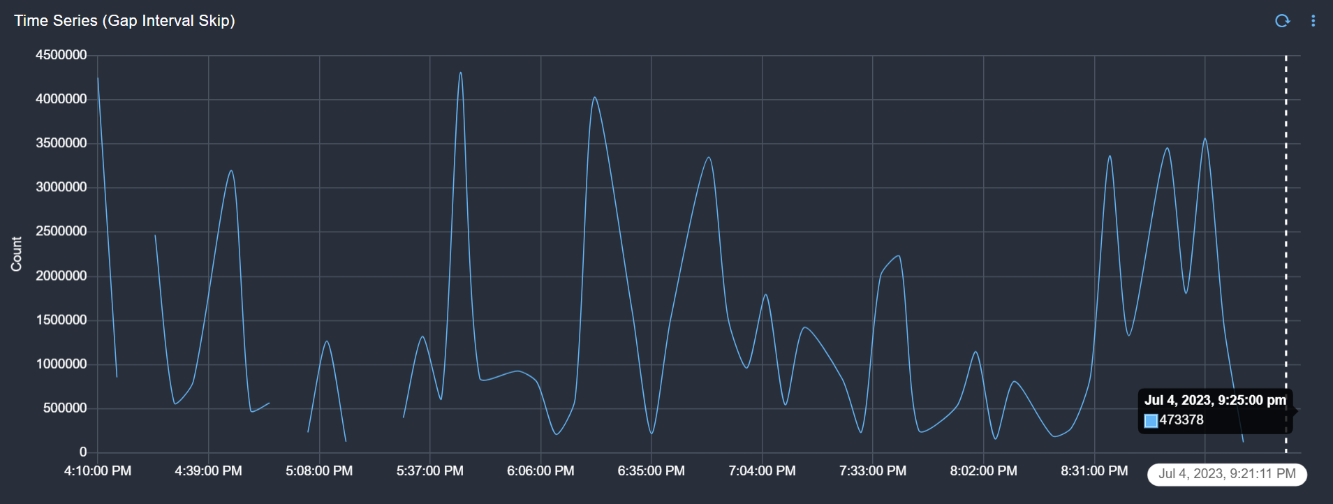
3.7.4 Line Graph / Timeseries Chart with Color Map
Below is a sample configuration of Line Graph/Timeseries Chart with Color Map / Widget configuration
{
"title": "Time Series",
"widget_type": "timeseries",
"gap_interval": "keep",
"stream": "people_custom_timestamp",
"ts_column": "timestamp",
"width": 4,
"height": 4,
"chartProperties": {
"yAxisLabel": "Count",
"xAxisLabel": null,
"legendLocation": "bottom"
},
"interval": "24h",
"series_spec": [
{
"column": "name",
"agg": "value_count",
"type": "int"
}
],
"group_by": "city",
"style": {
"color-map": {
"Austin": [
"#E91E63",
"#ffffff"
],
"Portland": [
"#FF5722",
"#ffffff"
],
"San Francisco": [
"#FFC107",
"#ffffff"
],
"Hyderabad": [
"#3F51B5",
"#ffffff"
]
}
}
}
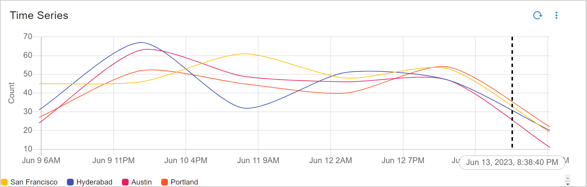
Color Map with Label
Below is a sample configuration of Line Graph Chart with Color Map with Label / Widget configuration
{
"title": "Time Series (Color-map with label)",
"widget_type": "timeseries",
"gap_interval": "keep",
"stream": "people_custom_timestamp",
"ts_column": "timestamp",
"width": 4,
"height": 4,
"chartProperties": {
"yAxisLabel": "Count",
"xAxisLabel": null,
"legendLocation": "bottom"
},
"interval": "24h",
"series_spec": [
{
"column": "name",
"agg": "value_count",
"type": "int",
"label": "City"
}
],
"group_by": "city",
"style": {
"color-map": {
"City (Portland)": [
"#E91E63",
"#ffffff"
],
"City (San Francisco)": [
"#FF5722",
"#ffffff"
],
"City (Hyderabad)": [
"#FFC107",
"#ffffff"
],
"City (Austin)": [
"#3F51B5",
"#ffffff"
]
}
}
}
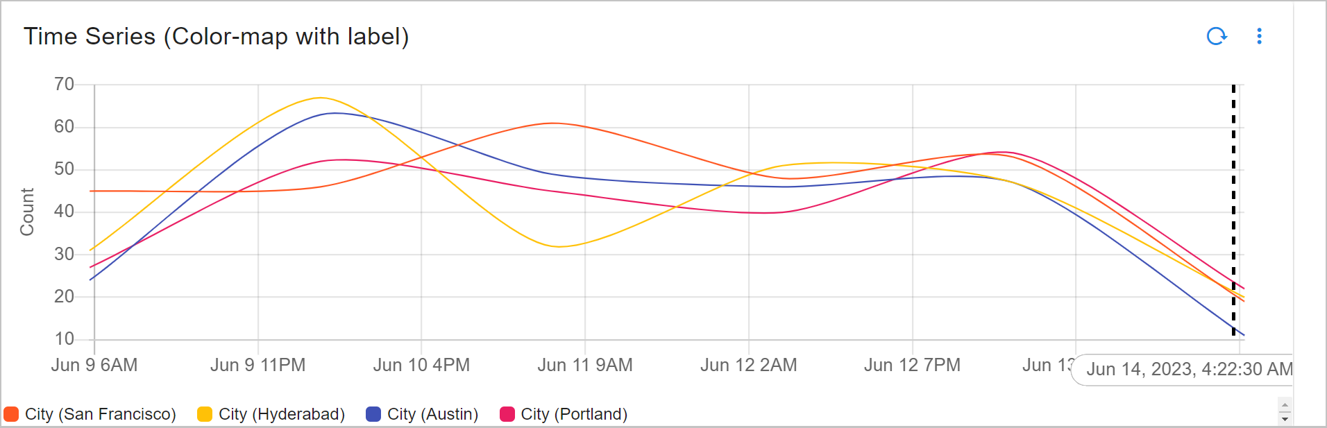
3.7.5 Line Graph / Timeseries Chart with Alert Markers
Please refer the below configuration parameter table which are additionally used to configure a Line Graph/Timeseries Chart with Alert Markers within the dashboard.
Parameter Name |
Mandatory | Description |
|---|---|---|
alert_markers |
yes | This parameter helps us to add markers in Time Series Graph |
ts_column |
yes | Specify the timestamp column name within the selected persistent stream. It is optional when dataset is used. |
stream |
yes | Specify the persistent stream |
message_column |
yes | This parameter will display a message when hovered on the graph, This parameter expects the message column to be displayed |
extra_filter |
no | This parameter is used to filter the data from from one or more selected field(s). It supports CFXQL query format |
severity_column |
yes | This parameter is used to specify the severity column for alert marker |
Below is a sample configuration of Line Graph / Timeseries Chart with Alert Markers / Widget configuration
{
"widget_type": "timeseries",
"title": "Alert Trend",
"stream": "oia-alerts-stream",
"min_width": 9,
"height": 3,
"max_width": 9,
"interval": "auto",
"ts_column": "a_created_ts",
"fixTimeWindow": true,
"group_by": [
"a_severity"
],
"alert_markers": [{
"stream": "oia-alerts-stream",
"ts_column": "a_created_ts",
"message_column": "a_message",
"extra_filter": "a_severity is 'CRITICAL'",
"severity_column": "a_severity"
}],
"series_spec": [
{
"agg": "sum",
"column": "count_",
"type": "int",
"label": "Alert Count"
}
],
"chartProperties": {
"yAxisLabel": "Alert Count",
"xAxisLabel": null,
"legendLocation": "right"
}
}
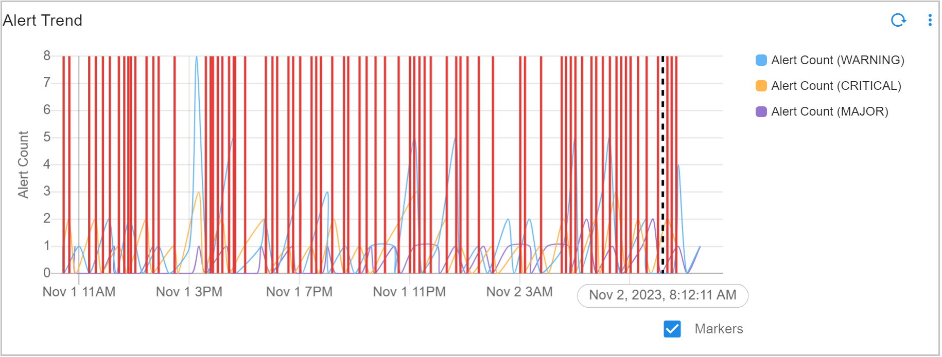
3.7.6 Line Graph / Timeseries Chart with Auto Intervals
Note
This widget computes aggregation based on Time Range selected (Not based on Data Availability)
Below is a sample configuration of Line Graph / Timeseries Chart with Auto Intervals / Widget configuration
{
"title": "Time Series using Stream Example",
"widget_type": "timeseries",
"stream": "company_alerts",
"ts_column": "timestamp",
"max_width": 12,
"height": 7,
"min_width": 12,
"chartProperties": {
"yAxisLabel": "Count",
"xAxisLabel": null,
"legendLocation": "bottom"
},
"fixTimeWindow": true,
"interval": "auto",
"series_spec": [
{
"column": "count_",
"agg": "sum",
"type": "int"
}
]
}
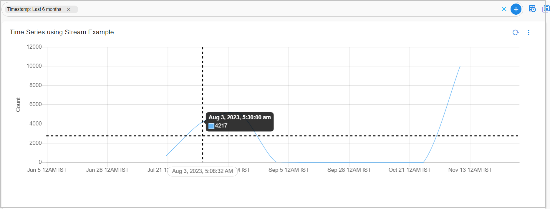
3.7.7 Line Graph / Timeseries Chart with Full Timeseries Data
As the user drills down into specific timestamp ranges from the time series chart, the system should provide more granular data for enhanced visibility.
Scenario |
Type | Description |
|---|---|---|
| Scenario 1 | Default Setting | By default, the interval is set to auto, and getDataOnZoom is set to true, allowing users to see more granular data as they zoom in on specific timestamp ranges. |
| Scenario 2 | Fixed Data Points | If getDataOnZoom is set to false, the user will only be able to zoom into the initially visible data, without gaining access to more granular details. |
By default, the user will now see more granular data, and the interval is automatically set to auto if not explicitly defined.
Note
When the interval is auto, getDataOnZoom is set to true.
Below is a sample configuration of Line Graph / Timeseries Chart with Full Timeseries Data for Scenario 1
{
"title": "Time Series",
"widget_type": "timeseries",
"gap_interval": "keep",
"stream": "test_gh",
"ts_column": "time_value",
"width": 6,
"height": 6,
"chartProperties": {
"yAxisLabel": "Count",
"xAxisLabel": null,
"xAxisTickOrientation": "STAGGERED",
"legendLocation": "right",
"mode": "selection",
"column-id": "timestamp",
"options": {
"axes": {
"display": false
}
}
},
"interval": "auto",
"series_spec": [
{
"column": "ID",
"label": "ID",
"agg": "value_count",
"type": "int"
},
{
"column": "Age",
"label": "Age",
"agg": "max",
"type": "int"
}
]
}
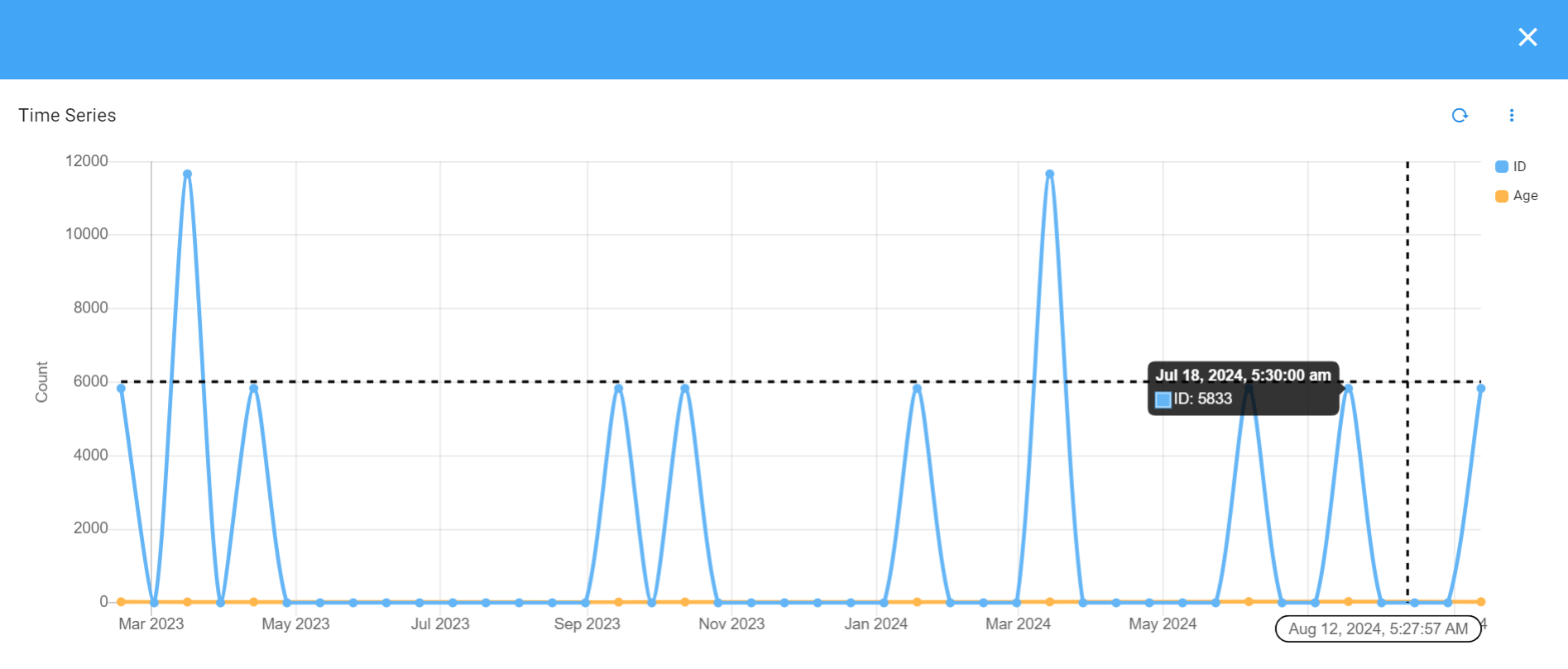
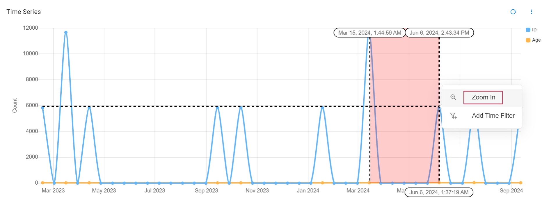
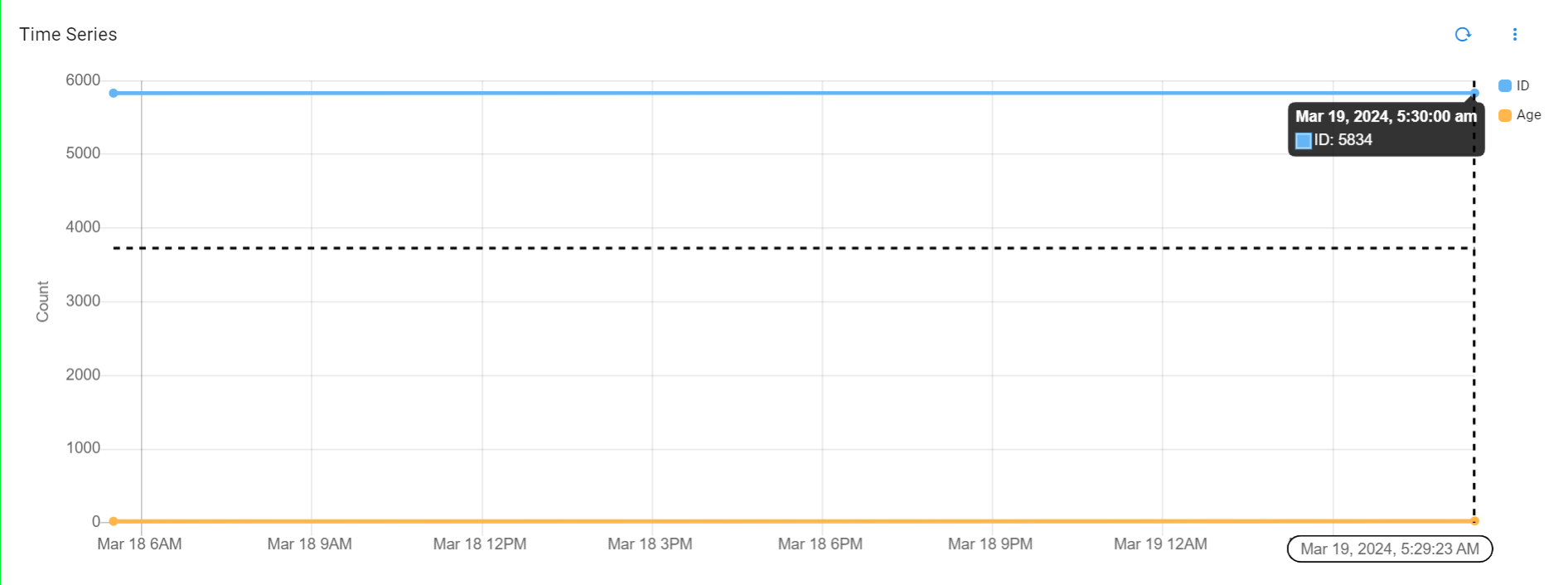
If getDataOnZoom is set to false, the user will not be able to see granular data and can only zoom into the data that was initially visible, with the same data points.
Below is a sample configuration of Line Graph / Timeseries Chart with Full Timeseries Data for Scenario 2
{
"title": "Time Series -getDataOnZoom false",
"widget_type": "timeseries",
"gap_interval": "keep",
"stream": "test_gh",
"ts_column": "time_value",
"width": 6,
"height": 6,
"chartProperties": {
"getDataOnZoom": false,
"yAxisLabel": "Count",
"xAxisLabel": null,
"xAxisTickOrientation": "STAGGERED",
"legendLocation": "right",
"mode": "selection",
"column-id": "timestamp",
"options": {
"axes": {
"display": false
}
}
},
"series_spec": [
{
"column": "ID",
"label": "ID",
"agg": "value_count",
"type": "int"
},
{
"column": "Age",
"label": "Age",
"agg": "max",
"type": "int"
}
]
}
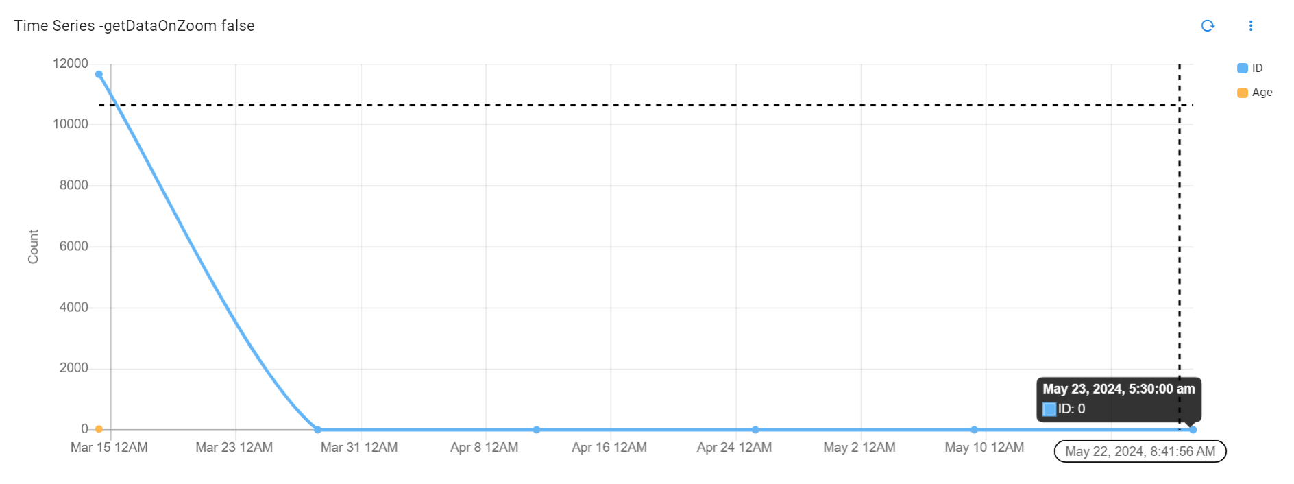
3.7.8 Line Graph / Timeseries Chart with Sorting Abilities
The group_selection feature enables sorting and grouping of data, allowing users to organize and aggregate results efficiently. It offers options to limit the output and control the order of the displayed results, ensuring that the most relevant data is highlighted.
Below is a sample configuration of Line Graph / Timeseries Chart with Sorting Abilities/ Widget configuration
{
"title": "Time Series asc",
"widget_type": "timeseries",
"stream": "people_custom_timestamp",
"ts_column": "timestamp",
"width": 6,
"height": 6,
"chartProperties": {
"yAxisLabel": "Count",
"xAxisLabel": null,
"legendLocation": "bottom"
},
"interval": "30Min",
"group_by": [
"name"
],
"group_selection": {
"column": "count_",
"agg": "sum",
"limit": 3,
"orderby": "asc"
},
"series_spec": [
{
"column": "count_",
"agg": "sum",
"type": "int"
}
]
}
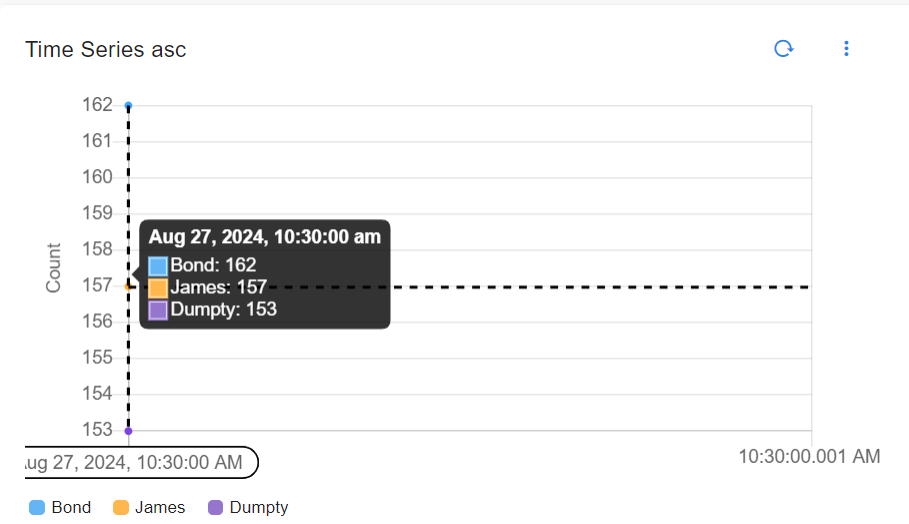
3.7.9 Line Graph / Time Series with Zoom and Page Filter Options
Users can drag and select a specific time range on the time series chart, with two key actions available:
-
Zoom In: The selected time range can be zoomed in for a more detailed view, allowing users to closely inspect the data within the chosen period.
-
Add Time Filter: The selected time range can also be applied as a global filter for the entire page, automatically updating all other charts and components to reflect data from that specific time window.
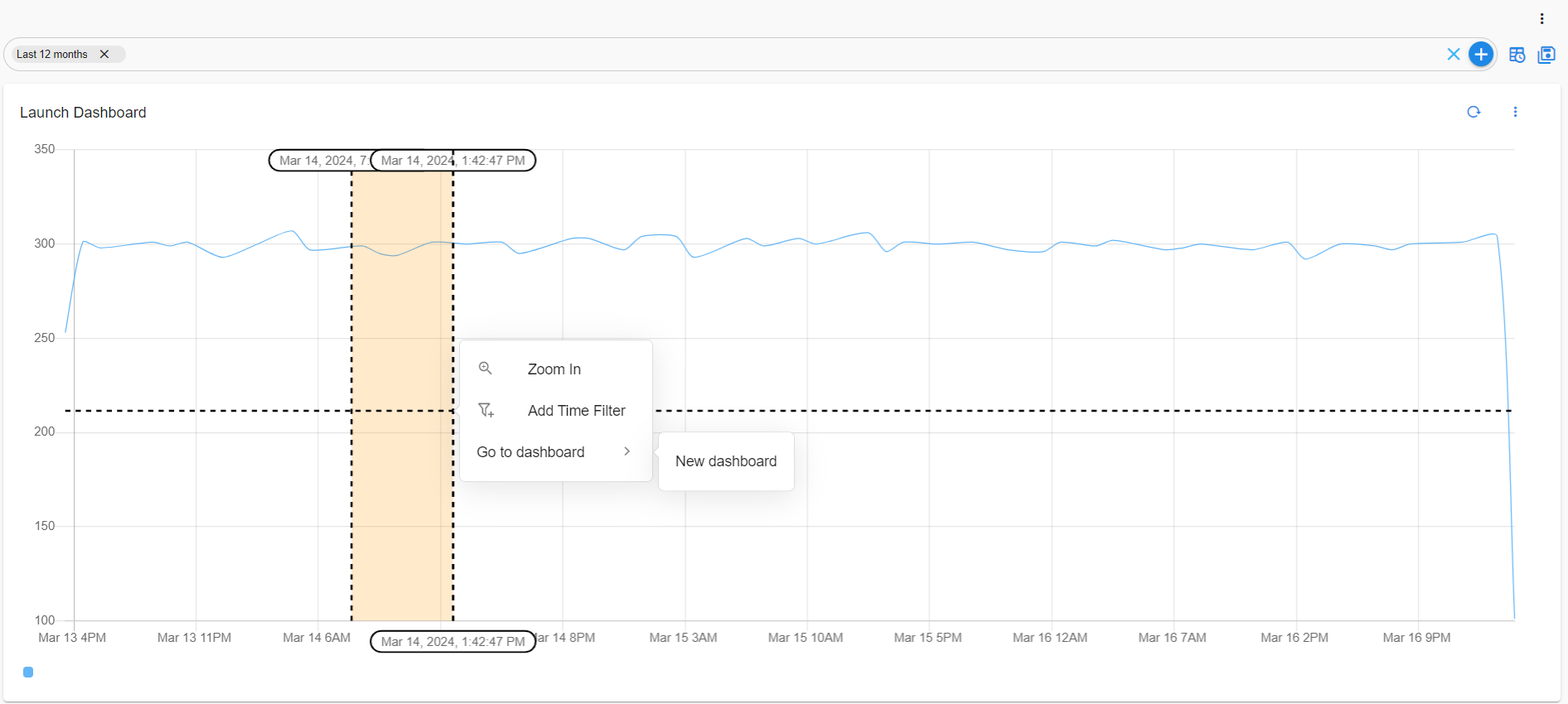

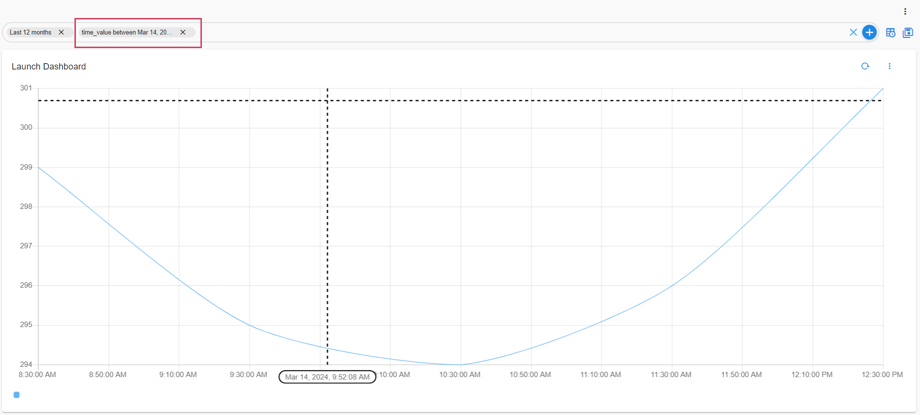
3.7.10 Line Graph / Timeseries to Launch Dashboards
If a dashboard is configured for the chart, selecting a time range can trigger an action to launch the corresponding dashboard, giving users deeper insights into the data. For example, after selecting a specific time range during an incident or peak, users can quickly navigate to a detailed dashboard related to that period, offering further diagnostic data and visualizations tailored to the chosen time frame.
Below is a sample configuration of Line Graph / Timeseries to Launch Dashboards with Sorting Abilities/ Widget configuration
{
"title": "Launch Dashboard",
"widget_type": "timeseries",
"stream": "main1",
"ts_column": "time_value",
"actions": [
{
"permission": "rda:user_dashboard:view",
"appName": "user-dashboard/rapid-ingestion",
"identifier": "launch.dashboard.device_view_app",
"title": "New dashboard",
"type": "GO_TO_APP_STATE"
}
],
"interval": "1h",
"series_spec": [
{
"column": "age",
"agg": "sum",
"type": "float"
}
]
}
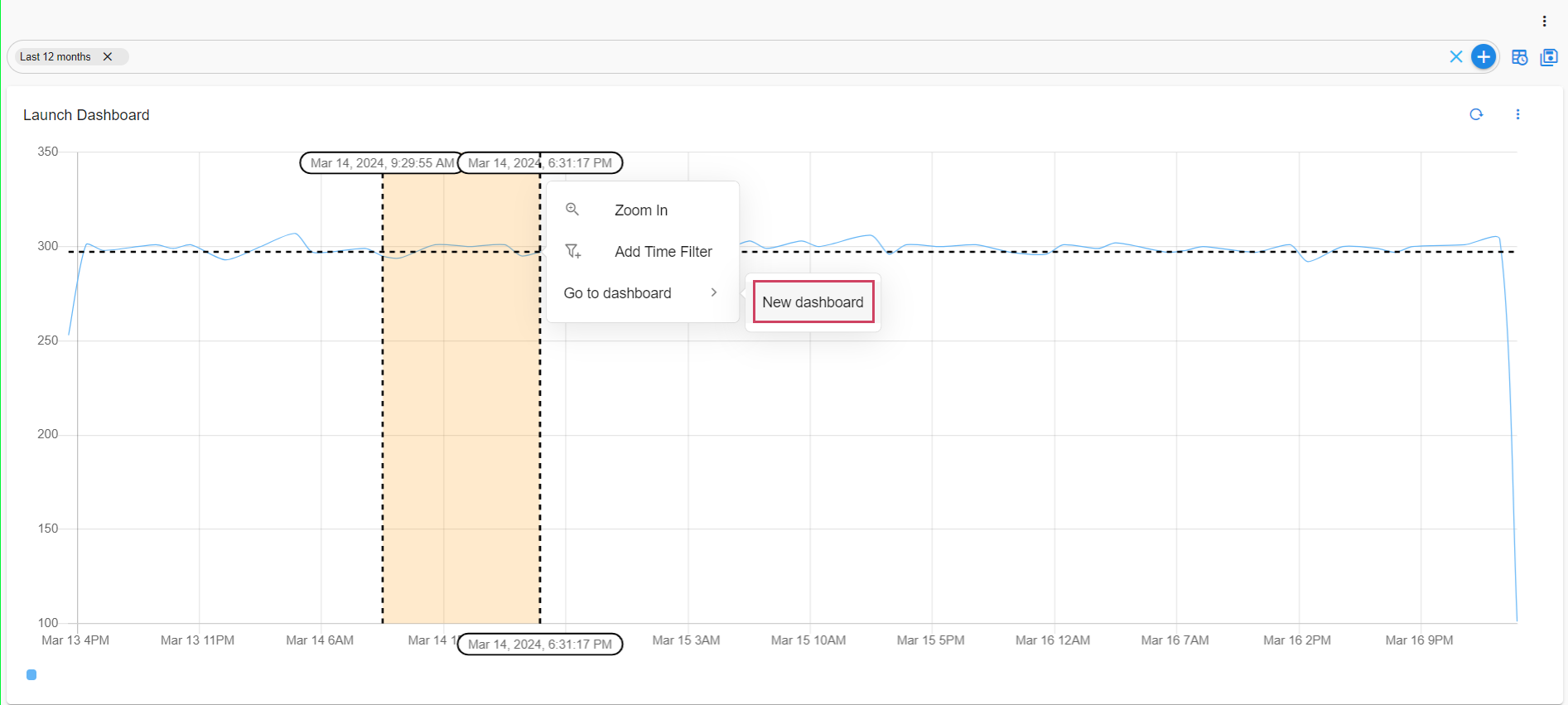
When the user launches the dashboard the user would get directed to rapid-ingestion App, As defined in the dashboard definition.
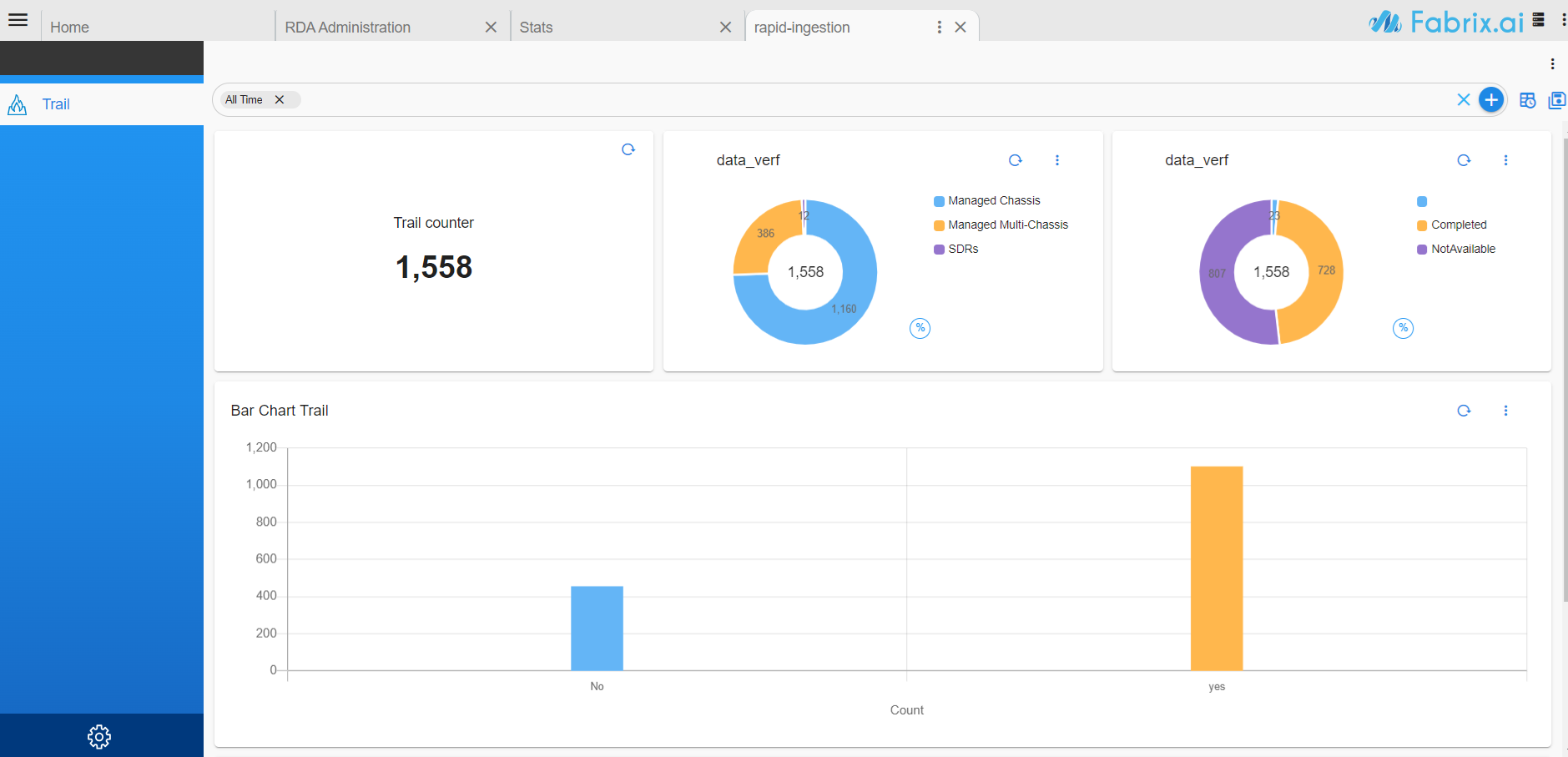
3.7.11 Line Graph / Timeseries Using Unit Conversion
The new converting option enhances chart formatting by enabling automatic unit conversion before applying display formatting.
Below is a sample configuration of Line Graph / Timeseries to Launch Dashboards with Unit Conversion configuration
{
"title": "Timeseries Using Unit Conversion",
"widget_type": "timeseries",
"stream": "main_enhanced",
"ts_column": "time_value",
"max_width": 12,
"height": 6,
"min_width": 12,
"chartProperties": {
"yAxisLabel": "Count",
"xAxisLabel": null,
"legendLocation": "bottom"
},
"converting": {
"unit": "seconds",
"addn": " p/s"
},
"interval": "1d",
"group_by": [
"age"
],
"series_spec": [
{
"column": "count_",
"agg": "value_count",
"type": "int"
}
]
}
Note
Example Supported Units
Data: bits, bytes, kilobytes, megabytes, gigabyte, terabyte
Time: seconds, minutes, hours
Length: meters, inches, feet, miles
For a full list, visit the Convert Library.
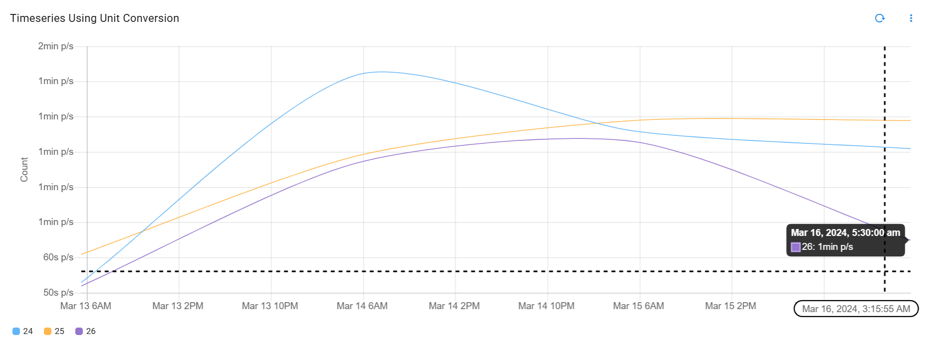
3.7.12 Timeseries Stats Panel
The stats configuration can be used in Timeseries charts to display aggregated statistics such as minimum, maximum, average, total count, and latest values for each grouped series inside the Details panel.
stats Parameters
| Parameter Name | Mandatory | Description |
|---|---|---|
display_by_default |
Yes | By default the Details panel with all the stats is shown. If set to false, the panel will be collapsed initially. |
collapse_legends |
Yes | Expands or collapses stats for legends/groups by default in the Details panel. By default, legends are expanded. |
aggs |
Yes | Specify one or more aggregation functions along with labels to display in the Details panel. |
aggs Parameters
| Parameter Name | Mandatory | Description |
|---|---|---|
value_count |
Yes | Shows the total count of records for the selected time range. |
min |
Yes | Displays the minimum value of the selected column for the selected time range. |
max |
Yes | Displays the maximum value of the selected column for the selected time range. |
avg |
Yes | Displays the average value of the selected column for the selected time range. |
sum |
Yes | Displays the total/sum of values for the selected column. |
cardinality |
Yes | Displays the unique count of values for the selected column. |
first_record |
Yes | Returns the earliest/starting value of the column for the selected time range. |
last_record |
Yes | Returns the latest/current/final value of the column for the selected time range. |
Below is a sample configuration of a Timeseries Chart with stats aggregation support to display minimum, maximum, average, total count, and latest values in the Details panel, along with the corresponding UI behavior.
{
"name": "timeseries_stats_demo",
"label": "Timeseries Stats Demo",
"description": "Timeseries chart with stats panel",
"enabled": true,
"dashboard_style": "auto",
"dashboard_type": "dashboard",
"stream": "temperature_timeseries",
"dashboard_sections": [
{
"title": "Temperature Trends",
"show_filter": true,
"widgets": [
{
"title": "Time Series Group",
"widget_type": "timeseries",
"stream": "temperature_timeseries",
"ts_column": "timestamp",
"max_width": 12,
"min_width": 12,
"height": 6,
"interval": "5m",
"chartProperties": {
"yAxisLabel": "Average Temperature",
"xAxisLabel": "Time",
"legendLocation": "bottom"
},
"group_by": [
"city"
],
"series_spec": [
{
"column": "temperature",
"agg": "avg",
"type": "float",
"label": "Temperature"
}
],
"stats": {
"display_by_default": true,
"collapse_legends": false,
"aggs": {
"value_count": "count",
"min": "min",
"max": "max",
"avg": "avg",
"sum": "total",
"cardinality": "unique",
"first_record": "earliest",
"last_record": "current"
}
},
"widget_id": "4fca5c14"
}
]
}
],
"saved_time": "2026-05-25T07:27:55.407126"
}
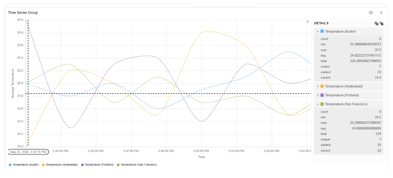
3.8 Data Flow Chart
Please refer the below configuration parameter table which are used to configure a Data flow chart within the dashboard.
Parameter Name |
Mandatory | Description |
|---|---|---|
title |
yes | Specify the label for the Data Flow chart. |
widget_type |
yes | Specify the chart / widget type. i.e. dataflow,eventflow |
chart properties |
yes | chartProperties defines the representation of data using Yaxis, Xaxis & Various other Combinations like zooming,color etc... |
stream |
no | Specify the persistent stream. Note: Either of persistent stream or dataset parameter is needed. |
dataset |
no | Specify the dataset name. Note: Either of persistent stream or dataset parameter is needed |
max_width |
no | Specify the chart / widget's maximum width size, range is 0 to 12. |
min_Width |
no | Specify the timestamp column name within the selected persistent stream or dataset. |
height |
no | Specify the chart / widget's height, range is 0 to n. |
formatter |
no | Formats integer values as K for thousands, M for Millions. If the input value is already a counted as thousands, optional value multiplier can be specified. |
extra_filter |
no | se this parameter to filter the data from from one or more selected field(s). It supports CFXQL query format. |
ts_column |
yes | Specify the timestamp column name within the selected persistent stream. It is optional when dataset is used. |
duration_hours |
no | This parameter specifies how many hours in the past should the data be fetched. If time_filter is set to true, time filter will override this value. |
group_by |
yes | Splitting and defining reports which are identical and showing them categorically |
column |
yes | Name of the column in the data that contains numerical data to perform aggregations |
agg |
yes | Specify the aggregation function. Supported values are value_count (shows total count), min, max, avg, sum, cardinality (shows unique count)first_record and last_record return the starting and final values of the column for the selected time range. |
type |
yes | Specify the data type while performing aggregation function. Supported values are int and str. int option is valid only for min, max, sum, mean aggregation functions. |
widget_id |
no | Every widget will be represented with Unique id at the end, Its Autogenerated if not provided |
Below is the sample of Data Flow Chart / Widget configuration.
{
"title": "Event Flow Graph",
"widget_type": "dataflow",
"chartProperties": {
"layoutDirection": "tb",
"userZoomingEnabled": false,
"hasToolbar": false
},
"output": {
"formatter": "DescriptiveCountFormatter",
"stream": "dli-log-stats",
"extra_filter": "mode is 'processed' and device not in ['ERROR','INFO','WARNING']",
"ts_column": "timestamp",
"duration_hours": 720,
"group_by": [
"device"
],
"column": "count",
"agg": "sum",
"type": "int"
},
"input": {
"formatter": "DescriptiveCountFormatter",
"stream": "dli-log-stats",
"extra_filter": "mode is 'ingested' and device not in ['ERROR','INFO','WARNING']",
"ts_column": "timestamp",
"duration_hours": 720,
"group_by": [
"device"
],
"column": "count",
"agg": "sum",
"type": "int",
"widget_id": "da16c98b"
},
"widget_id": "66b927bc"
}
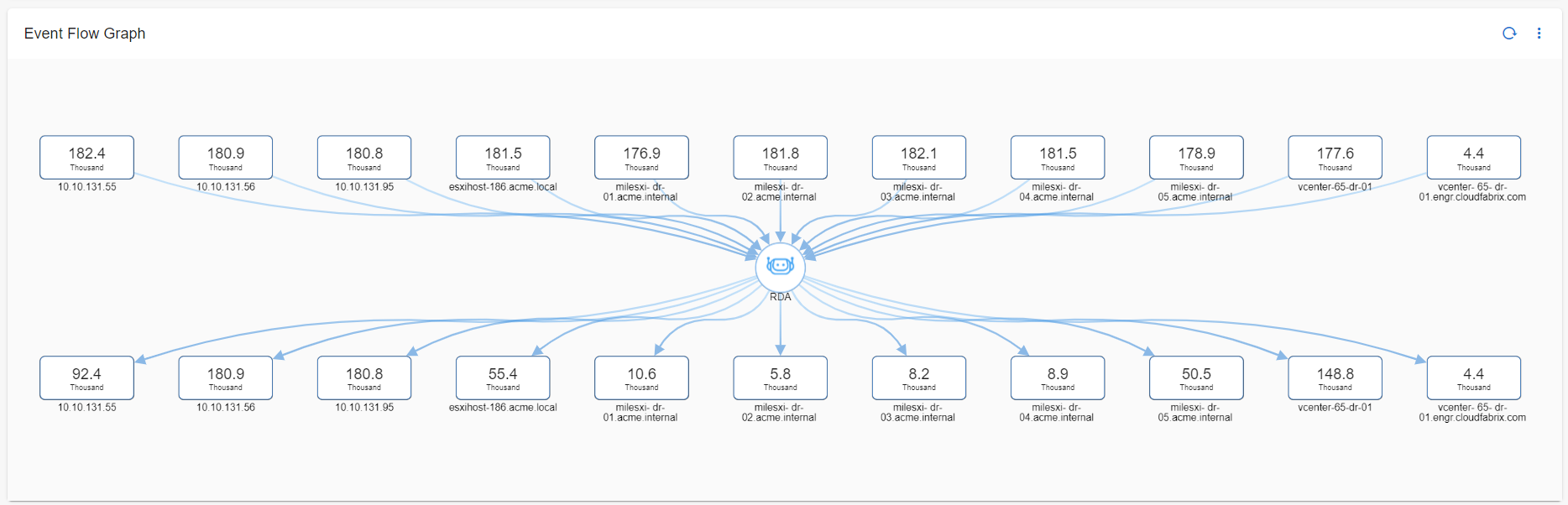
3.9 Image Chart
Image widget can show any image that is accessible through a URL.
Please refer the below configuration parameter table which are used to configure an Image chart / widget within the dashboard.
Parameter Name |
Mandatory | Description |
|---|---|---|
title |
yes | Specify the label for the Image chart |
widget_type |
yes | Specify the chart / widget type. i.e. image |
max_width |
no | Specify the chart / widget's maximum width size, range is 0 to 12. |
min_width |
no | Specify the timestamp column name within the selected persistent stream or dataset. |
imageUrl |
yes | Specify the url of the image thats needs to be represented in the chart |
widget_id |
no | Every widget will be represented with Unique id at the end, Its Autogenerated if not provided |
Below is a sample configuration of Image Chart / Widget.
{
"title": "Ocean",
"widget_type": "image",
"max_width": 6,
"min_width": 4,
"height": 6,
"imageUrl": "https://images.unsplash.com/photo-1657883509333-0b1d2ee75853?ixlib=rb-1.2.1&ixid=MnwxMjA3fDB8MHxwaG90by1wYWdlfHx8fGVufDB8fHx8&auto=format&fit=crop&w=704&q=80",
"widget_id": "6e8df419"
}

3.10 3-Column Navigator
3.10.1 3-Column Navigator with Regular Definition
A 3 column navigator is a type of website or application layout where the screen is divided into three vertical sections or columns.
Please refer the below configuration parameter table which are used to configure 3-Column Navigator within the dashboard.
Parameter Name |
Mandatory | Description |
|---|---|---|
tree_data |
yes | First visible column. Mandatory fields: column_name, pstream_name. |
tree_detail |
yes | Second visible column. Can be configured using display_column & pstream_name, cfxql_query OR with a report_definition. |
include_icon_url |
no | Looks for an icon_url column in the stream. If such a column does not exist, set "include_icon_url": false in the tree_data definition. |
showNodeIcon |
no | Displays icons beside tree data (default: false). |
showSearchBox |
no | Enables search within tree details (default: true). |
autoCollapse |
no | Enables automatic collapsing of tree nodes (default: false). |
collapsedByDefault |
no | Whether tree nodes are collapsed by default on load (default: true). |
autoSelectFirstItem |
no | Boolean flag that auto-selects the first item in the navigation tree_detail list menu upon dashboard initialization (default: false) |
Note
Any widget part of dashboard section will be visible as third column in the 3-column navigator.
Below is the sample configuration of 3-Column Navigator.
{
"name": "navigator",
"label": "Navigator",
"description": "Navigator",
"enabled": true,
"dashboard_style": "auto",
"dashboard_type": "template",
"short_label": "Stack",
"context_label_id": "stack_name",
"dashboard_folder": "Default",
"version": "23.10.02.1",
"dashboard_filters": {
  "time_filter": true,
  "default_time_filter_labels": [
    "Last 1 month"
  ]
},
"template_variables": {
"CITY": {
"contextId": [
"navigatorSelectionContexts",
"secondaryListSelection",
"city"
]
},
"NAME": {
"contextId": [
"navigatorSelectionContexts",
"secondaryListSelection",
"name"
]
}
},
"navigation_dashboards": {
"tree_data": {
"column_name": "city",
"pstream_name": "main",
"cfxql_query": "timestamp is after -720d "
},
"tree_detail": {
"display_column": "name",
"pstream_name": "main",
"cfxql_query": "timestamp is after -720d "
},
"showNodeIcon": false,
"showSearchBox": true
},
"dashboard_sections": [
{
"title": "Node Details",
"widgets": [
{
"title": "Details",
"widget_type": "tabular",
"extra_filter": "(name is '{{NAME}}') and (city is '{{CITY}}')",
"stream": "main",
"max_width": 12,
"height": 8,
"min_width": 12,
"widget_id": "cc9a9626"
}
]
}
],
"saved_time": "2023-11-02T08:25:25.205071"
}
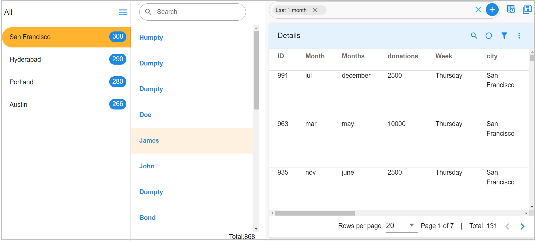
3.10.2 3-Column Navigator with Report Definition
In this example, tree_detail is configured using a report_definition, allowing for custom columns, pivoting, and richer UI representation.
tree_detail can be configured using a report_definition, which supports custom columns, pivoting, and richer UI representation, where the custom_columns define how values are mapped into the second column of the 3-column navigator.
Supported Custom Columns
| Field | Purpose |
|---|---|
label1 |
Main title text (primary label). |
label2 |
Secondary text (can appear as right-side badge or secondary label). |
description |
Extra descriptive text (often displayed under label1). |
{
  "name": "navigator_test_pivot",
  "label": "Navigator",
  "description": "Navigator",
  "enabled": true,
  "dashboard_style": "auto",
  "dashboard_type": "template",
  "live_edit": true,
  "short_label": "Stack",
  "context_label_id": "stack_name",
  "dashboard_folder": "Default",
  "version": "23.10.02.1",
  "dashboard_filters": {
    "time_filter": true,
    "default_time_filter_labels": [
      "All Time"
    ]
  },
  "navigation_dashboards": {
    "tree_data": {
      "column_name": "city",
      "pstream_name": "main_enhanced",
      "include_icon_url": false,
      "cfxql_query": "timestamp is after -720d "
    },
    "tree_detail": {
      "report_definition": {
        "title": "Mock Data",
        "widget_type": "tabular",
        "cfxql_query": "timestamp is after -720d",
        "stream": "main_enhanced",
        "min_width": 12,
        "height": 6,
        "max_width": 12,
        "custom_columns": [
          {
            "id": "label1",
            "expr": "str(name)"
          },
          {
            "id": "label2",
            "expr": "str(city)"
          },
          {
            "id": "description",
            "expr": "str(donations)"
          }
        ],
        "columns": {
          "name": "Name",
          "city": "city",
          "donations": "donations"
        },
        "pivot": {
          "pivot_type": "advanced",
          "group_by": [
            "name",
            "city",
            "donations"
          ],
          "series": [
            {
              "column": "name",
              "agg": "cardinality"
            }
          ]
        }
      }
    },
    "showNodeIcon": false,
    "showSearchBox": true,
    "autoCollapse": false,
    "collapsedByDefault": true
  },
  "dashboard_sections": [
    {
      "title": "Node Details",
      "widgets": [
        {
          "title": "Details",
          "widget_type": "tabular",
          "stream": "main_enhanced",
          "max_width": 12,
          "height": 8,
          "min_width": 12,
          "widget_id": "cc9a9626"
        }
      ]
    }
  ],
  "saved_time": "2025-08-26T05:10:04.518248"
}
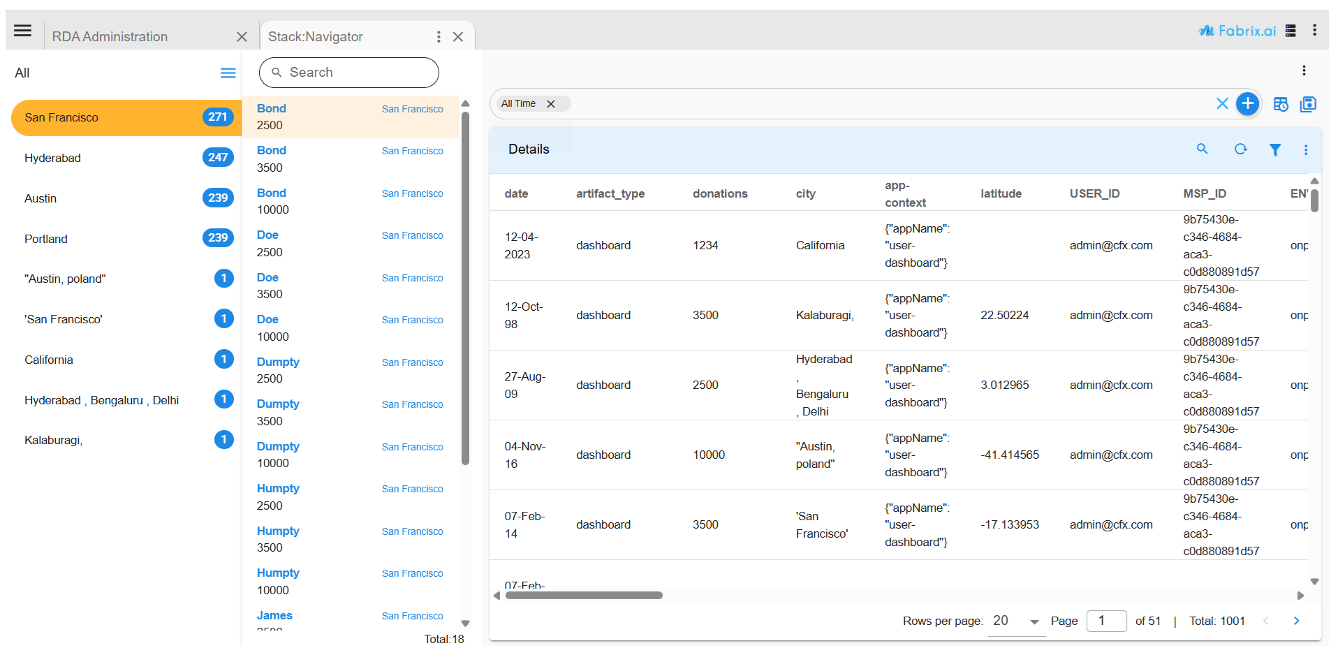
Key Difference Between the Two Approaches
| Regular Definition (3.10.1) | Report Definition (3.10.2) |
|---|---|
Uses display_column and pstream_name. |
Uses a full report_definition. |
| Simpler, best for straightforward hierarchies. | Supports custom columns, pivoting, and advanced UI customization. |
3.11 Shaded Chart
Please refer the below configuration parameter table which are used to configure Shaded Chart / widget within the dashboard.
Note
This chart/widget is only specific to Machine Learning Data & not for Generic Use
Parameter Name |
Mandatory | Description |
|---|---|---|
title |
yes | Specify the label for the Shaded Chart. |
widget_type |
yes | Specify the chart / widget type. i.e. shaded_chart_multisource |
stream |
yes | Specify the persistent stream |
chart properties |
yes | chartProperties defines the representation of data using Yaxis, Xaxis & Various other Combinations like zooming,color etc... |
downsample |
no | if set to true chart will downsample the number of datapoints maintaining overall pattern of data else plot entire data |
baseline_column |
yes | column name representing actual data |
anomalies_column |
yes | column name representing anomaly values |
predicted_column |
yes | column name representing predicted values by the model |
predicted_anomalies |
yes | column name representing predicted anomaly values by the model |
upperBound_column |
yes | column name representing upper bound values |
lowerBound_column |
yes | column name representing lower bound values |
show-markers |
no | if set to true charts will show an yellow vertical line which denotes Prediction start time |
type |
yes | This attribute accepts two types of data train&predict train: refers to historical trained data source & predict: refers to live data source that contains live data and live anomalies |
ts_column |
yes | Specify the timestamp column name within the selected persistent stream. It is optional when dataset is used. |
Below is a sample configuration of Shaded Chart / Widget.
{
  "widget_type": "shaded_chart_multisource",
  "title": "Forecasting and Anomaly Detection",
  "show-markers": true,
  "max_width": 12,
  "min_width": 12,
  "height": 8,
  "chartProperties": {
    "yAxisLabel": "Value",
    "xAxisLabel": "Time"
  },
  "sources": [
    {
      "type": "train",
      "downsample": false,
      "stream": "regression-train-output",
      "ts_column": "timestamp",
      "baseline_column": "baseline",
      "anomalies_column": "anomalies",
      "predicted_column": "predicted",
      "predicted_anomalies": "predicted_anomalies",
      "upperBound_column": "upperBound",
      "lowerBound_column": "lowerBound",
      "duration_hours": 1000000,
      "synchronized-group": 0
    },
    {
      "type": "predict",
      "downsample": false,
      "stream": "regression-live-output",
      "ts_column": "live_timestamp",
      "baseline_column": "baseline",
      "anomalies_column": "anomaly",
      "predicted_column": "predicted",
      "predicted_anomalies": "predicted_anomalies",
      "upperBound_column": "upperBound",
      "lowerBound_column": "lowerBound",
      "duration_hours": 1000000,
      "synchronized-group": 0
    }
  ],
  "widget_id": "7a134625"
}
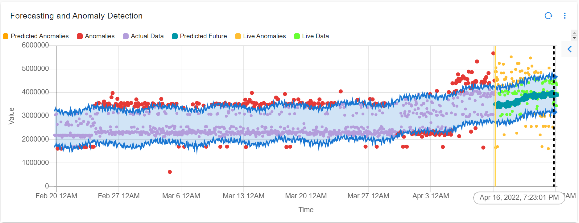
{
  "widget_type": "shaded_chart_multisource",
  "title": "Forecasting and Anomaly Detection (Memory Usage - 10.95.125.90)",
  "show-markers": true,
  "max_width": 12,
  "min_width": 12,
  "height": 8,
  "chartProperties": {
    "yAxisLabel": "Memory Usage (bytes)",
    "xAxisLabel": "Time"
  },
  "sources": [
    {
      "type": "train",
      "downsample": false,
      "stream": "regression-train-output",
      "extra_filter": "status is 'Success'",
      "ts_column": "timestamp",
      "baseline_column": "baseline",
      "anomalies_column": "anomalies",
      "predicted_column": "predicted",
      "predicted_anomalies": "predicted_anomalies",
      "upperBound_column": "upperBound",
      "lowerBound_column": "lowerBound",
      "duration_hours": 1000000,
      "synchronized-group": 0
    },
    {
      "type": "predict",
      "downsample": false,
      "stream": "regression-live-output",
      "extra_filter": "status is 'Success'",
      "ts_column": "live_timestamp",
      "baseline_column": "baseline",
      "anomalies_column": "anomaly",
      "predicted_column": "predicted",
      "predicted_anomalies": "predicted_anomalies",
      "upperBound_column": "upperBound",
      "lowerBound_column": "lowerBound",
      "duration_hours": 1000000,
      "synchronized-group": 0
    }
  ],
  "widget_id": "7a134625"
}
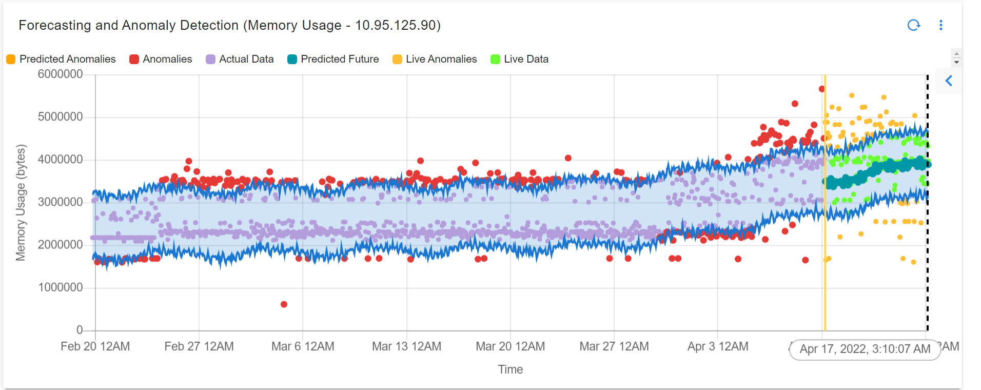
3.12 Label Chart
This widget can be used as a label Chart inside the dashboard section.
Please refer the below configuration parameter table which are used to configure Label Chart widget within the dashboard.
Parameter Name |
Mandatory | Description |
|---|---|---|
label |
yes | Specify the content in the html format ex.heading in <h1> to <h6> |
widget_type |
yes | Specify the widget_type as label |
{
  "widget_type": "label",
  "label": "<div style='text-align:center;width:100%;'><h1><a style='text-decoration:none;color:#0066ff;' target='_blank'> Welcome to RDAF Community </a></h1></div>"
}
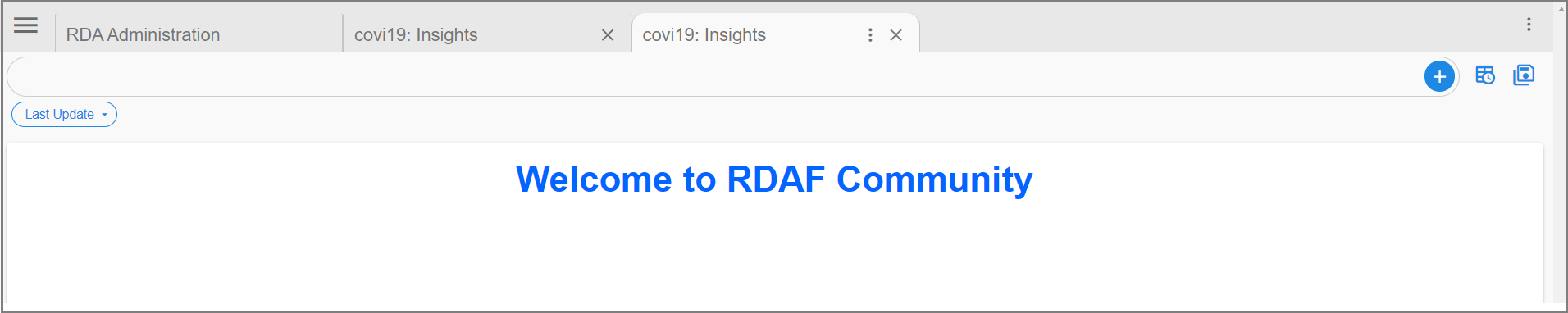
{
  "widget_type": "label",
  "min_width": 4,
  "height": 3,
  "max_width": 4,
  "sorting": [
    {
      "endTime": "desc"
    }
  ],
  "label": "{% set all_latest_data = {} %}\r\n{% for latest in latest_end_time %}\r\n    {% set last_updated_time = latest.get(\"label\") %}\r\n    {% set _ = all_latest_data.update({ \"latest\": last_updated_time }) or \"\" %}\r\n{% endfor %}\r\n\r\n<br><br> <center><h4> Last Collected at </h4></center><br><center><h3>{{all_latest_data.get(\"latest\")}}</h3></center>",
  "segments": [
    {
      "stream": "main",
      "variable": "latest_end_time",
      "ts_column": "timestamp",
      "agg": "value_count",
      "group_by": "endTime",
      "column": "city"
    }
  ]
}

3.13 Connectivity Chart
The objective is to create a connected graph illustrating the interrelationships among various columns. Upon mouseover, additional details should be displayed. Clicking or hovering should highlight both incoming and outgoing links. In the case of numerous columns, a horizontal scroll bar should be available for navigation.
Note
This is not network connectivity or topology.
Please refer the below configuration parameter table which are used to configure Connectivity Chart
Parameter Name |
Mandatory | Description |
|---|---|---|
title |
yes | Specify the label for the Connectivity Chart. |
widget_type |
yes | Specify the chart / widget type. i.e. connectivity_chart |
stream |
no | Specify the persistent stream. |
columns |
yes | Specify one or more columns / fields to be shown in the Connectivity Chart. This parameter expects group_by,limit(default is 10),label& color-map. Here limit,color-map is optional |
agg |
yes | Specify the aggregation function. Supported values are sum, min and max |
agg_column |
yes | Specify the column name that has the values to apply aggregate function on. |
min_width |
no | Specify the chart / widget's minimum width size, range is 0 to 12. |
height |
no | Specify the chart / widget's height, range is 0 to n. |
max_width |
no | Specify the chart / widget's maximum width size, range is 0 to 12. |
ts_column |
yes | Specify the timestamp column name within the selected persistent stream. |
widget_id |
no | Every widget will be represented with Unique id at the end, Its Autogenerated if not provided |
extra_filter |
no | Use this parameter to filter the data from from one or more selected field(s). It supports CFXQL query format. |
{
  "widget_type": "connectivity_chart",
  "title": "People",
  "stream": "main",
  "ts_column": "timestamp",
  "min_width": 12,
  "max_width": 12,
  "height": 8,
  "agg": "sum",
  "agg_column": "count_",
  "columns": [
    {
      "group_by": "city",
      "label": "For City",
      "color-map": {
        "Portland": [
          "#ef5350",
          "#ffffff"
        ],
        "San Francisco": [
          "#FF9800",
          "#ffffff"
        ],
        "Austin": [
          "#8BC34A",
          "#ffffff"
        ],
        "Hyderabad": [
          "#1E88E5",
          "#ffffff"
        ]
      }
    },
    {
      "group_by": "name",
      "label": "For Name",
      "color-map": {
        "James": [
          "#ef5350",
          "#ffffff"
        ]
      }
    },
    {
      "group_by": "age",
      "label": "For Age"
    },
    {
      "group_by": "donation",
      "label": "For Donation"
    }
  ]
}
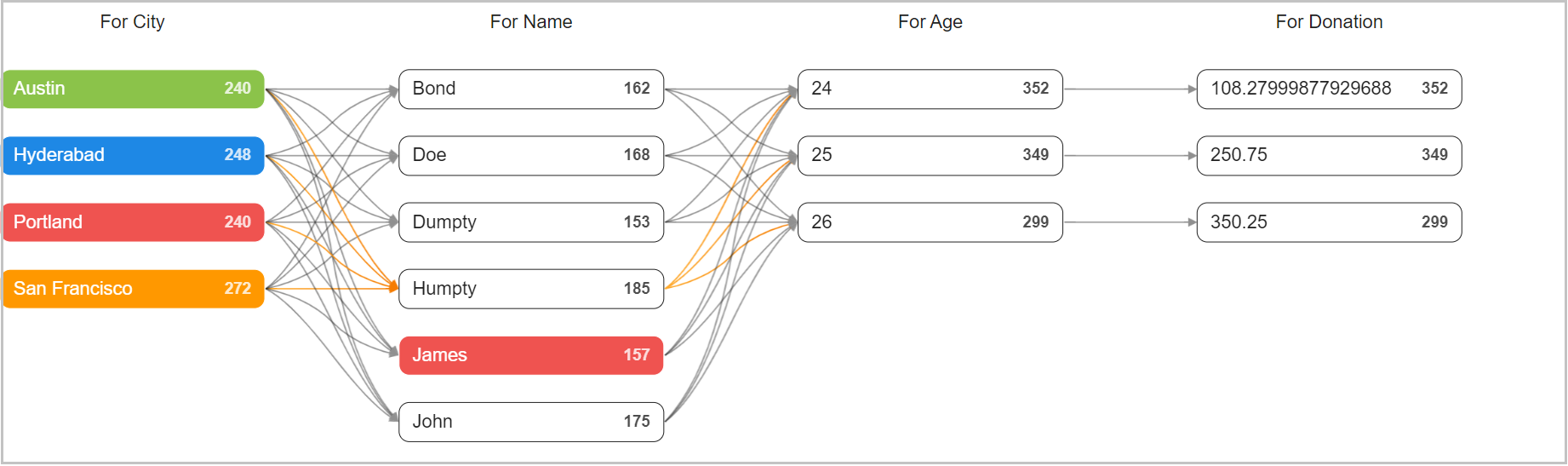
3.14 Markdown
This Widget will parse Markdown text and display it as an HTML-like view. This functionality is intended to facilitate the presentation of documentation . The widget should specifically support Markdown content sourced from rda_object(Object Store from artifacts) for integration within the dashboard. This feature will enhance the user experience by providing neatly formatted documentation within the Dashboard interface.
Prerequisites
Step-1: Go to Main Menu --> Configuration --> RDA Administration --> Object Store
Step-2: Click on Upload to update rda object.
Please refer the below configuration parameter table which are used to configure Markdown Widget
Parameter Name |
Mandatory | Description |
|---|---|---|
| widget_type | yes | markdown |
| folder | yes | Folder name defined in rda_object(Object Store from artifacts) |
| objectName | yes | Object name defined in rda_object(Object Store from artifacts) |
Below is a sample configuration of Markdown / Widget.
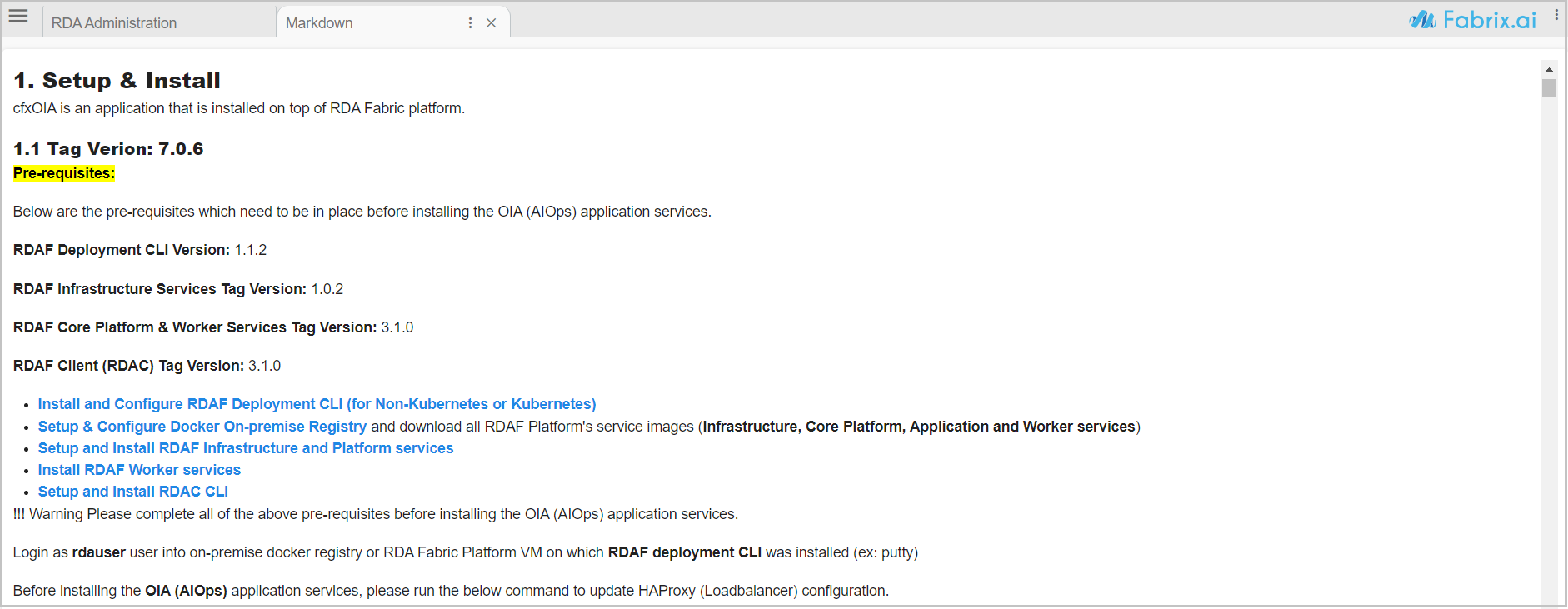
3.15 Codeblock Widget
The Code Block widget allows users to display formatted code or data dynamically from various sources, including:
-
A specified stream.
-
A particular column within a stream.
-
A file stored in MinIO.
-
A Hardcoded Content
This widget provides flexibility for developers and analysts who need to visualize structured data, logs, or script outputs directly within the dashboard.
Parameter Name |
Mandatory | Description |
|---|---|---|
widget_type |
yes | Specify the chart / widget type. i.e. codeblock. |
title |
yes | The display title of the widget. |
stream |
(optional) | (Optional) The stream from which data should be loaded. |
lang |
(optional) | (Optional) The language for syntax highlighting (e.g., json, python, shell). |
minio_object_path |
(optional) | (Optional) Path to the MinIO object containing data. |
duration_hours |
(optional) | (Optional) The time range (in hours) for fetching data from the stream. |
extra_filter |
(optional) | (Optional) Additional filtering conditions for stream data. |
content |
(optional) | (Optional) Directly provided content to be displayed in the code block. |
3.15.1 Loading Data from a Stream
This configuration loads data from the main stream and formats it as JSON.
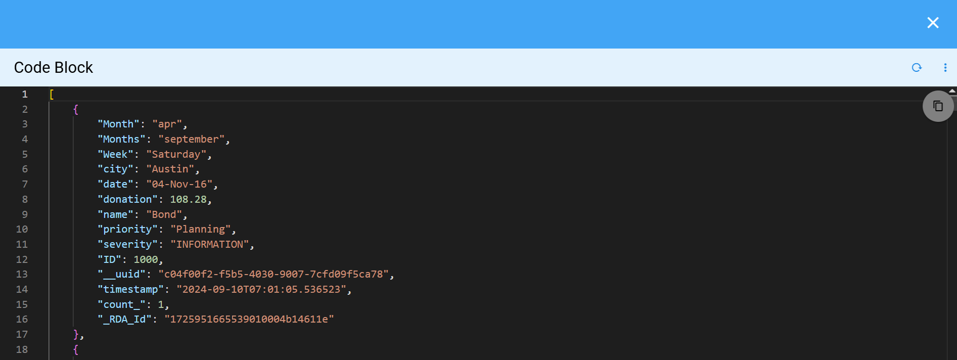
3.15.2 Reading a File from MinIO
This configuration loads a JSON file from MinIO at the specified path.
{
    "widget_type": "codeblock",
    "title": "Command Builder Output",
    "minio_object_path": "bundle_to_pack/converted_bundles.json"
}
3.15.3 Applying Filters to Stream Data
This example fetches data from the main stream, applies a filter to exclude None values in the city column, and retrieves data from the past 1080 hours (45 days).
{
    "widget_type": "codeblock",
    "title": "Output Stream",
    "duration_hours": 1080,
    "extra_filter": "city is not None GET city",
    "stream": "main"
}
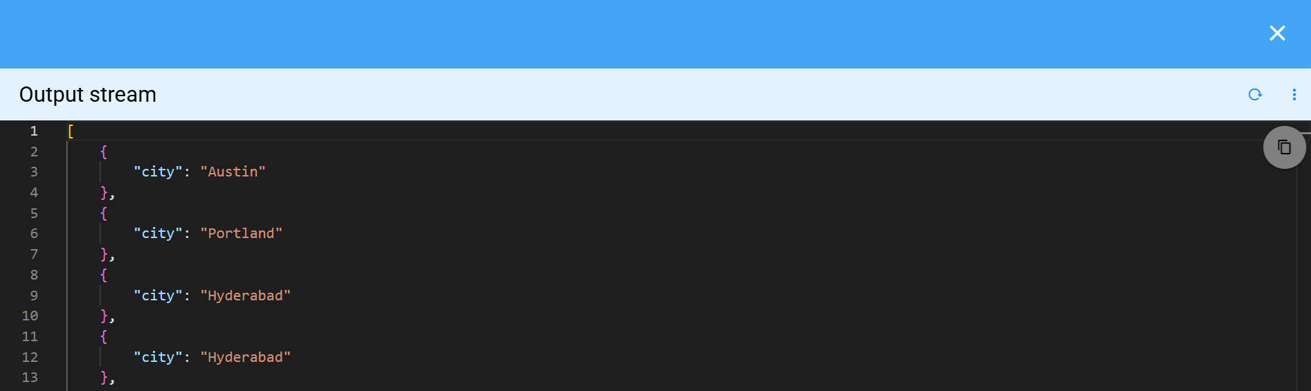
3.15.4 Displaying Direct Content
This example displays a predefined message directly inside the code block without relying on external data sources.
{
    "widget_type": "codeblock",
    "title": "Code Block",
    "content": "Welcome to Fabrix.ai ( CloudFabrix )"
}
3.16 Gauge Widget
Please refer the below configuration parameter table which is used to configure a Gauge Chart within the dashboard.
Parameter Name |
Mandatory | Description |
|---|---|---|
| label | no | Adds a label beneath the gauge, often used to describe the metric or context. |
Please refer the below chartProperties which are used to configure a Gauge chart within the dashboard.
Parameter Name |
Mandatory | Description |
|---|---|---|
minValue |
Yes | The minimum value for the gauge. This should be a positive number. |
maxValue |
Yes | The maximum value for the gauge. This should be a positive number. |
isSingleZoned |
Yes | Indicates whether the widget should display a single background zone or multiple zones. It should be true in the single zone configuration & false under multi zone configuration |
bgZones |
Yes | An array of objects with each object containing from, to and color properties for each zone. The Filled gauge color changes in reference on these array of objects dynamically based on its value in case of single zone case and for the multi-zone case, this array defines the different segments that appear on the gauge. There can be multiple objects in this array. 1. bgColor(optional): A string or a hex value for the color. 2. from(required): The percentage or the value from where the zone starts. The decision (to use percentage or value) is based on the bgZoneMode property. If providing percentage, this should be a number between 0 and 100 and if providing a value it should be a number between the minvalue and the maxValue 3. to(required): The percentage or the value where the zone ends. The decision (to use percentage or value) is based on the bgZoneMode property. If providing percentage, this should be a number between 0 and 100 and if providing a value it should be a number between the minvalue and the maxValueNote: If isSingleZoned is set to true, bgZones is optional. If its set to false, bgZones is mandatory. |
minLabel |
no | The label displayed on the bottom-left corner of the gauge. Examples: “0%”, “Low”, or “Min”. |
maxLabel |
no | The label displayed on the bottom-right corner of the gauge. Examples: “100%”, “High”, or Max”. |
arcWidth |
no | The thickness of the gauge’s arc. This should be a positive number from 1 to 100. Defaults to 50 if not found. |
valueFontSize |
no | Font size (in px) for the actual value of the gauge (from gaugeData), displayed at the bottom.Defaults to 45px if not provided. |
showPointer |
no | Boolean that controls whether the pointer/needle is displayed. Hidden by default. |
pointer |
no | An object containing the configurations for the needle. Works only when showPointer is set to true. 1. length: Determines the length of the needle. 2. strokeWidth: The width of the needle. 3. color: The color of the needle. |
bgZoneMode |
no | Determines how the zone range from the bgZones property is interpreted. It accepts either 'percent' (default) or 'value'. |
{
  "title": "Gauge Widget",
  "widget_type": "gauge_widget",
  "stream": "rda_test_pstream",
  "ts_column": "timestamp",
  "group_by": [
    "dashboard_folder"
  ],
  "column": "count_",
  "agg": "sum",
  "min_width": 6,
  "height": 6,
  "max_width": 6,
  "refreshRequired": true,
  "chartProperties": {
        "minValue": 100,
        "maxValue": 300,
        "minLabel": "100",
        "maxLabel": "300",
        "isSingleZoned": true
      },
}
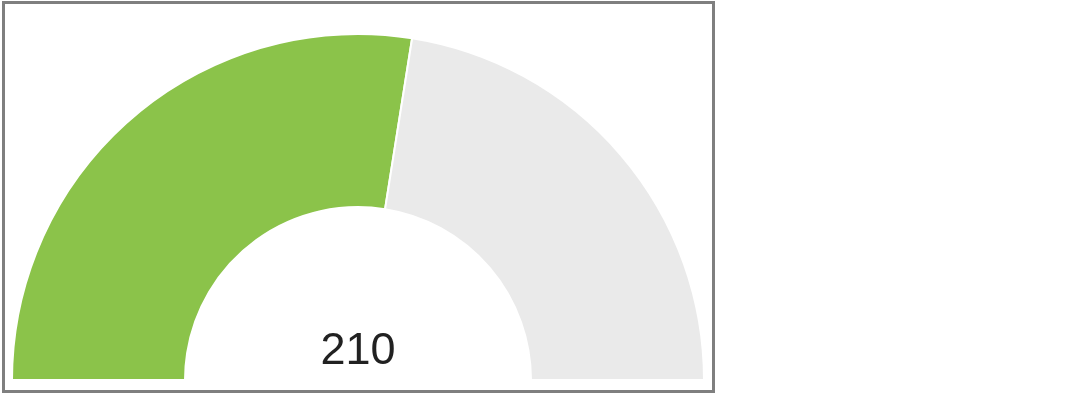
{
  "title": "Gauge Widget",
  "widget_type": "gauge_widget",
  "stream": "rda_test_pstream",
  "ts_column": "timestamp",
  "group_by": [
    "dashboard_folder"
  ],
  "column": "count_",
  "agg": "sum",
  "min_width": 6,
  "height": 6,
  "max_width": 6,
  "refreshRequired": true,
  "label": "Gauge Chart",
  "chartProperties": {
    "isSingleZoned": false,
    "showPointer": true,
    "pointer": {
      "length": 85,
      "strokeWidth": 25,
      "color": "red"
    },
    "minLabel": "0",
    "maxLabel": "100",
    "minValue": 0,
    "maxValue": 100,
    "arcWidth": 10,
    "valueFontSize": 30,
    "bgZonesMode": "percent",
    "bgZones": [
      {
        "from": 0,
        "to": 20,
        "bgColor": "teal",
        "label": "N-1"
      },
      {
        "from": 21,
        "to": 40,
        "bgColor": "yellow",
        "label": "N-2"
      },
      {
        "from": 41,
        "to": 60,
        "bgColor": "orange",
        "label": "N-3"
      },
      {
        "from": 61,
        "to": 85,
        "bgColor": "lightgreen",
        "label": "N-4"
      },
      {
        "from": 86,
        "to": 100,
        "bgColor": "green",
        "label": "N-5"
      }
    ]
  }
}
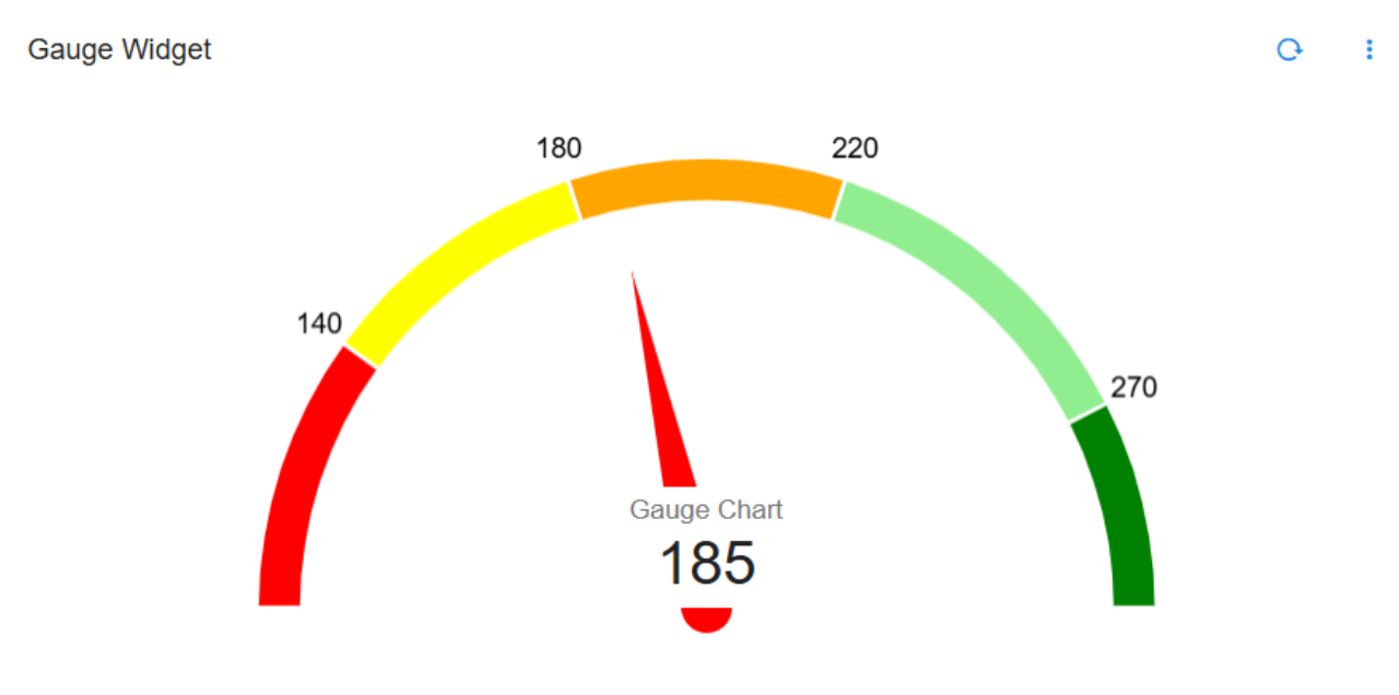
3.16.1 Gauge Chart with Formatting Options
Below are the sample configurations of Gauge Chart with Formatting Options.
{
    "title": "Gauge Widget",
    "widget_type": "gauge_widget",
    "stream": "rda_artifact_dependencies",
    "ts_column": "timestamp",
    "column": "count_",
    "agg": "sum",
    "min_width": 6,
    "height": 6,
    "max_width": 6,
    "refreshRequired": true,
    "timebased": false,
    "formatting": {
        "style": "unit",
        "unit": "percent",
        "signDisplay": "always"
    },
    ...
}
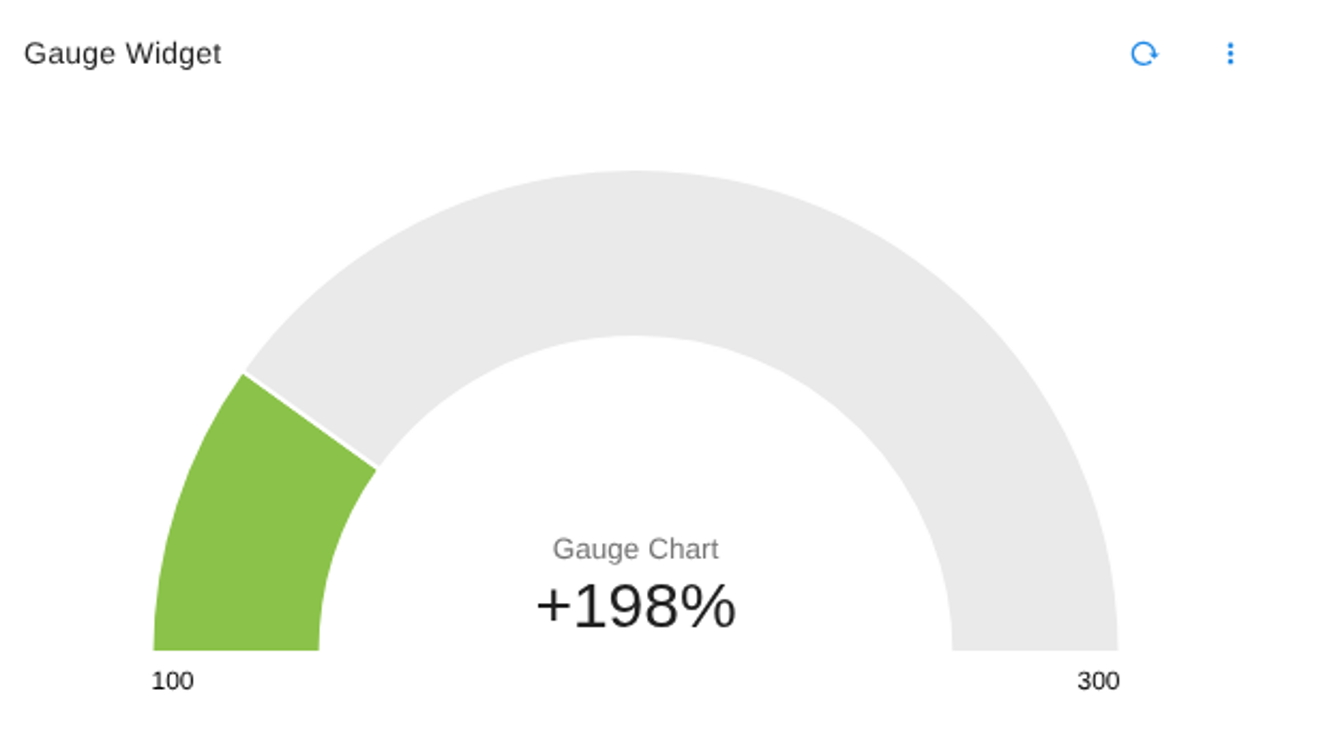
{
    "title": "Gauge Widget",
    "widget_type": "gauge_widget",
    "stream": "rda_artifact_dependencies",
    "ts_column": "timestamp",
    "column": "count_",
    "agg": "sum",
    "min_width": 6,
    "height": 6,
    "max_width": 6,
    "refreshRequired": true,
    "timebased": false,
    "formatting": {
        "style": "currency",
        "currency": "USD"
    },
    ...
}
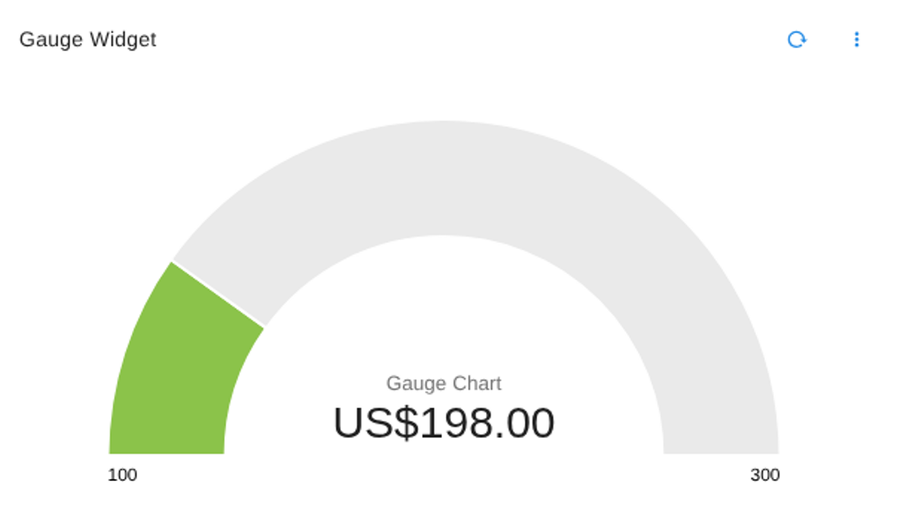
3.17 Card Report
Please refer the below configuration parameter table which are used to configure Card Report
| Parameter | Mandatory | Description |
|---|---|---|
title |
yes | Specify the label for the card report. |
widget_type |
yes | Specify the chart/widget type, e.g. portal_card. |
widget_template |
no | Cards are rendered with the provided widget template. Note: Either widget_template or html_template is required. |
html_template |
no | Cards are rendered with the provided HTML template. Note: Either html_template or widget_template is required. |
uiOptions |
no | UI-related config options. Card appearance can be customized under uiOptions.cardOptions.cardStyles using CSS-style properties. (Refer section 1.1) |
min_width |
no | Specify the chart/widget's minimum width (range: 0 to 12). |
height |
no | Specify the chart/widget's height (range: 0 to n). |
max_width |
no | Specify the chart/widget's maximum width (range: 0 to 12). |
widget_id |
no | Unique id for the widget; autogenerated if not provided. |
Below is the sample configuration
{
    "title": "Organizations",
    "widget_type": "portal_card",
    "widget_template": "saas/cfx-label-description-action-cards",
    "reportId": "oia.organizations.list.tabular",
    "height": 10,
    "min_wdith": 12,
    "exportSupported": false,
    "widget_id": "bb1dd6c0"
}
3.17.1 Card Report with Custom Styles
{
    "title": "Projects",
    "widget_type": "portal_card",
    "html_template": "attachment://card_template",
    "reportId": "aiprojects.list.tabular",
    "height": 10,
    "min_wdith": 12,
    "exportSupported": false,
    "widget_id": "bb1dd6c0",
    "uiOptions": {
        "cardOptions": {
            "cardStyles": {
                "borderLeft": "3px solid #1B7AD6",
                "borderRadius": "6px",
                "height": "120px",
                "width": "500px"
            }
        }
    }
}
<div>{%raw%}
    <div style="font-weight:bold; font-size:1.2em; margin-bottom:6px;">
    {{ data.name }}
  </div>
   <div style="margin-bottom:10px; font-size:0.95em;">
    {{ data.description }}
  </div>
    <div style="margin-bottom:10px; font-size:0.9em;">
    <b>Type:</b> <span>{{ data.type }}</span>
  </div>
   <div style="display:flex; align-items:center; font-size:0.95em;">
    <span
      :style="{
        display:'inline-block',
        width:'12px',
        height:'12px',
        marginRight:'8px',
        borderRadius:'50%',
        backgroundColor: data.enabled == 'Yes' ? 'green' : 'grey'
      }">
    </span>
    <span><b>Enabled:</b> {{ data.enabled }}</span>
  </div>
{%endraw%}</div>
4. Features
4.1 Library
By using a library, Once a widget is specified it can be called any number of times. Any dashboard can be a widget library and can import widgets from any library. This approach helps users to reduce the time spent creating the same widget multiple times in various dashboards.
Please refer the below configuration parameter table which are used to configure Library within the dashboard.
Parameter Name |
Mandatory | Description |
|---|---|---|
name |
yes | Specify name of the Dashboard which need to be added as a page. |
label |
yes | Specify the label for Dashboard page. |
title |
yes | Specify the title |
stream |
no | Specify the persistent stream. Note: Either of persistent stream or dataset parameter is needed. |
library |
yes | Any Dashboard can be a widget library. Note: Any other dashboard can import any widget from any library |
import |
no | from (the library dashboard name) and as (rename that dashboard temporary as) ex.from: "covi-library-1", as: "lib1" |
extends |
yes | will get the name of library within the definition or from other dashboard ex. "extends": "self:covi_count" / "extends": "lib1:covi_counter" Note: self is used when we call the library within the definition & name of the library if its imported |
Library Defined
Below is a sample configuration of Library / Widget.
{
  "name": "covi-library-1",
  "label": "Test Library for Sample Widgets",
  "enabled": "false",
  "description": "Sample library",
  "library": {
    "widgets": {
      "covi_counter": {
        "title": "Deaths",
        "min_width": 6,
        "height": 4,
        "max_width": 6,
        "widget_type": "custom_counter",
        "formatter": "DescriptiveCountFormatter",
        "stream": "covid19",
        "ts_column": "timestamp",
        "duration_hours": 9600,
        "sparkline": {
          "interval": "360h"
        },
        "style": {
          "color-list": [
            "#8e24aa"
          ]
        },
        "column": "Deaths",
        "agg": "sum"
      }
    }
  }

}
Library Being Called from the above Definition
Below is a sample configuration of Library Being Called from the above Definition / Widget.
{
  "name": "covi-library-2",
  "label": "Library Widget Covid",
  "description": "Covid data",
  "enabled": "false",
  "dashboard_type": "dashboard",
  "dashboard_folder": "Default",
  "import": [
    {
      "from": "covi-library-1",
      "as": "lib1"
    }
  ],
  "dashboard_sections": [
    {
      "title": "SECTION 1",
      "show_filter": true,
      "widgets": [
        {
          "extends": "self:covi_count",
          "widget_id": "e1201b84"
        },
        {
          "extends": "lib1:covi_counter",
          "widget_id": "c3ac1d59"
        }
      ]
    }
  ],
  "library": {
    "widgets": {
      "covi_count": {
        "title": "Confirmed",
        "min_width": 6,
        "height": 4,
        "max_width": 6,
        "widget_type": "custom_counter",
        "formatter": "DescriptiveCountFormatter",
        "stream": "covid19",
        "ts_column": "timestamp",
        "duration_hours": 8990,
        "sparkline": {
          "interval": "360h"
        },
        "style": {
          "color-list": [
            "#008000"
          ]
        },
        "column": "Confirmed",
        "agg": "sum"
      }
    }
  }
}
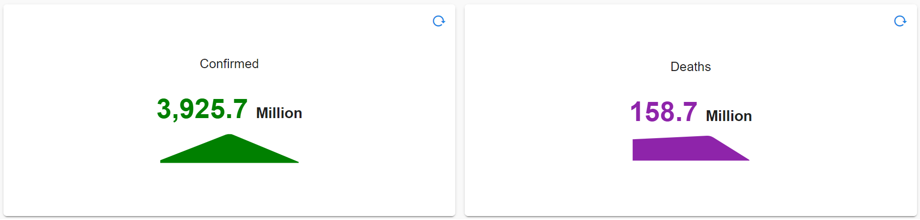
4.2 Stream Query Mapping
This feature enables to mix and match data from different PStreams into a single Dashboard.
Even though you can already do that today, when filters are applied, usually it breaks several widgets to avoid it we have introduced the new feature which helps break free connectivity within the dashboard
Please refer the below configuration parameter table which are used to configure Stream Query Mapping
Parameter Name |
Mandatory | Description |
|---|---|---|
stream |
yes | Name of the stream which needs to be passed |
Note
When specifying a replacement column, both columns must be of same type
Below is a sample configuration of Stream Query Mapping / Widget
"stream_query_mapping": {
        "oia-incidents-stream": {
            "timestamp": "i_created_ts",
            "a_severity": null
        },
        "oia-alerts-stream": {
            "timestamp": "a_created_ts",
            "i_priority_label": null
        }
    }
Info
By adding above section to any dashboard, it will alter queries sent to OpenSearch based which stream it is querying. If filter contains column "timestamp", replace it with i_created_ts If the filter contains a_severity column skip that specific filter in the query (rest of the conditions will still apply)
{
  "name": "oia-trends----rv",
  "label": "Trends",
  "description": "Trends",
  "version": "23.8.9",
  "enabled": true,
  "debug": true,
  "dashboard_style": "auto",
  "dashboard_type": "template",
  "stream_query_mapping": {
    "oia-incidents-stream": {
      "timestamp": "i_created_ts",
      "a_severity": null
    },
    "oia-alerts-stream": {
      "timestamp": "a_created_ts",
      "i_priority_label": null
    }
  },
  "dashboard_filters": {
    "time_filter": true,
    "default_time_filter_non_removable": true,
    "show_default_time_filter": true,
    "additional_datetime_column_filters": [
      {
        "id": "timestamp",
        "label": "Timestamp"
      }
    ],
    "default_time_filter_labels": [
      "Last 24 hours"
    ],
    "group_filters": [
      {
        "stream": "oia-alerts-stream",
        "title": "Source",
        "group_by": [
          "a_source_systemname"
        ],
        "ts_column": "a_updated_ts",
        "agg": "value_count",
        "column": "a_id",
        "type": "str"
      }
    ]
  },
  "dashboard_sections": [
    {
      "title": "Trends",
      "show_filter": true,
      "widgets": [
        {
          "widget_type": "timeseries",
          "title": "Alert Trend",
          "stream": "oia-alerts-stream",
          "min_width": 9,
          "height": 3,
          "max_width": 9,
          "interval": "auto",
          "ts_column": "a_created_ts",
          "fixTimeWindow": true,
          "group_by": [
            "a_severity"
          ],
          "alert_markers": [{
            "stream": "oia-incidents-stream",
            "ts_column": "i_created_ts",
            "message_column": "i_summary",
            "extra_filter": "i_priority_label is 'Critical'",
            "severity_column": "i_priority_label"
          }
          ],
          "series_spec": [
            {
              "agg": "sum",
              "column": "count_",
              "type": "int",
              "label": "Alert Count"
            }
          ],
          "chartProperties": {
            "yAxisLabel": "Alert Count",
            "xAxisLabel": null,
            "legendLocation": "right",
            "options": {
              "elements": {
                "line": {
                  "borderWidth": 1
                },
                "point": {
                  "radius": 0,
                  "hitRadius": 3,
                  "hoverRadius": 2
                }
              }
            }
          },
          "widget_id": "e146eb95"
        },
        {
          "widget_type": "timeseries multi markers",
          "title": "Incident Trend",
          "stream": "oia-incidents-stream",
          "min_width": 9,
          "height": 3,
          "max_width": 9,
          "interval": "auto",
          "ts_column": "timestamp",
          "fixTimeWindow": true,
          "group_by": [
            "i_priority_label"
          ],
          "alert_markers": [
            {
              "stream": "oia-alerts-stream",
              "ts_column": "timestamp",
              "message_column": "a_message",
              "extra_filter": "a_severity is 'CRITICAL'",
              "severity_column": "a_severity"
            }
          ],
          "series_spec": [
            {
              "agg": "sum",
              "column": "count_",
              "type": "int",
              "label": "Incident Count"
            }
          ],
          "chartProperties": {
            "yAxisLabel": "Incident Count",
            "xAxisLabel": null,
            "legendLocation": "right",
            "options": {
              "elements": {
                "line": {
                  "borderWidth": 1
                },
                "point": {
                  "radius": 0,
                  "hitRadius": 3,
                  "hoverRadius": 2
                }
              }
            }
          },
          "widget_id": "17004a8e"
        }
      ]
    }
  ],
  "saved_time": "2023-12-13T04:47:16.762883"
}
4.3 Generating Dashboard using Pstream
This feature enables the user to take data and load a dashboard from the stream specified in less time.
Using RDA Portal
Step-1: Login into RDA Fabric platform as a MSP Admin user.
Step-2: Go to Main Menu --> Configuration --> RDA Administration --> Persistent Stream
Step-3: Click on Menu button from the stream name and click Generate Dashboard.
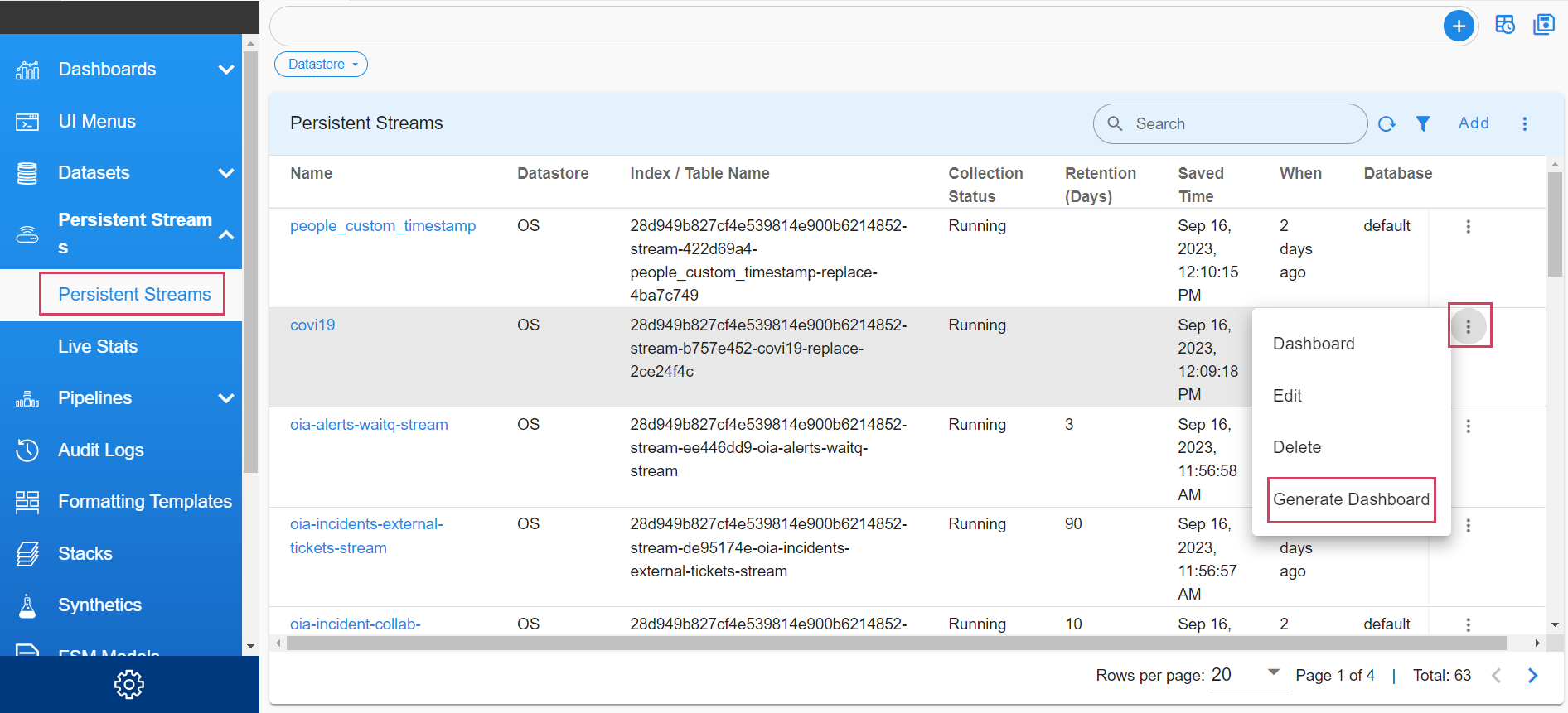
Step-4: Fill the Dashboard label and Dashboard folder, change the dashboard name if required.
Step-5: Need to select Publish Dashboard option to publish the generated dashboard. If the dashboard with name already exists you can select Overwrite Existing Dashboard option to overwrite existing dashboard
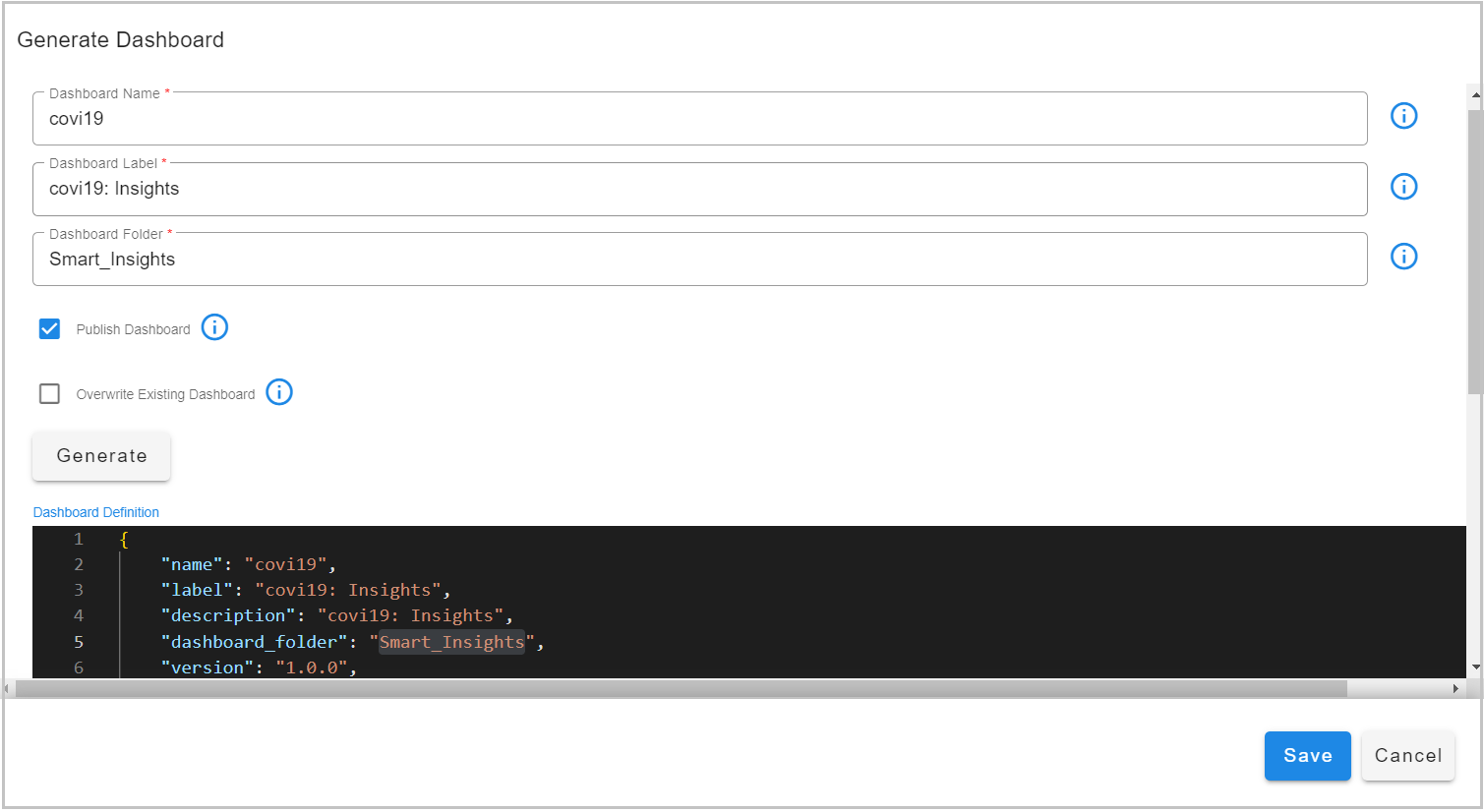
Using Command
Login to ssh session, run the below command
4.4 Generating Dashboard using Attachments
What is Dashboard Generator?
The Dashboard Generator is a powerful feature that lets you create dynamic dashboards that automatically adapt and change based on different conditions. Instead of creating a static dashboard with fixed widgets, you can write a template that generates widgets, sections, and filters on-the-fly when the dashboard is loaded.
Think of it like a smart template: you define the rules for how your dashboard should be built, and the system automatically creates the dashboard components based on those rules and the current context (like which devices are available, what data streams exist, or what parameters are provided).
Why Use Dashboard Generator?
Here are some common scenarios where Dashboard Generator is incredibly useful:
-
Multiple Devices: You want to create a dashboard that shows metrics for 10 different devices, but you don't want to manually create 10 identical widgets. The generator can create them automatically.
-
Dynamic Lists: Your dashboard needs to show widgets for a list of items that changes over time (like new servers being added). The generator adapts automatically.
-
Conditional Content: You want to show different dashboard sections depending on what data is available or what environment you're in.
-
Reusable Templates: You have a dashboard template that works for different customers or sites, but needs slight customization for each one.
How It Works - Simple Explanation
When user creates a dashboard with a Dashboard Generator, here's what happens:
- A template is defined - A recipe describing how the dashboard should be built.
- The system loads the template - It can be stored in the dashboard itself or in a separate location.
- The template runs - It uses the current context (available data, parameters, etc.) to decide what to create.
- The dashboard is built - Widgets, sections, and filters are automatically added or modified.
- The dashboard is displayed - The final result is shown, customized for the current context.
The best part? This happens automatically every time the dashboard is loaded, so it always reflects the current state of your data and environment.
Getting Started
Step 1: Add the Dashboard Generator Section
Add a dashboard_generator section to the dashboard JSON to indicate the dashboard should use a template to generate its content.
{
  "name": "my-dynamic-dashboard",
  "label": "My Dynamic Dashboard",
  "dashboard_generator": {
    "attachment": "my_template"
  }
}
Step 2: Create Your Template
There are two options for storing the template
Option A: Store Template as an Attachment (Simple)
Embed the template directly within the dashboard JSON as an attachment.
{
  "name": "my-dynamic-dashboard",
  "dashboard_generator": {
    "attachment": "my_template"
  },
  "attachments": [
    {
      "name": "my_template",
      "value": "Your template code goes here..."
    }
  ]
}
When to use this: Good for simple templates that are specific to one dashboard.
Option B: Store Template in Object Store (Advanced)
Store your template separately and reference it by name:
{
  "name": "my-dynamic-dashboard",
  "dashboard_generator": {
    "objectName": "templates/my-dashboard-template.j2"
  }
}
When to use this: Better for complex templates that you want to reuse across multiple dashboards or maintain separately.
Important
You can only use one method - either attachment OR objectName, not both.
Understanding Templates
Templates use a special syntax that enables:
- Iterating through lists to create multiple widgets
- Applying conditional logic to determine what to display
- Accessing data and environment information
- Programmatic modification of the dashboard structure
The system supports two template languages:
Jinja2 Templates (Recommended for Beginners)
Jinja2 uses simple, readable syntax:
- {{ }} - For displaying values or executing expressions
- {% %} - For control structures like loops and conditions
{# Clear any existing widgets first #}
{{ dashboard["dashboard_sections"][0]["widgets"].clear() }}

{# Split the device list into individual devices #}
{% set device_list = devices.split(",") %}

{# Loop through each device and create a widget #}
{% for device in device_list %}
  {{
    dashboard["dashboard_sections"][0]["widgets"].append({
      "title": "Metrics for " + device,
      "widget_type": "timeseries",
      "stream": "my_data_stream",
      "ts_column": "timestamp",
      "min_width": 12,
      "max_width": 12,
      "height": 3,
      "extra_filter": "hostname = '" + device + "'",
      "interval": "1H",
      "series_spec": [
        {
          "column": "count_",
          "agg": "sum",
          "type": "int"
        }
      ]
    })
  }}
{% endfor %}
Mako Templates (For Advanced Users)
Mako uses Python-like syntax with <% %> for code blocks. It's more powerful but slightly more complex.
What Information Can You Use in Templates?
When your template runs, it has access to several useful pieces of information:
The Dashboard Object
The dashboard variable gives users access to the entire dashboard structure. users can:
- Add widgets: dashboard["dashboard_sections"][0]["widgets"].append({...})
- Modify sections: dashboard["dashboard_sections"].append({...})
- Change filters: dashboard["dashboard_filters"] = {...}
- Update any dashboard property
Context Variables
These are variables passed to users dashboard when it's deployed or loaded. Common examples include:
- devices - A list of device names
- site_name - The name of the current site
- severities - A list of severity levels to monitor
- available_streams - Data streams that are available
Users can use any context variables that are provided to your dashboard.
Built-in Functions
Templates have access to a set of built-in helper functions
String Operations:
- split() - Split a string into a list
- len() - Get the length of a string or list
- str() - Convert something to a string
Date and Time:
- time_now_as_dt() - Get current date and time
- utcnow() - Get current UTC time
- timedelta() - Calculate time differences
Data Operations:
- json_loads() - Parse JSON strings
- json_dumps() - Convert data to JSON
And many more! These functions help you manipulate data and create dynamic content.
Complete Example: Multi-Device Monitoring Dashboard
Let's create a complete example that shows how to build a dashboard that monitors multiple devices.
{
  "name": "multi-device-monitor",
  "label": "Multi-Device Monitor",
  "description": "Automatically monitors all specified devices",
  "dashboard_folder": "monitoring",
  "version": "1.0.0",
  "enabled": true,
  "dashboard_type": "dashboard",
  "live_edit": true,

  "dashboard_generator": {
    "attachment": "device_monitor_template"
  },

  "dashboard_filters": {
    "time_filter": true,
    "default_time_filter_labels": ["Last 24 Hours", "Last 7 Days", "All Time"]
  },

  "dashboard_sections": [
    {
      "title": "Device Metrics",
      "show_filter": true,
      "widgets": []
    }
  ],

  "attachments": [
    {
      "name": "device_monitor_template",
      "value": "YOUR TEMPLATE CODE HERE (see below)"
    }
  ]
}
Replace "YOUR TEMPLATE CODE HERE" with this template:
{# Clear any existing widgets #}
{{ dashboard["dashboard_sections"][0]["widgets"].clear() }}

{# Check if devices are provided #}
{% if devices %}
  {# Split the comma-separated device list #}
  {% set device_list = devices.split(",") %}

  {# Create a widget for each device #}
  {% for device in device_list %}
    {% set device_clean = device.strip() %}

    {# Add a timeseries widget for this device #}
    {{
      dashboard["dashboard_sections"][0]["widgets"].append({
        "title": "Metrics: " + device_clean,
        "widget_type": "timeseries",
        "stream": "syslog_stream",
        "ts_column": "timestamp",
        "min_width": 12,
        "max_width": 12,
        "height": 4,
        "extra_filter": "hostname = '" + device_clean + "'",
        "synchronized-group": 0,
        "chartProperties": {
          "yAxisLabel": "Event Count",
          "xAxisLabel": "Time",
          "mode": "lines",
          "legendLocation": "top"
        },
        "interval": "1H",
        "series_spec": [
          {
            "column": "count_",
            "agg": "sum",
            "type": "int",
            "label": "Events"
          }
        ]
      })
    }}
  {% endfor %}
{% else %}
  {# If no devices provided, show a message widget #}
  {{
    dashboard["dashboard_sections"][0]["widgets"].append({
      "title": "No Devices Configured",
      "widget_type": "text",
      "content": "Please provide a list of devices in the context variables."
    })
  }}
{% endif %}
When Users deploy or load this dashboard, provide context variables like this:
The template will automatically:
1. Split the device list
2. Create one widget for each device
3. Configure each widget to filter data for that specific device
4. Set up proper chart properties and time intervals
If you later add more devices to the list, the dashboard automatically creates widgets for them too!
Common Use Cases and Patterns
Pattern 1: Creating Widgets from a List
Scenario: You have a list of items and want one widget per item.
{% set items = item_list.split(",") %}
{% for item in items %}
  {{ dashboard["dashboard_sections"][0]["widgets"].append({
    "title": "Data for " + item.strip(),
    "widget_type": "table",
    "stream": "my_stream",
    "extra_filter": "item_name = '" + item.strip() + "'"
  }) }}
{% endfor %}
Pattern 2: Conditional Sections
Scenario: Only show a section if certain data is available.
{% if 'network_data' in available_streams %}
  {{
    dashboard["dashboard_sections"].append({
      "title": "Network Metrics",
      "show_filter": true,
      "widgets": [
        {
          "title": "Network Traffic",
          "widget_type": "timeseries",
          "stream": "network_data"
        }
      ]
    })
  }}
{% endif %}
Pattern 3: Different Content for Different Sites
Scenario: Customize dashboard based on which site it's deployed to.
{% if site_name == "production" %}
  {# Production gets more detailed widgets #}
  {{ dashboard["dashboard_sections"][0]["widgets"].append({
    "title": "Production Metrics",
    "widget_type": "timeseries",
    "height": 5
  }) }}
{% elif site_name == "staging" %}
  {# Staging gets simpler widgets #}
  {{ dashboard["dashboard_sections"][0]["widgets"].append({
    "title": "Staging Overview",
    "widget_type": "timeseries",
    "height": 3
  }) }}
{% endif %}
Pattern 4: Nested Loops
Scenario: Create widgets for combinations of items (e.g., devices × severity levels).
{% set device_list = devices.split(",") %}
{% set severity_list = severities.split(",") %}

{% for device in device_list %}
  {% for severity in severity_list %}
    {{
      dashboard["dashboard_sections"][0]["widgets"].append({
        "title": device.strip() + " - Severity " + severity.strip(),
        "widget_type": "timeseries",
        "extra_filter": "hostname = '" + device.strip() + "' AND severity = " + severity.strip()
      })
    }}
  {% endfor %}
{% endfor %}
Best Practices
1. Start Simple
Begin with a basic template that creates one or two widgets. Once that works, gradually add complexity.
2. Test Your Templates
Before deploying to production, test your templates with sample data to make sure they work as expected.
3. Handle Missing Data
Always check if variables exist before using them:
{% if devices %}
  {# Use devices here #}
{% else %}
  {# Provide a fallback or error message #}
{% endif %}
4. Clean Up First
If you're replacing widgets, clear the existing ones first:
5. Use Meaningful Names
Name your templates and attachments clearly so others can understand what they do.
6. Document Your Templates
Add comments in your templates explaining what they do:
{# This template creates widgets for each device in the devices list #}
{# Expected context variable: devices (comma-separated string) #}
7. Store Complex Templates Separately
If your template is longer than a few lines, consider storing it in the object store rather than as an attachment for easier maintenance.
Troubleshooting
My Dashboard Shows No Widgets
Possible causes:
- The template didn't run (check if dashboard_generator section is correct)
- Context variables are missing (add checks like {% if devices %})
- Template has syntax errors (check the logs for error messages)
Solution: Add a simple test widget first to verify the template is running:
{{ dashboard["dashboard_sections"][0]["widgets"].append({
  "title": "Test Widget",
  "widget_type": "text",
  "content": "Template is working!"
}) }}
Widgets Are Duplicated
Cause: The template is running multiple times or not clearing existing widgets.
Solution: Always clear widgets at the start of your template:
Template Not Found Error
Possible causes:
- Attachment name doesn't match between dashboard_generator.attachment and the attachment name
- Object store path is incorrect
- Template file doesn't exist in object store
Solution: Double-check that the names match exactly (they're case-sensitive).
Variables Are Not Available
Cause: Context variables weren't provided when the dashboard was loaded.
Solution: Always check if variables exist before using them, and provide helpful error messages:
{% if devices %}
  {# Use devices #}
{% else %}
  {{
    dashboard["dashboard_sections"][0]["widgets"].append({
      "title": "Configuration Error",
      "widget_type": "text",
      "content": "Please provide 'devices' context variable."
    })
  }}
{% endif %}
Tips for Success
-
Use the Dashboard Editor: Create a basic dashboard structure first using the visual editor, then add the generator to enhance it.
-
Incremental Development: Build your template step by step. Add one widget first, test it, then add more.
-
Keep Templates Readable: Use comments, proper indentation, and clear variable names.
-
Reuse Patterns: Once you create a working template pattern, you can reuse it for similar dashboards.
-
Version Control: If storing templates in object store, consider versioning them (e.g.,
template-v1.j2,template-v2.j2).
4.5 File Upload and Download in Forms
This section explains how to enable file upload and download functionality in your forms and dashboards. This is useful when you need users to upload files (like templates, configurations, or data files) or download files that have been processed or generated.
Understanding File Upload and Download
The system provides a seamless way to:
- Upload files from users' computers to the system's file storage (MinIO)
- Download files from the system's file storage back to users' computers
- Track uploaded files in a file library for easy management
- Generate download links automatically for uploaded files
How File Upload Works
File upload is handled through a form field and a processing pipeline. Here's how it works:
- User selects a file in a form using a file upload field
- Form is submitted and triggers a pipeline
- Pipeline processes the file and stores it in the file library
- File information is saved for later retrieval and download
Setting Up File Upload
Step 1: Add File Upload Field to Your Form
In your form definition, add a file upload field to your formFieldList:
{
    "help": "Choose file to upload",
    "dataType": "string",
    "required": true,
    "editable": true,
    "is_url": false,
    "label": "Choose file to upload",
    "controlType": "FILE_UPLOAD",
    "hidden": false,
    "fieldId": "fileUpload"
}
This creates a file picker button in your form that allows users to select a file from their computer.
Step 2: Create a Processing Pipeline
When the form is submitted, you need a pipeline to process the uploaded file. Create a pipeline with the following steps:
@c:new-block
    --> @dm:empty
    --> @exec:get-input
    --> @dm:eval updated_time ='int(time_now_as_ms())'
    --> @dm:explode-json column="fileUpload"
    --> @dm:eval filename="objectName.split('/')[-1].split('.')[-2]"
    --> @dm:eval file_extension="objectName.split('.')[-1]"
    --> @dm:eval downloadURL ="'/api/portal/rdac/services/download-minio-object?bucketName=' + str(bucket_name) + '&objectName=file_library/public/' + displayName"
    --> @dm:save name="temp-exec_file_upload"

--> @c:data-loop columns="bucketName,objectName,displayName,updated_time,bucket_name,downloadURL" and dataset ="temp-exec_file_upload"
    --> @dm:recall name="exec_file_upload" and return_empty="yes"
    --> @dm:addrow bucketName ="$bucketName" and objectName = "$objectName" and displayName="$displayName" and updated_time =$updated_time and bucket_name="$bucket_name" and downloadURL ="$downloadURL"
    --> @dm:dedup
    --> @dm:to-type columns="updated_time" and type="int"
    --> @dm:save name="exec_file_upload"

--> @c:data-loop columns="bucketName,objectName,filename,file_extension,bucket_name,downloadURL" and dataset ="temp-exec_file_upload"
    --> @dm:get-from-location path="$bucketName/$objectName"
    --> @dm:save-to-location name="$filename" and location="file_library/public" and format="$file_extension"
What This Pipeline Does
Let's break down what each part of the pipeline does:
- Gets the uploaded file information - Extracts details about the file that was uploaded
- Extracts file details - Separates the filename and file extension from the full path
- Creates a download URL - Generates a URL that can be used later to download the file
- Saves file metadata - Stores information about the file (name, location, download URL) in a dataset called
exec_file_upload - Moves file to public library - Copies the file from the temporary upload location to the permanent
file_library/publiclocation where it can be accessed
Step 3: Configure Form to Trigger Pipeline
Make sure your form's submit action triggers this pipeline. The pipeline will automatically receive the uploaded file information in the fileUpload field.
How File Download Works
Once files are uploaded and stored, you can provide download functionality in your forms or dashboards. The system generates download links that users can click to download files.
Setting Up File Download
Step 1: Display Files in a Table or List
To show uploaded files with download options, add a field to your formFieldList that displays the file information:
{
  "permission": "rda:github:view",
  "title": "Download File",
  "type": "DOWNLOAD_URL",
  "selectionType": "SINGLE",
  "refreshType": "parent",
  "drillDownLinkField": "displayName",
  "urlField": "downloadURL",
  "identifier": "cfx.fb.file.download"
}
Understanding the Download Field Configuration
- type: "DOWNLOAD_URL" - This tells the system to create a download link
- drillDownLinkField: "displayName" - The text that will be shown as the clickable link (usually the filename)
- urlField: "downloadURL" - The field that contains the download URL (generated by the upload pipeline)
- selectionType: "SINGLE" - Users can download one file at a time ( Row level action)
Step 2: Provide File Data
The download field needs data from your exec_file_upload dataset (or similar) that contains:
- displayName - The name of the file to display
- downloadURL - The URL to download the file
Make sure your form or dashboard query retrieves this data and provides it to the download field.
Here's a complete example of a form that allows users to upload files and then download them:
{
    "permission": "rda:dashboard:view",
    "title": "Upload File",
    "type": "POPUP_FORM",
    "selectionType": "NONE",
    "identifier": "saas-service-action:userdashboard-add-yaml",
    "api-endpoint": {
        "service-name": "saas-reports",
        "methodName": "getForm",
        "stringified-params": true,
        "parse-output": false,
        "params": [
            {
                "formId": "rda.saas.dynamic.form",
                "formDefinition": {
                    "id": "rda.saas.dynamic.form",
                    "refreshRequired": true,
                    "formFieldList": [
                        {
                            "help": "Choose file to upload",
                            "dataType": "string",
                            "required": true,
                            "editable": true,
                            "is_url": false,
                            "label": "Choose file to upload",
                            "controlType": "FILE_UPLOAD",
                            "hidden": false,
                            "fieldId": "fileUpload"
                        }
                    ]
                },
                "actions": [
                    {
                        "type": "RUN_PIPELINE",
                        "pipelineName": "exec_file_upload",
                        "isSync": true,
                        "workerGroup": "rda-site-01"
                    }
                ]
            }
        ]
    }
},
{
    "permission": "rda:github:view",
    "title": "Download File",
    "type": "DOWNLOAD_URL",
    "selectionType": "SINGLE",
    "refreshType": "parent",
    "drillDownLinkField": "displayName",
    "urlField": "downloadURL",
    "identifier": "cfx.fb.file.download"
}
How It Works Together
- User sees the form with a file upload field
- User selects a file using the file upload field
- User clicks "Upload File" button
- Pipeline processes the file:
- Extracts file information
- Generates download URL
- Saves file to file_library/public
- Stores metadata in exec_file_upload dataset
-
Form refreshes and shows the new file in the table
-
User can click the filename in the download field to download the file
File Storage Locations
-
Upload location: Files are initially uploaded to a temporary location
-
Public library: Files are moved to
file_library/public/for permanent storage -
File metadata: Information about files is stored in the
exec_file_uploaddataset
Best Practices
-
File Naming: The pipeline automatically extracts the filename and extension, so users can upload files with any name.
-
File Organization: All files are stored in
file_library/public/, so consider adding metadata (like categories or tags) if you need to organize files. -
Download URLs: The download URLs are automatically generated and point to the correct file location. You don't need to manually create them.
-
Permissions: Use the
permissionfield in the download field configuration to control who can download files. -
File Size: Be aware of file size limits. Very large files may take longer to upload and process.
-
File Types: The system supports all file types. The pipeline automatically detects the file extension and preserves it.
Troubleshooting File Upload/Download
Files Not Appearing After Upload
Possible causes:
- Pipeline didn't run successfully
- Dataset exec_file_upload doesn't exist or wasn't created
- File wasn't moved to file_library/public/
Solution: Check the pipeline execution logs to see if there were any errors.
Download Links Not Working
Possible causes:
- downloadURL field is empty or incorrect
- File was deleted from file_library/public/
- URL format is incorrect
Solution: Verify that the upload pipeline successfully generated the downloadURL and that the file exists in the expected location.
File Upload Field Not Showing
Possible causes:
-
Form field type is incorrect (should be
FILE_UPLOAD) -
Form permissions don't allow file upload
-
Browser doesn't support file upload
Solution: Check that the form field configuration is correct and that you have the necessary permissions.
Summary
File upload and download functionality allows you to: - Accept files from users through forms - Store files securely in the file library - Provide easy download access to stored files - Track and manage uploaded files
The key components are:
-
File upload field in your form
-
Processing pipeline to handle the uploaded file
-
Download field to provide download links
-
File metadata storage to track uploaded files
With these components in place, users can easily upload files (like templates, configurations, or data) and download them later as needed!
4.6 UI Menus
UI Menus
UI Menu -> Add Menu Folder
After Clicking on Add Folder option from “Top Level” we will get a floating tab to add the label of parent folder, Add the name of the folder and icon name as desired and click on Add
Once we add them click on save
Create a child folder
Click on the Menu Folder -> add Child Folder -> click on Add
Note
Once Menu is saved successfully. Refresh browser to reflect changes.
Now Assign a dashboard to the saved UI menus
Assigning a dashboard
Select Menu Where Dashboard will show up
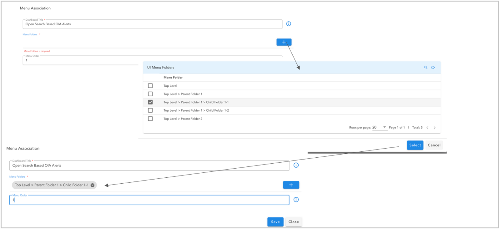
Note
Once we Click on Save, Dashboard association to menu will be saved successfully. Now refresh browser to reflect changes.
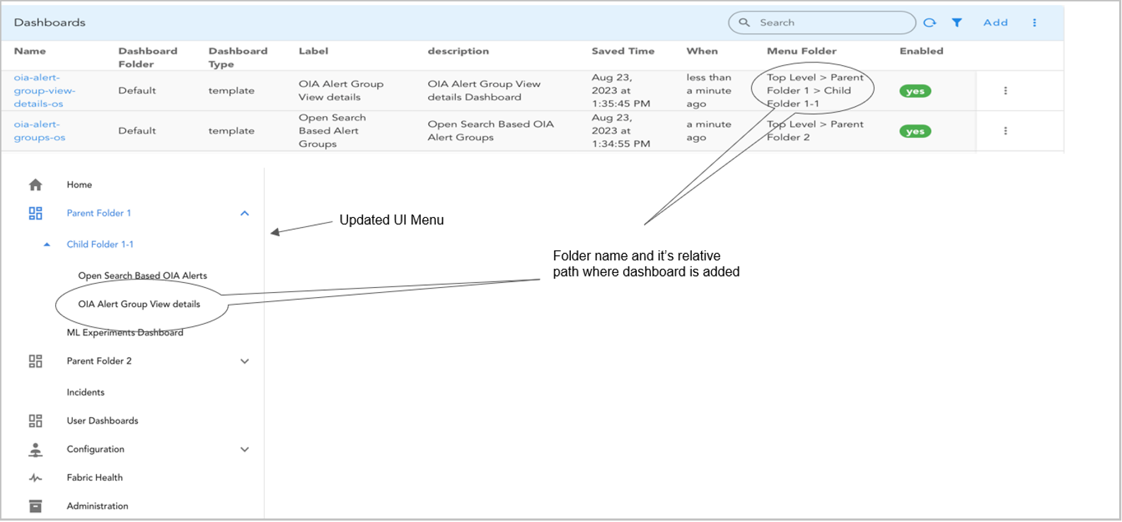
Re-ordering by Weight
To re-arrange the folder level by ordering the menu order (Set bigger number to position lower)
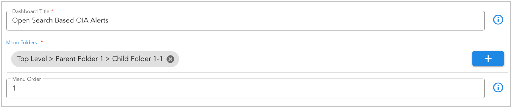
Menu order is set to 1 for Open Search Based OIA Alerts
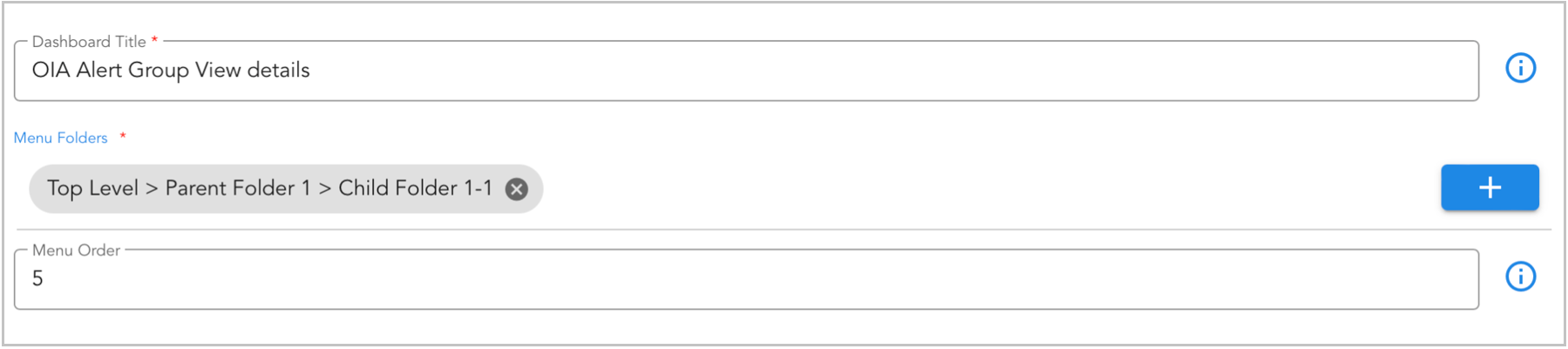
Menu order is set to 5 for OIA Alert Group View details
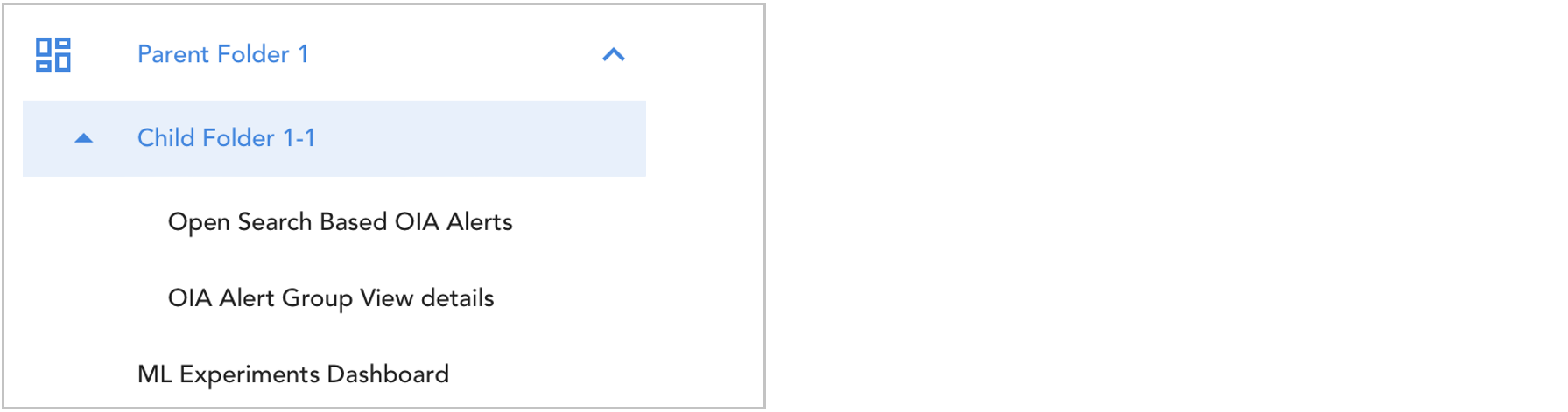
Unassign Dashboard from Menu
To Remove the UI menu associated with a particular dashboard, we can unassign them by following the below methods
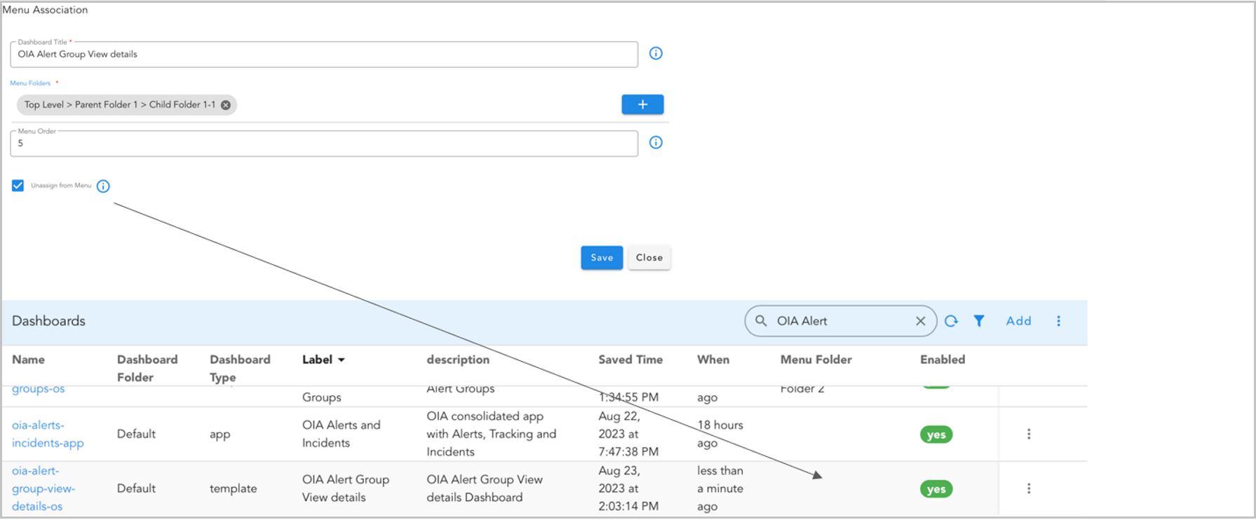
4.7 Template Variable
A template variable is a placeholder for a value that will be filled in at runtime. It is often used in report definition, where it allows functions and classes to operate with generic types. This allows a function or class to be written once and then be used with various data types without being rewritten for each one. The template variable is specified in the function or class definition and then the actual data type is provided when the function or class is used.
Below is the sample configuration of Template Variable.
"template_variables": {
  "CITY": {
    "contextId": [
      "navigatorSelectionContexts",
      "secondaryListSelection",
      "city"
    ]
  },
  "NAME": {
    "contextId": [
      "navigatorSelectionContexts",
      "secondaryListSelection",
      "name"
    ]
  }
}
Important
Template Variable should be passed only when dashboard type is set to Template
{
  "title": "Details",
  "widget_type": "tabular",
  "extra_filter": "(name is '{{NAME}}') and (city is '{{CITY}}')",
  "stream": "main",
  "max_width": 12,
  "height": 8,
  "min_width": 12,
  "widget_id": "cc9a9626"
}
4.8 Dynamic Forms
With this feature, we can make forms and actions right within the dashboard. An example usage of this is to provide Add, Edit, Delete operations on a tabular view. When user uses the form, it updates the stream or runs a pipeline, or both. We can line up actions when the form is submitted, and they happen one after the other.
Please refer the below configuration parameter table which are used to configure Dynamic Forms within the dashboard.
Parameter Name |
Mandatory | Description |
|---|---|---|
type |
yes | Supported values are UPDATE_PSTREAM, RUN_PIPELINE & GO_TO_APP_STATE |
pstreamName |
yes | This will update the Pstream directly |
operation |
yes | By default Value is ADD Other supported values are UPDATE & DELETE |
cfxql_query |
no | Need to specify when operation is UPDATE & DELETE |
pipelineName |
yes | This will trigger the specified pipeline |
isSync |
no | Runs pipeline in the background if isSync is False. Otherwise, it waits for the pipeline to be completed before going to the next action |
appName |
yes | Name of the app and dashboard in the format user-dashboard/dashboard_name |
FormTitle |
no | Title for the message dialog. Defaults to Success if not provided. |
statusMessage |
no | Message content to display. Defaults to "Your changes have been saved successfully! You will be redirected to dashboard_name page. |
actionLabel |
no | Text label for the dialog's action button. Defaults to Continue. |
messageType |
no | Controls whether the message Dialog is shown. Use with_message" to display it; otherwise it will be hidden. Defaults to without_message |
contexts |
no | Additional context information passed to the navigation dashboard. Defaults to an empty dictionary. |
Note
cfxql_query, operation and pstreamName are applicable only if type is UPDATE_PSTREAM and isSync and pipelineName are applicable only if type is RUN_PIPELINE
{
"type": "UPDATE_PSTREAM",
"pstreamName": "main",
"operation": "UPDATE",
"cfxql_query": "_RDA_Id is '{{_RDA_Id}}'"
}
The pipeline used in the below example is simple_pipeline, It will get the input from the dashboard to the temp-dataset
The content of the pipeline is as below.
{
"appName": "user-dashboard/file_uploads_5200",
"FormTitle": "Magic",
"statusMessage": "Magic show in 10 mins",
"actionLabel": "Joining",
"messageType": "with_message",
"contexts": {
"unique_id": "abcd123"
},
"type": "GO_TO_APP_STATE"
}
When the user submits the form, a new dialog will appear displaying either the message they requested or a default message to inform them about the behavior.
{
"appName": "user-dashboard/user_management",
"type": "GO_TO_APP_STATE",
"messageType": "without_message"
}
When the user submits the form, they will be redirected directly to the respective dashboard without any dialog appearing.
Dynamic forms provide various control types, each designed to capture specific inputs or display information efficiently. For Documentation on various Form Control Types with detailed examples of their structure and usage please Click Here
Below is a sample configuration which performs actions using Dynamic Forms.
{
"name": "Dynamic forms",
"label": "Dynamic forms",
"is_template": false,
"description": "Dynamic forms",
"version": "24.01.03.1",
"enabled": true,
"dashboard_type": "dashboard",
"dashboard_folder": "Default",
"dashboard_style": "auto",
"stream": "main",
"dashboard_sections": [
{
"title": "Student App",
"widgets": [
{
"title": "Registration Details",
"widget_type": "tabular",
"stream": "main",
"timebased": false,
"remote_searchable": true,
"ts_column": "timestamp",
"paginated": true,
"height": 10,
"min_wdith": 12,
"columns": {
"name": {
"title": "Name",
"key": true
},
"city": {
"title": "City",
"key": true
},
"age": {
"title": "Age",
"key": true
},
"Month": {
"title": "Month",
"key": true
},
"donations": {
"title": "Donations",
"key": true
},
"_RDA_Id": {
"title": "RDA ID",
"key": true,
"visible": false
}
},
"actions": [
{
"permission": "rda:github:view",
"title": "Onboard Details",
"type": "POPUP_FORM",
"selectionType": "NONE",
"identifier": "saas-service-action:userdashboard-add-yaml",
"api-endpoint": {
"service-name": "saas-reports",
"methodName": "getForm",
"stringified-params": true,
"parse-output": false,
"params": [
{
"formId": "rda.saas.dynamic.form",
"formDefinition": {
"id": "rda.saas.dynamic.form",
"refreshRequired": true,
"formFieldList": [
{
"help": "User Name",
"dataType": "string",
"controlType": "TEXT_FIELD",
"required": true,
"editable": true,
"label": "User Name",
"hidden": false,
"fieldId": "name"
},
{
"help": "City Name",
"dataType": "string",
"controlType": "TEXT_FIELD",
"required": true,
"editable": true,
"label": "City Name",
"hidden": false,
"fieldId": "city"
},
{
"help": "Age",
"required": false,
"editable": true,
"label": "Age",
"hidden": false,
"fieldId": "age",
"dataType": "INT",
"controlType": "INT",
"defaultValue": false
},
{
"help": "Month",
"required": false,
"editable": true,
"label": "Month",
"hidden": false,
"fieldId": "Month",
"dataType": "string",
"controlType": "TEXT_FIELD",
"defaultValue": false
},
{
"help": "Donations",
"required": false,
"editable": true,
"label": "Donations",
"hidden": false,
"fieldId": "donations",
"dataType": "INT",
"controlType": "INT",
"defaultValue": false
}
]
},
"actions": [
{
"type": "UPDATE_PSTREAM",
"pstreamName": "main"
},
{
"type": "RUN_PIPELINE",
"pipelineName": "simple_pipeline",
"isSync": true
}
]
}
]
}
},
{
"permission": "rda:github:view",
"title": "Edit User",
"type": "POPUP_FORM",
"selectionType": "SINGLE",
"identifier": "saas-service-action:userdashboard-add-yaml",
"api-endpoint": {
"service-name": "saas-reports",
"methodName": "getForm",
"stringified-params": true,
"parse-output": false,
"params": [
{
"formId": "rda.saas.dynamic.form",
"formDefinition": {
"id": "rda.saas.dynamic.form",
"refreshRequired": true,
"formFieldList": [
{
"help": "User Name",
"dataType": "string",
"controlType": "TEXT_FIELD",
"required": true,
"editable": true,
"label": "User Name",
"hidden": false,
"fieldId": "name"
},
{
"help": "City Name",
"dataType": "string",
"controlType": "TEXT_FIELD",
"required": true,
"editable": true,
"label": "City Name",
"hidden": false,
"fieldId": "city"
},
{
"help": "Age",
"required": false,
"editable": true,
"label": "Age",
"hidden": false,
"fieldId": "age",
"dataType": "INT",
"controlType": "INT",
"defaultValue": false
},
{
"help": "Month",
"required": false,
"editable": true,
"label": "Month",
"hidden": false,
"fieldId": "Month",
"dataType": "string",
"controlType": "TEXT_FIELD",
"defaultValue": false
},
{
"help": "Donations",
"required": false,
"editable": true,
"label": "Donations",
"hidden": false,
"fieldId": "donations",
"dataType": "INT",
"controlType": "INT",
"defaultValue": false
}
]
},
"actions": [
{
"type": "UPDATE_PSTREAM",
"pstreamName": "main",
"operation": "UPDATE",
"cfxql_query": "_RDA_Id is '{{_RDA_Id}}'"
},
{
"appName": "user-dashboard/user_management",
"type": "GO_TO_APP_STATE",
"messageType": "with_message"
},
{
"type": "RUN_PIPELINE",
"pipelineName": "simple_pipeline",
"isSync": true
}
]
}
]
}
},
{
"permission": "rda:github:view",
"title": "Delete User",
"type": "POPUP_FORM",
"selectionType": "SINGLE",
"identifier": "saas-service-action:userdashboard-add-yaml",
"api-endpoint": {
"service-name": "saas-reports",
"methodName": "getForm",
"stringified-params": true,
"parse-output": false,
"params": [
{
"formId": "rda.saas.dynamic.form",
"formActionList": {
"formActions": [
{
"identifier": "Submit",
"actionLabel": "Delete"
}
]
},
"formDefinition": {
"id": "rda.saas.dynamic.form",
"refreshRequired": true,
"formFieldList": [
{
"help": "Do you want to delete the onboarded User?",
"dataType": "string",
"controlType": "LABEL",
"required": false,
"editable": false,
"label": "Do you want to delete the onboarded User?",
"hidden": false,
"fieldId": "name"
}
]
},
"actions": [
{
"type": "UPDATE_PSTREAM",
"pstreamName": "main",
"operation": "DELETE",
"cfxql_query": "_RDA_Id is '{{_RDA_Id}}'"
},
{
"type": "RUN_PIPELINE",
"pipelineName": "simple_pipeline",
"isSync": true
}
]
}
]
}
}
]
}
]
}
]
}
Note
As shown in the screenshot below, we've used operations like 'ADD' for 'Onboard Details', 'UPDATE' for 'Edit User', and 'DELETE' for 'Delete User' which are highlighted in the above Configuration.
4.9 Multi Widget Support
This feature empowers users to organize multiple widgets within a dashboard layout by specifying their grouping or location. For example, assigning the widget_group as "group1" consolidates all widgets into one layout, while setting it as "group2" accomplishes the same for another distinct set of widgets, continuing similarly for additional groups as needed.
Please refer the below configuration parameter table which are used to configure Multi Widget Support within the dashboard.
Parameter Name |
Mandatory | Description |
|---|---|---|
widget_group |
No | Name of the group were it belongs |
Below is a sample configuration for Multi Widget Support.
{
  "widget_group": "group",
  "min_width": 6,
  "height": 8,
  "max_width": 12,
  "widget_type": "pie_chart",
  "title": "Widget 1",
  "stream": "rdaf_services_logs",
  "extra_filter": "log_severity in ['ERROR', 'DEBUG', 'INFO']",
  "ts_column": "timestamp",
  "column": "_id",
  "agg": "value_count",
  "group_by": [
    "log_severity"
  ],
  "type": "str"
}
{
  "name": "Multi_support",
  "label": "Multi Support Widget",
  "description": "GH_2745",
  "version": "24.01.03.1",
  "enabled": true,
  "dashboard_type": "dashboard",
  "dashboard_filters": {
    "time_filter": true
  },
  "dashboard_folder": "Default",
  "dashboard_sections": [
    {
      "title": "Student App",
      "show_filter": true,
      "widgets": [
        {
          "widget_group": "group2",
          "title": "Student city",
          "widget_type": "pie_chart",
          "stream": "main",
          "column": "count_",
          "min_width": 6,
          "group_by": [
            "city"
          ],
          "type": "int",
          "agg": "value_count",
          "ts_column": "timestamp"
        },
        {
          "widget_group": "group2",
          "title": "Student name",
          "widget_type": "counter",
          "stream": "main",
          "column": "count_",
          "min_width": 6,
          "group_by": [
            "name"
          ],
          "type": "int",
          "agg": "value_count",
          "ts_column": "timestamp"
        },
        {
          "title": "Student donation",
          "label": "Donation",
          "widget_group": "group1",
          "widget_type": "bar_chart",
          "min_width": 6,
          "stream": "main",
          "column": "count_",
          "group_by": [
            "donation"
          ],
          "type": "int",
          "agg": "value_count",
          "ts_column": "timestamp"
        }
      ]
    }
  ]
}
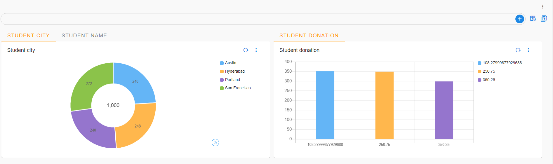
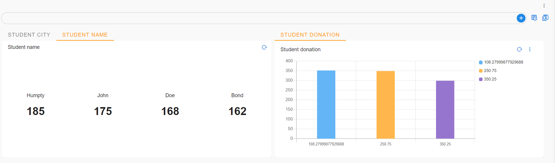
4.10 Context Enrichment
Context enrichment involves adding additional data to the current dashboard context by querying a dataset or a PStream. This query uses current context variables to retrieve more attributes and update the existing context. This feature also enables developers to integrate data from various streams or datasets during dashboard loading time. Combined with other new features, it even allows for the dynamic usage of different dashboards based on runtime conditions or context variable values.
Note
This enrichment is supported exclusively in App-Type Dashboards.
Enriching from a Dataset
Below is a sample configuration for Enriching from a Dataset
"context_enrichment": {
    # Mandatory
    "dataset": "name-of-dataset",

    # mandatory.
    # Substitues current context variables in query and then
    # applies filter on data
    "query_template": "projectId = '$project_id'",

    # Mandatory. if query matches, add these variables from the dataset
    # into current context
    "enrich_columns": [ "bpaURL", "accedianURL" ],

    # Optional. If specified, and if the query does not result any rows
    # add following defaultValues into context
    "defaultValues": {},

    # This context enrichment would be done only the context_filter matches
    # if the context_filter is not specified, enrichment is always performed
    "context_filter": "vendorOS contains 'Juniper'"

}
Below is a sample configuration for Enriching from a Stream
"context_enrichment": {
    # Mandatory
    "stream": "name-of-stream",

    # mandatory.
    # Substitues current context variables in query and then
    # applies filter on stream
    "query_template": "projectId = '$project_id'",

    # Mandatory. if query matches, add these variables from the stream
    # into current context
    "enrich_columns": [ "bpaURL", "accedianURL" ],

    # Optional. If specified, and if the query does not result any rows
    # add following defaultValues into context
    "defaultValues": {},

    # Optional
    # specifies sorting crtitea (in case query matches more than 1 row)
    # allows to sort specific and get the only first row
    "sorting": [ { "timestamp": "desc" } ],

    # This context enrichment would be done only the context_filter matches
    # if the context_filter is not specified, enrichment is always performed
    "context_filter": "vendorOS contains 'Juniper'"
}
"context_enrichment": {
        "dataset": "sample_dataset",
        "enrich_columns": [
            "url1",
            "url2"
        ],
        "query_template": "ID = '$ID' and cust_id ='$cust_id' ",
        "defaultValues": {}
    },
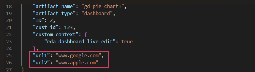
4.11 Conditional Page Inclusion
This allows App level Dashboard pages to be included only if it matches a condition based on context variables, this enrichment is also supported to widgets and dashboard section so that user can see the content based on the context they are trying to filter in context
Conditional Dashboard Pages
Below is a sample configuration for Conditional Dashboard Pages
"dashboard_pages": [
  {
      "name": "juniper_device_metrics",
      "label": "Metrics",
      "icon": "license.svg",
      "context_filter": "vendorOS contains 'Juniper'"
  },
  {
      "name": "cisco_device_metrics",
      "label": "Metrics",
      "icon": "license.svg",
      "context_filter": "vendorOS contains 'Cisco'"
  },
  {
      "name": "generic_device_metrics",
      "label": "Metrics",
      "icon": "license.svg",
      "context_filter": "vendorOS not conatains 'Juniper' and vendorOS not conatains 'Cisco'"
  },
]
Conditional Dashboard Section
Below is a sample configuration for Conditional Dashboard Section
{
    "name": "animal",
    "label": "day1_01",
    "description": "animal: Insights",
    "dashboard_folder": "day1",
    "version": "1.0.0",
    "enabled": false,
    "stream": "animal",
    "dashboard_type": "dashboard",
    "live_edit": true,
    "dashboard_filters": {
        "time_filter": true,
        "default_time_filter_labels": [
            "Last 12 months"
        ]
    },
    "dashboard_sections": [
        {
            "title": "day1_01",
            "show_filter": true,
            "context_filter":"week contains 'monday'",
            "widgets": []
        }
    ]
}
Conditional Dashboard Widgets
Below is a sample configuration for Conditional Dashboard Widgets
{
  "widget_type": "pie_chart",
  "context_filter":"week contains 'monday'",
  "title": "Week",
  "duration_hours": 1080,
  "stream": "animal",
  "ts_column": "time_value",
  "extra_filter": null,
  "column": "count_",
  "agg": "sum",
  "group_by": [
      "Week"
  ],
  "type": "int",
  "min_width": 3,
  "height": 3,
  "max_width": 6
}
4.12 Substituting Context Variables in Dashboard Page Attributes
This feature will let the user pick the specified column to launch the URL
The below sample dataset that can be used for creating Variable URL fields
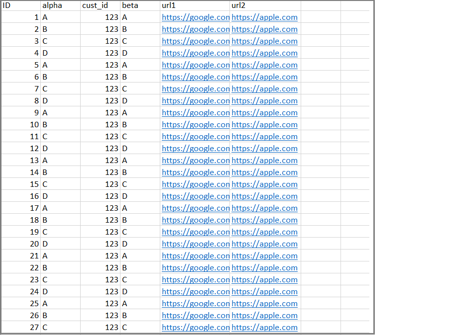
Below is the sample configuration for Substituting Context Variables under Dashboard Pages Attributes of app type of dashboard
Note
User needs to have a column which has the links, and user needs to use the same column under launchURL attributes where user wants the app to redirect to the same URL.
"dashboard_pages": [
  {
    "name": "URL_Link_1",
    "label": "End Visibility",
    "template_attrs": [
      "launchURL"
    ],
    "icon": "insights.svg",
    "launchURL": "$url1",
    "context_filter": "url1 is not null"
  },
  {
    "name": "URL_Link_2",
    "label": "Config Orchestration",
    "icon": "insights.svg",
    "template_attrs": [
      "launchURL"
    ],
    "launchURL": "$url2",
    "context_filter": "url2 is not null"
  }
]
4.13 UI Display Dashboard Title
This feature will let the user add the dashboard label as header
Below is a sample configuration to enable the Dashboard Title
{
    "name": "documentation",
    "label": "Multi Support Widget",
    "description": "Multi Support Widget",
    "showTitle": true,
    "version": "26.3.24.1",
    "enabled": true,
    "live_edit": true,
    "status_poller": {},
    "dashboard_filters": {
        "time_filter": true,
        "columns_filter": [],
        "group_filters": []
    },
    "dashboard_sections": [],
    "dashboard_type": "dashboard",
    "dashboard_pages": [],
    "dashboard_folder": "Default"
}

4.14 Live Edit
This support lets users Edit dashboard definition within the dashboard which can be shown up on top right portion of the dashboard, by default live_edit feature is disabled
The user will have the ability to perform the following actions when live edit is enabled
1) View Json -> Displays current dashboard definition
2) View Context -> Displays current dashboard context
3) View Dependencies -> Displays dependencies of current dashboard
4) Audit Logs -> Displays audit logs for current dashboard
5) Edit Json -> Enables to edit the current dashboard and save the changes without leaving the dashboard
To enable the actions user needs to follow the below configuration
{
    "name": "live edit",
    "label": "Live Edit",
    "live_edit": true,
    "description": "Testing live edit",
    "version": "26.3.24.1",
    "enabled": true,
    "dashboard_filters": {
        "time_filter": true,
        "columns_filter": [],
        "group_filters": []
    },
    "dashboard_sections": [],
    "dashboard_type": "dashboard",
    "dashboard_pages": [],
    "dashboard_folder": "Default"
}
live_edit is set to true User would have the ability to edit the dashboard as highlighted below
when the live_edit is set to false the user would not have the ability to edit the dashboard
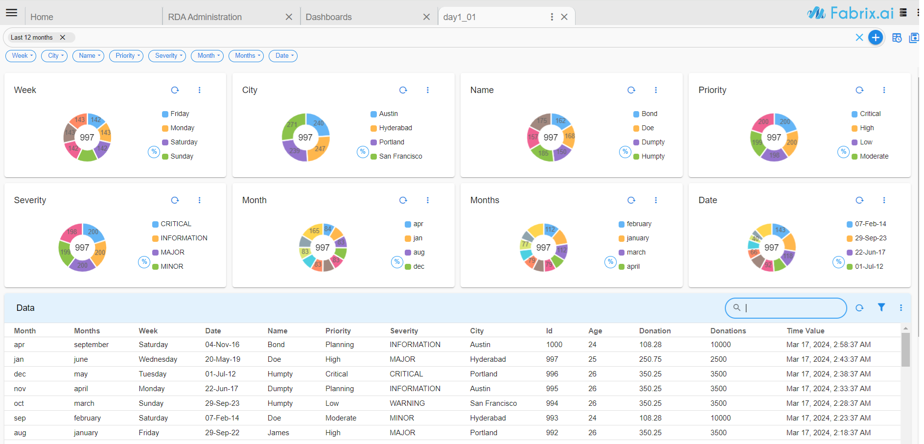
To enable live edit at Dashboard App user needs follow the below configuration
Note
If enabled at app level all the dashboard pages within the app will have live edit feature
{
    "name": "Live_edit_app",
    "label": "Dashboards",
    "description": "examples",
    "version": "24.4.12.1",
    "custom_context": {
        "rda-dashboard-live-edit": true
    },
    "enabled": true,
    "dashboard_sections": [
        {
            "title": "Widgets"
        }
    ],
    "dashboard_type": "app",
    "dashboard_pages": [
        {
            "name": "gd_pie_chart1",
            "label": "Pie Chart",
            "icon": "white_label.svg"
        }
    ]
}
rda-dashboard-live-edit is set to true User would have the ability to edit the dashboard as highlighted below
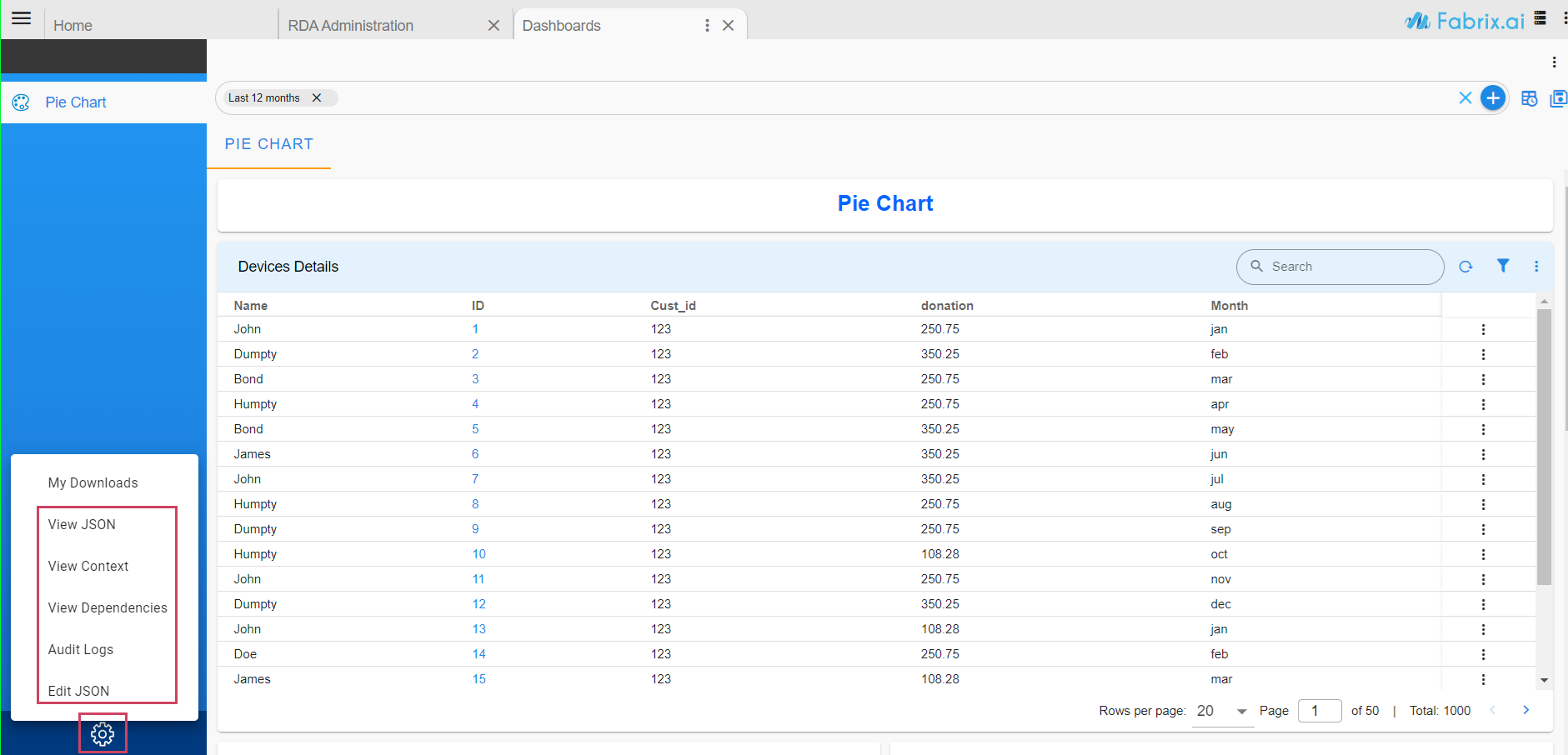
when the rda-dashboard-live-edit is set to false the user would not have the ability to edit the dashboard
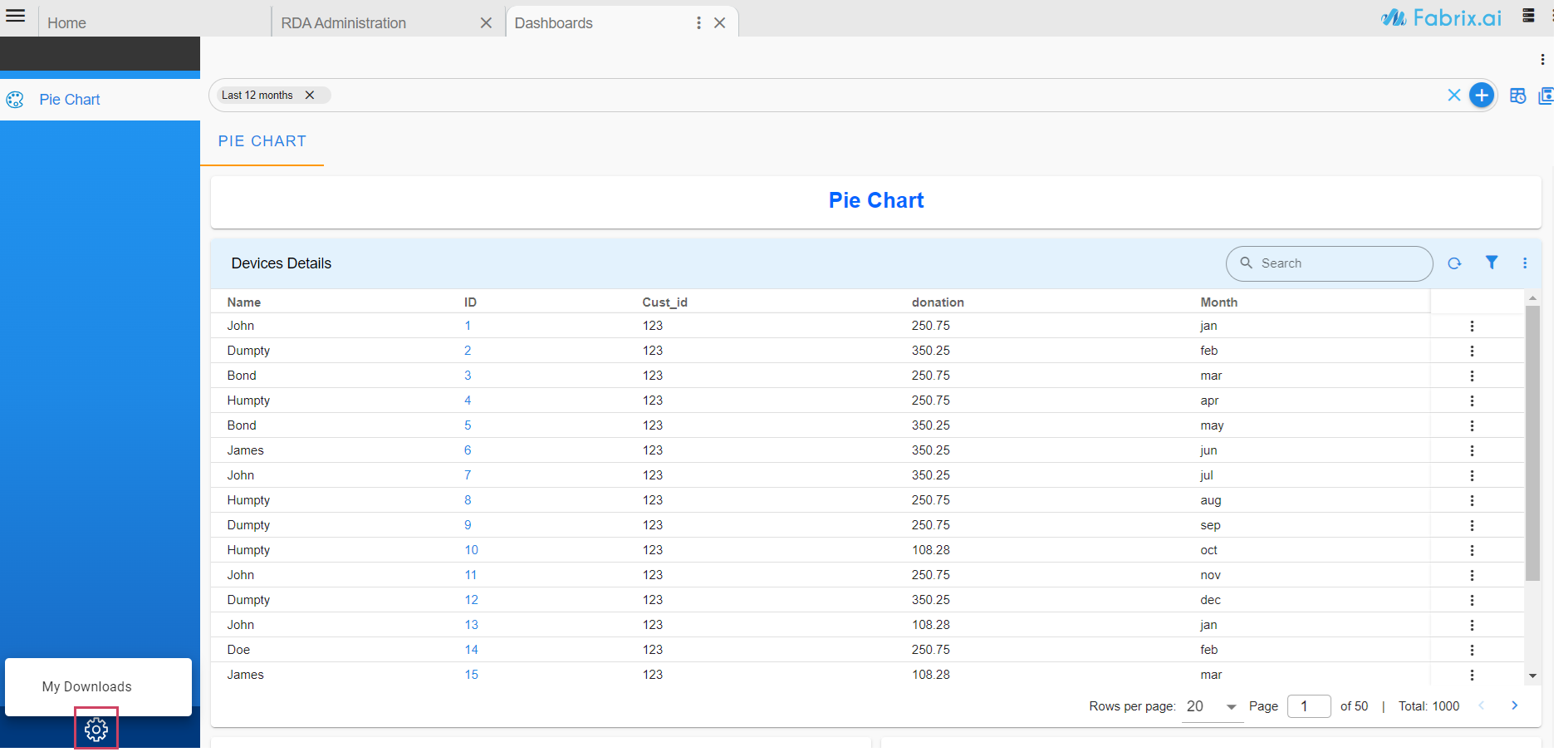
4.15 Dashboard as Link in Main Menu
This dashboard contains a web URL which can be assigned to the Main Menu as a launching point. As a menu item, it shall contain url attribute for the menu object.
To enable this feature user needs to follow the below configuration
{
    "name": "launch_dashboard",
    "label": "URL Dashboard 1",
    "description": "URL Dashboard",
    "dashboard_folder": "Default",
    "version": "22.12.1.2",
    "enabled": false,
    "dashboard_type": "url-dashboard",
    "live_edit": true,
    "url": "https://www.google.com/",
    "dashboard_sections": []
}
Note
After adding the dashboard, the user must assign it to the menu as outlined in Section 4.4 Once assigned, the user can launch the provided URL directly from the UI menu, as illustrated in the screenshot.
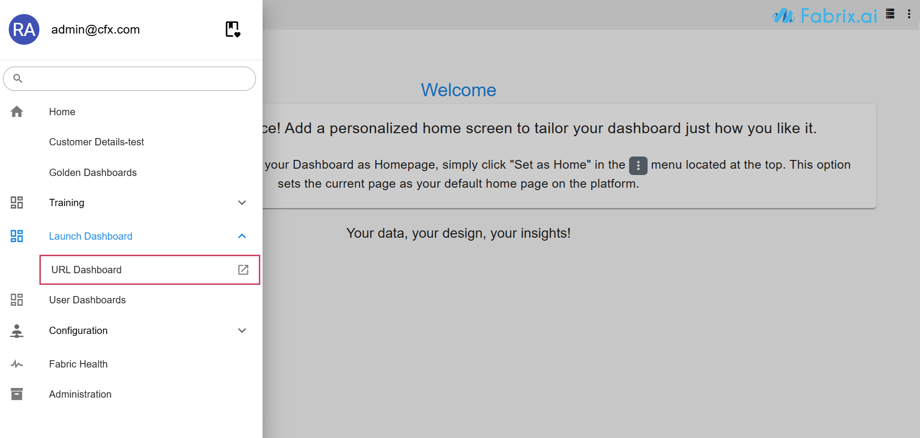
To verify, refresh the browser and open the hamburger menu. The assigned menu will be visible, and by clicking on it will open the specified URL.
4.16 Control Panel & Computed Contexts
4.16.1 Control Panel
What is the Control Panel?
The Control Panel enhances dashboards by making them more dynamic and customizable. It allows users to set parameters through a form, which are then injected into the Dashboard's context.
Key Features
-
Users can specify customization parameters via a form.
-
Parameters are injected into the Dashboard context.
-
Injected variables can be used for:
- Updating widget filters
- Changing Titles/Labels
- Updating widget parameters (such as
Interval,group_by,hide/show columns)- Hiding or showing sections or widgets
How to Add the Control Panel
To enable the Control Panel in a dashboard, specify the following segment at the top level of the dashboard template.
"dynamic_form": {
        "formData": {},
        "controlPanelFormDefinition": {
            "title": "Customize Report",
            "buttonLabel": "Apply",
            "id": "kpi.benchmark.json",
            "refreshRequired": true,
            "formFieldList": [
        {
        // each field in Form
        }
        ]
    }
}
It adds a new icon located in the top right corner of the Dashboard, just above the Time filters as shown in the below screenshot.
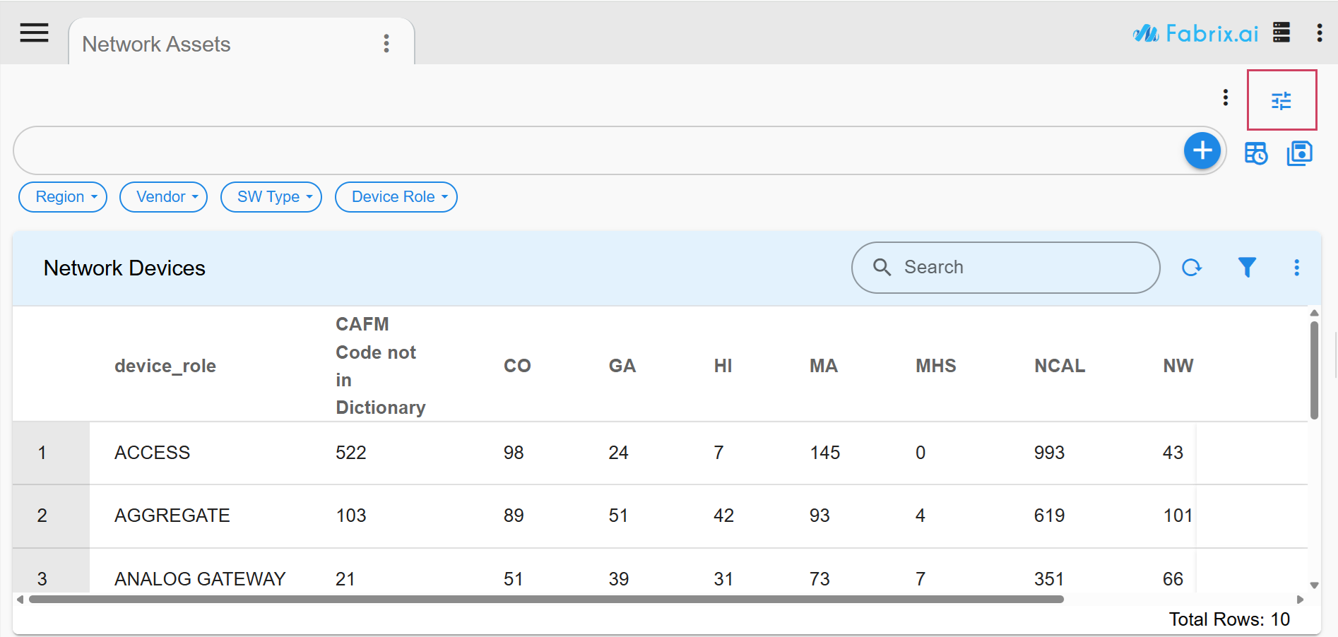
Click on the Control Panel icon to open/close the control panel.

Click here to view the Example of a Full Dashboard definition, including Computed Context and Control Panel.
{
"name": "demo-aia-control-panel",
"label": "Network Assets",
"description": "AIA with control panel",
"dashboard_folder": "demo",
"version": "1.0.1",
"enabled": false,
"live_edit": true,
"dashboard_type": "template",
"dashboard_style": "auto",
"section_as_dashboard": true,
"stream": "aia_network_remote",
"computedContext": {
"y_axis_1": {
"expr": "y_axis_1",
"defaultValue": "device_role"
},
"x_axis": {
"expr": "x_axis",
"defaultValue": "region"
},
"show_hw_expiry": {
"expr": "'yes' if str(show_hw_expiry) in [ 'yes', 'True'] else 'no'",
"defaultValue": "error"
},
"show_site_type": {
"expr": "'yes' if str(show_site_type ) in [ 'yes', 'True'] else 'no'",
"defaultValue": "error"
},
"show_vendor": {
"expr": "'yes' if str(show_vendor) in [ 'yes', 'True'] else 'no'",
"defaultValue": "error"
},
"show_device_role": {
"expr": "'yes' if str(show_device_role) in [ 'yes', 'True'] else 'no'",
"defaultValue": "error"
}
},
"template_variables": {
"Y_AXIS_1": {
"contextId": "y_axis_1",
"default": "device_role"
},
"X_AXIS": {
"contextId": "x_axis",
"default": "region"
},
"SHOW_DEVICE_ALLROLE": {
"contextId": "show_device_role",
"default": "unknown"
},
"ALL_CONTEXT": {
"contextId": "CONTEXT",
"default": "unknown"
}
},
"dashboard_filters": {
"time_filter": true,
"custom_time_filters": [
"1y",
"10y"
],
"default_time_filter_labels": [
"Last 10 years"
],
"columns_filter": [
{
"id": "timestamp",
"label": "Timestamp1",
"type": "DATETIME"
},
{
"id": "region",
"label": "Region",
"type": "TEXT"
},
{
"id": "site_type",
"label": "Site Type",
"type": "TEXT"
},
{
"id": "sw_type",
"label": "SW Type",
"type": "TEXT"
},
{
"id": "device_role",
"label": "Device Role",
"type": "TEXT"
},
{
"id": "vendor",
"label": "Vendor",
"type": "TEXT"
},
{
"id": "device_family_exec",
"label": "Device Family",
"type": "TEXT"
}
],
"group_filters": [
{
"stream": "aia_network_remote",
"title": "Region",
"group_by": [
"region"
],
"extra_filter": "(equipment_type = 'CHASSIS')",
"ts_column": "timestamp",
"agg": "sum",
"column": "count_",
"type": "int",
"show_counts": true
},
{
"stream": "aia_network_remote",
"title": "Vendor",
"group_by": [
"vendor"
],
"extra_filter": "(equipment_type = 'CHASSIS')",
"ts_column": "timestamp",
"agg": "sum",
"column": "count_",
"type": "int",
"show_counts": true
},
{
"stream": "aia_network_remote",
"title": "SW Type",
"group_by": [
"sw_type"
],
"extra_filter": "(equipment_type = 'CHASSIS')",
"ts_column": "timestamp",
"agg": "sum",
"column": "count_",
"type": "int",
"show_counts": true
},
{
"stream": "aia_network_remote",
"title": "Device Role",
"group_by": [
"device_role"
],
"extra_filter": "(equipment_type = 'CHASSIS')",
"ts_column": "timestamp",
"agg": "sum",
"column": "count_",
"type": "int",
"show_counts": true
}
]
},
"dashboard_sections": [
{
"title": "Devices",
"show_filter": true,
"widgets": [
{
"context_filter": "show_vendor = 'yes'",
"visibility_on_error": false,
"stream": "aia_network_remote",
"widget_type": "pie_chart",
"title": "Vendors",
"group_by": [
"vendor"
],
"extra_filter": "(equipment_type = 'CHASSIS')",
"ts_column": "timestamp",
"agg": "sum",
"column": "count_",
"type": "int",
"show_counts": true,
"min_width": 3,
"height": 4,
"max_width": 12,
"widget_id": "31359b26"
},
{
"context_filter": "show_site_type = 'yes'",
"visibility_on_error": false,
"stream": "aia_network_remote",
"widget_type": "pie_chart",
"title": "Site Type",
"group_by": [
"site_type"
],
"extra_filter": "(equipment_type = 'CHASSIS')",
"ts_column": "timestamp",
"agg": "sum",
"column": "count_",
"type": "int",
"show_counts": true,
"min_width": 3,
"height": 4,
"max_width": 12,
"widget_id": "373a7f88"
},
{
"context_filter": "show_device_role = 'yes'",
"visibility_on_error": false,
"stream": "aia_network_remote",
"widget_type": "pie_chart",
"title": "Device Role",
"group_by": [
"device_role"
],
"extra_filter": "(equipment_type = 'CHASSIS')",
"ts_column": "timestamp",
"agg": "sum",
"column": "count_",
"type": "int",
"show_counts": true,
"min_width": 3,
"height": 4,
"max_width": 12,
"widget_id": "3e61bc6b"
},
{
"context_filter": "show_hw_expiry = 'yes'",
"visibility_on_error": false,
"stream": "aia_network_remote",
"widget_type": "bar_chart",
"title": "Vendors",
"group_by": [
"hw_expiring_year"
],
"extra_filter": "(equipment_type = 'CHASSIS')",
"ts_column": "timestamp",
"agg": "sum",
"column": "count_",
"type": "int",
"show_counts": true,
"min_width": 3,
"height": 4,
"max_width": 12,
"widget_id": "3598a91f"
},
{
"title": "Network Devices",
"widget_type": "tabular",
"stream": "aia_network_remote",
"ts_column": "timestamp",
"extra_filter": "(equipment_type = 'CHASSIS')",
"virtual_scrolling": true,
"showRowSummary": true,
"resizableColumns": false,
"min_width": 12,
"height": 12,
"max_width": 12,
"columns": {
"{{Y_AXIS_1}}": "{{Y_AXIS_1}}",
"{{X_AXIS}}": "{{X_AXIS}}"
},
"pivot": {
"pivot_type": "extended",
"group_by": [
"{{Y_AXIS_1}}",
"{{X_AXIS}}"
],
"series": [
{
"column": "count_",
"agg": "sum",
"type": "int",
"label": "Device Count"
}
]
},
"widget_id": "9c0e0f6e"
},
{
"widget_type": "label",
"context_filter": "error",
"visibility_on_error": false,
"height": 10,
"min_width": 12,
"max_width": 12,
"label": "{{ALL_CONTEXT}}",
"widget_id": "00c2d761"
}
]
}
],
"dynamic_form": {
"formData": {},
"controlPanelFormDefinition": {
"title": "Customize Report",
"buttonLabel": "Apply",
"id": "kpi.benchmark.json",
"refreshRequired": true,
"formFieldList": [
{
"fieldId": "y_axis_1",
"label": "Y Axis Column",
"help0": "",
"hidden": false,
"editable": true,
"required": true,
"controlType": "COMBO_BOX",
"defaultValue": "device_role",
"lovValues": [
{
"identifier": "region",
"displayName": "Region"
},
{
"identifier": "site_code",
"displayName": "Site Code"
},
{
"identifier": "site_type",
"displayName": "Site Type"
},
{
"identifier": "sw_type",
"displayName": "SW Type"
},
{
"identifier": "down_ports_categorization",
"displayName": "Down Ports Category"
},
{
"identifier": "device_role",
"displayName": "Device Role"
},
{
"identifier": "hw_expiring_year",
"displayName": "HW Expiry year"
},
{
"identifier": "product_id",
"displayName": "Product ID"
},
{
"identifier": "sys_uptime_days",
"displayName": "Uptime"
},
{
"identifier": "vendor",
"displayName": "Vendor"
},
{
"identifier": "device_family_exec",
"displayName": "Device Family"
}
]
},
{
"fieldId": "x_axis",
"label": "X Axis Column",
"help0": "X-Axis Column for Pivot Table",
"hidden": false,
"editable": true,
"required": true,
"controlType": "COMBO_BOX",
"defaultValue": "region",
"lovValues": [
{
"identifier": "region",
"displayName": "Region"
},
{
"identifier": "site_code",
"displayName": "Site Code"
},
{
"identifier": "site_type",
"displayName": "Site Type"
},
{
"identifier": "sw_type",
"displayName": "SW Type"
},
{
"identifier": "down_ports_categorization",
"displayName": "Down Ports Category"
},
{
"identifier": "device_role",
"displayName": "Device Role"
},
{
"identifier": "hw_expiring_year",
"displayName": "HW Expiry year"
},
{
"identifier": "product_id",
"displayName": "Product ID"
},
{
"identifier": "sys_uptime_days",
"displayName": "Uptime"
},
{
"identifier": "vendor",
"displayName": "Vendor"
},
{
"identifier": "device_family_exec",
"displayName": "Device Family"
}
]
},
{
"fieldId": "label0",
"label": "",
"hidden": false,
"editable": false,
"required": false,
"controlType": "LABEL",
"defaultValue": "Charts"
},
{
"fieldId": "show_device_role",
"label": "Device Role",
"hidden": false,
"editable": true,
"required": false,
"controlType": "BOOLEAN_FIELD",
"defaultValue": false
},
{
"fieldId": "show_vendor",
"label": "Vendor",
"hidden": false,
"editable": true,
"required": false,
"controlType": "BOOLEAN_FIELD",
"defaultValue": false
},
{
"fieldId": "show_site_type",
"label": "Site Type",
"hidden": false,
"editable": true,
"required": false,
"controlType": "BOOLEAN_FIELD",
"defaultValue": false
},
{
"fieldId": "show_hw_expiry",
"label": "HW Expiry",
"hidden": false,
"editable": true,
"required": false,
"controlType": "BOOLEAN_FIELD",
"defaultValue": false
}
]
}
},
"saved_time": "2024-06-15T21:10:35.022399"
}
4.16.2 Computed Contexts
The Computed Context is generated from existing input context and can be used for various processing purposes.
Order of Context Computation
-
Update the context variables if ComputedContext is specified.
-
Templatize the content (applicable for Template Apps or Dashboards).
-
Apply context filters to exclude Pages, Sections, or Widgets.
"computedContext: {
    "ipAddress": {
        "expr": "ipAddress if ipAddress else network.split('/')[0]",
        "defaultValue": "0.0.0.0"
    },
    "dummyContext": {
        "defaultValue": "some-dummy-value"
    }
}
"computedContext": {
        "y_axis_1": {
            "expr": "y_axis_1",
            "defaultValue": "device_role"
        },
        "x_axis": {
            "expr": "x_axis",
            "defaultValue": "region"
        },
        "show_hw_expiry": {
            "expr": "'yes' if str(show_hw_expiry)  in [ 'yes', 'True'] else 'no'",
            "defaultValue": "error"
        },
        "show_site_type": {
            "expr": "'yes' if str(show_site_type ) in [ 'yes', 'True'] else 'no'",
            "defaultValue": "error"
        },
        "show_vendor": {
            "expr": "'yes' if str(show_vendor)  in [ 'yes', 'True'] else 'no'",
            "defaultValue": "error"
        },
        "show_device_role": {
            "expr": "'yes' if str(show_device_role) in [ 'yes', 'True'] else 'no'",
            "defaultValue": "error"
        }
}